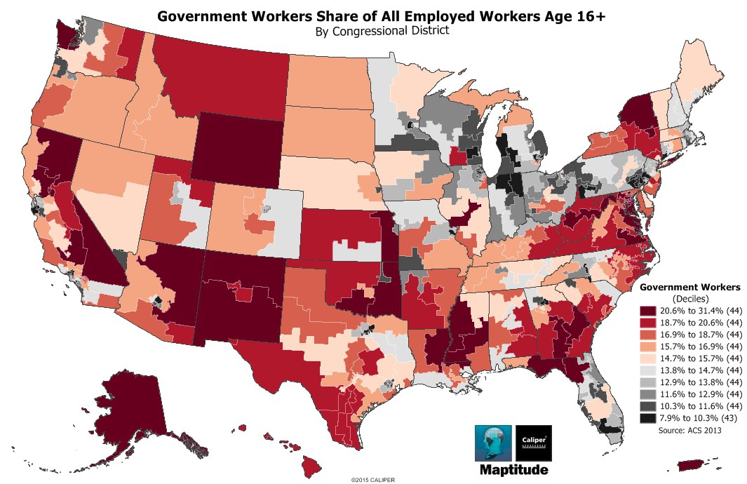
Maptitude is the best mapping software for business intelligence! This month's featured map uses a nested averages heat/color theme by congressional district to show those districts that have more or less than the average number of government employees as a percentage of total employees. Alaska is notable for being above average, with the Federal Government traditionally being the largest employer in the state. Most urban areas have significantly fewer public sector employees, as do the many of the midwestern states such as Michigan, Indiana, Ohio, and Wisconsin, as well as Pennsylvania.
If you need a custom map for your story, blog, or website, contact us because we offer a limited number of free custom maps on a first-come, first-served basis! See our Featured Maps for inspiration.
Map: Created with Maptitude Mapping Software by Caliper,
May 2015
Source: American Community Survey 2013