You can visualize time series data, such as population projections, using data visualization software.
Often we have data that shows the variation of some information over time. Common examples of this type of data include:
- Population Projection data, which shows how the population of an area will change over time
- Quarterly Sales data, showing how sales are growing
- Disease Incidence data, tracking how a disease is spreading over time
It can be hard to know the best way to visualize this data on a map, since usually, the maps are static images not ideally suited to showing a changing variable. In this article, we will discuss three different techniques Maptitude users employ to visualize these changes.
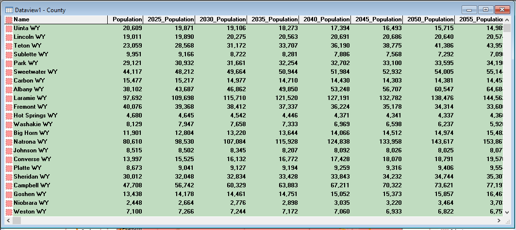
In these examples, we will be using the Population Projection data that comes included with the USA Country package. We will be focusing on the counties in Wyoming to analyze how they are expected to change in population over the next few decades.
Option 1: Color Theme on % Change
One of the challenges when visualizing Time Series data is that one of the most common methods of data visualization, the Color Theme, can only show one field at a time. This is because the Color Theme works by shading in the area based on a given value and an area can only be one color at a time.
One option therefore for the time series data is to create a formula field that will combine multiple fields as inputs and output a single field that we want to visualize. The most common choice for this analysis is % Change
These steps will walk through calculating % Change in population from 2025 to 2030 and showing that as a Color Theme:
- Right-click on County in the Display Manager and choose New Dataview
- Click
 in the main toolbar
 - From the Field Picker, choose 2030 Population (close to the bottom of the list)
- Type /
- From the Field Picker choose 2025 Population (close to the bottom of the list)
- Type – 1
- Under Formula Fields, name the field % Change 25 – 30
- Click OK
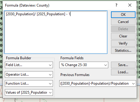
How Can I Visualize Time Series Data, Such as Population Projections? Formula of Percent Change. - In the resulting dataview, right-click anywhere and choose Field Properties
- Go to the bottom of the list and change the format for % Change 25 – 30 to 12.34%
- Go back to the map and make County the working layer
- Click
 in the main toolbar
 - From Field choose [% Change 25 – 30]
- For Method, choose Equal Number of Features
- Check the box next to Break at
- Click OK
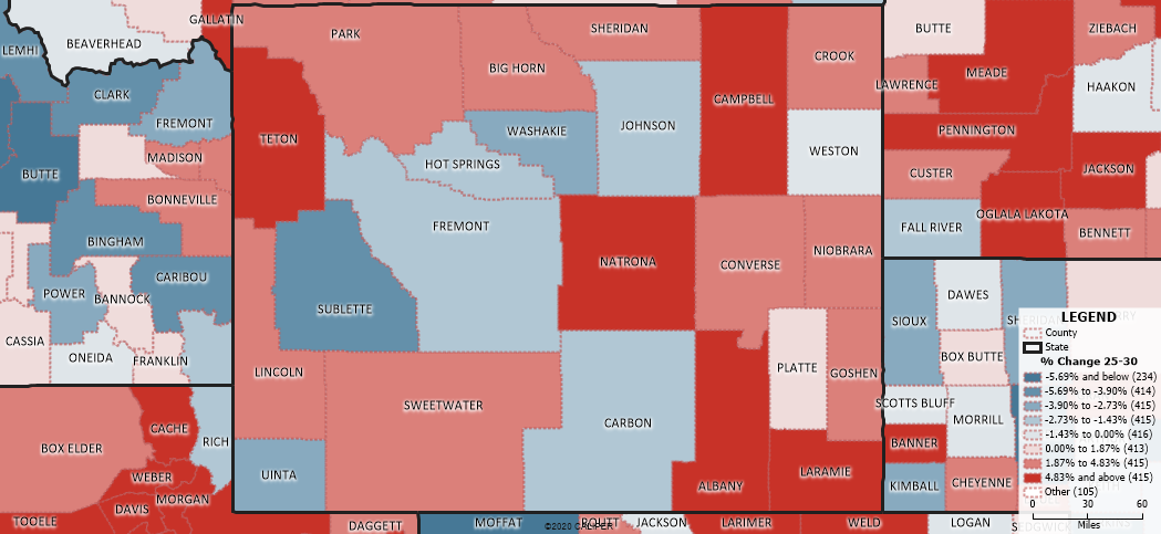
This will produce a Color Theme map where the areas growing will be in red and the areas shrinking will be in blue, with the shade of each color representing the size of this change
Option 2: Chart Theme
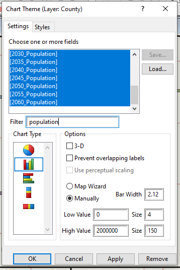
While the Color Theme can only visualize one field at a time, the Chart Theme can show multiple fields at a time by making various charts at the center of each area in the map. Creating a bar chart for time series data can be an effective way of showing change over time:
- Make County the Working Layer
- Click
 in the main toolbar
 - In Filter type in Population and scroll to the bottom of the list
- Click and drag to highlight 2025_Population to 2060_Population
- Click the Vertical Bar Chart option in Chart Type
- Click OK
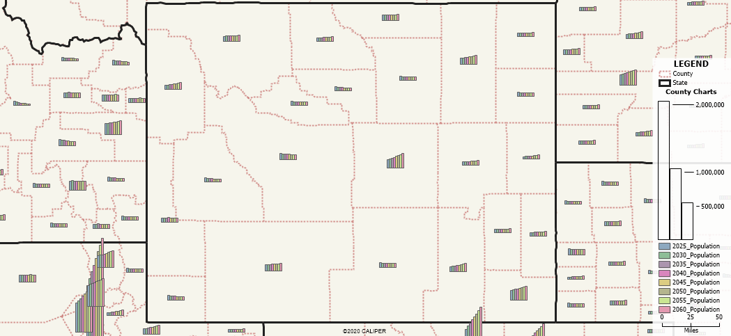
You may need to calibrate the High and Low values for your chart in order for the area you are looking at to have a good range of data. You can go back into the Chart Wizard and edit the Low and High Value as well as the size of the bars. The settings I used for the above map are:
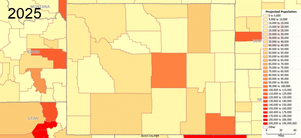
Option 3: Animated GIF (more advanced)
A feature in Maptitude that is ideally suited to showing time series data is the ability to create animated GIF images. These can be created to show change over time in an animated fashion, with the image itself changing as it progresses through the years. This combines well with a simple Color Theme to show how the density of the data changes over time.
Step 1: Set up the Color Theme and the first map
- Make County the working layer
- Click in the main toolbar
- From the Field dropdown, select the earliest of the time series fields you have, e.g. 2025 Population
- You will be using the same range of classes for each of the different fields, so we would recommend customizing these ranges by clicking Customize
- You can also customize the display of the Color Theme under the styles tab
- Once you are happy with the theme settings click Save and choose a location to save the Settings File
- Name the theme (e.g. Population Projections)
- Add freehand text to a corner to label which field is being shown
- In the Display Manager, click the grey plus next to County. Right-click on the Theme and choose Rename. Use a name that is not specific to any year (e.g. Projected Population)
This will set up the first frame of the animation to be the map you want. To make the animation look nice, we don’t want to move the map around from this point forward so that it has a consistent view.
Step 2: Create the GIF
- Go to File>Share>Animated GIF
- Click
 to add the first map to the animation
 - For each successive field to add to the GIF:
- Click and click Remove
- Click and choose the new field from the Field dropdown
- Click Apply, then click Customize
- Click Load and choose the Theme created in Step 1
- Click OK and click Yes
- Click OK
- Right-click on the freehand text and choose Properties. Update to the correct year
- Right-click on the Theme in the Display Manager and choose Rename
- Rename to Projected Population
- Click to add this map to the GIF
- Click
- Once you have added all the individual maps to the GIF, click
 to save the GIF
 - Save the GIF file in an appropriate location
- Maptitude will save an animated GIF that will automatically cycle between all the different maps you added