Maptitude includes a wealth of preloaded demographic fields that can be recombined to create new variables using the flexible formula building tools included with the software. By exploring the differences in these values it is easy to visualize those areas that have grown or that are likely to grow.
The following steps outline how to create a map that compares 2020 population to 2010 population to identify areas with high population growth potential:
- Open Maptitude and choose New map of United States (or your appropriate country package).
- Choose United States from the scroll list and click Finish.
- If the County layer is not visible, use the Display Manager to make it visible and make the County layer the working layer.
- Choose Map>Thematic Mapping>Color or click
 .
. - Choose Formula from the bottom of the Field drop-down list.
- Create the following formula with the Formula Builder or by typing in the formula box:
( [2010 Population] – Population ) / Population * 100 - Type “% Change in Population” for the field name and click OK to return to the Color Theme dialog box.
- Choose Equal Number of Features from the Method drop-down list, check the Break at box and click OK.
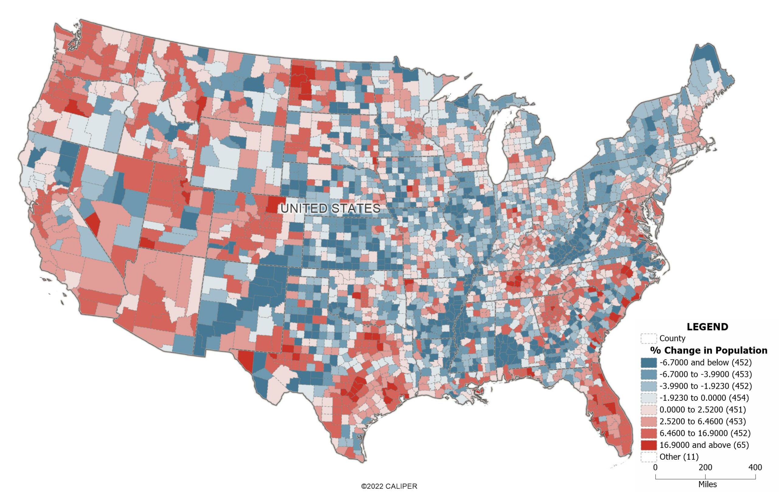
Maptitude creates a color theme on the County layer. Counties with negative population growth are shown with varying intensities of one color and counties with positive population growth are shown with varying intensities of another color. Darker colors indicate counties with the greatest increases or decreases in population.
The software also has population projection fields in 5 year intervals going out to 2100, so you can also use these in conjunction with the other historic and current population fields.
In addition, we have a free data download specifically for US County projections: https://www2.caliper.com/store/product/population-projection-data/