Last updated on March 4, 2026
Types of Themes
Maptitude Online can assemble information about map features to create a map that illustrates the patterns in the data using themes. Thematic maps use distinctive colors, symbols, and fill styles to portray data such as population, sales volume, home values, or income. The different styles highlight the similarities and differences among map features. When data are portrayed in a thematic map, the information becomes easier to see, understand, and interpret.
Maptitude Online supports the following theme types:
- Color themes
- Size themes
- Symbol themes
- Chart themes and Cluster Chart themes
- Cluster themes
- Density/heat themes
The type of themes that are available will depend upon the type of layer with which you are working. Themes that do not apply will be inactive.
|
NOTE: When you create a map of your data located as points on the map, you can choose Color/Size theme to show the points with a color theme based on one field value and a size theme based on a second field value. |
Color Themes
Color themes group the features in a map layer into classes, based on the value of a data field and displays each class with a unique color. Each class contains all of the features with similar values for the chosen field. This type of theme is useful for showing numeric (e.g., sales, population) and non-numeric (e.g., territory, political party) data.
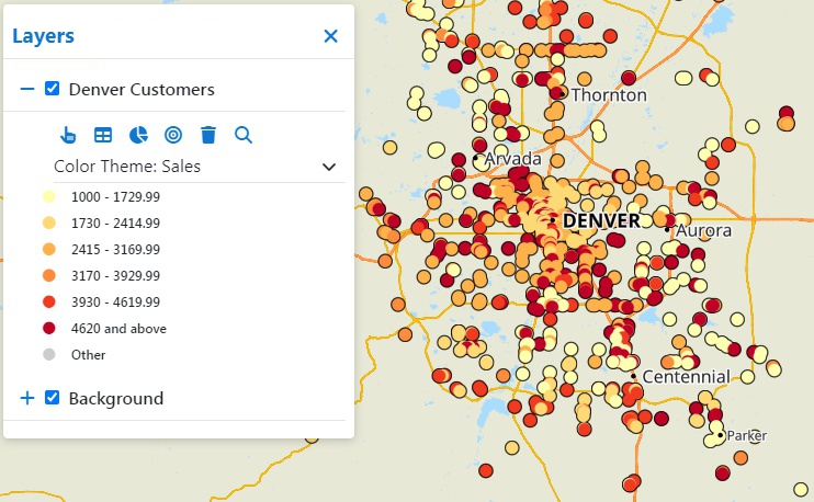
This color theme shows customers with a lighter color if they have lower sales and a darker color if they have higher sales
In the theme drop-down you can click ![]() next to a color theme to modify it:
next to a color theme to modify it:
Options include:
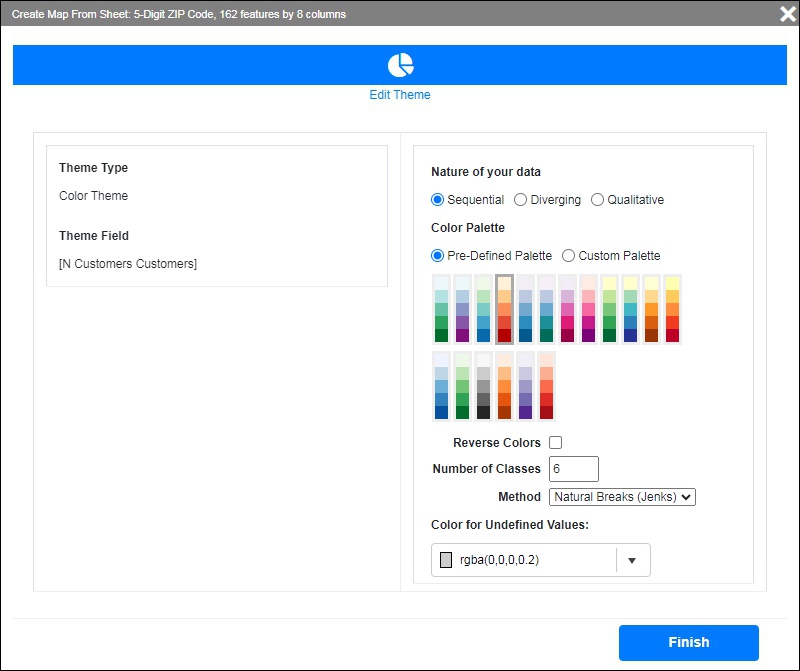
- Nature of your data:
Choose Sequential if you want to make high values stand out more than lower ones, Diverging if you want high and low outliers to stand out more than other values, or Qualitative to have separate values for each class. The Qualitative option is best if there are only a few values. - Color Palette:
Choose a Pre-Defined Palette to use for the theme (you can check Reverse Colors to reverse the order of the palette), or choose Custom Palette and set the colors for the low and high values. - Number of Classes:
Choose the number of classes to divide the data into. The colors will be assigned to each class and the range of each class will be determined by the Method. - Method:
Choose the method for dividing the data into separate classes. The options are:- Equal Size Intervals: Divides the data into equal intervals from the lowest to the highest value in the chosen data field
- Natural Breaks (Jenks): Each class is a cluster of values that minimizes within-group variance using the Fisher-Jenks Algorithm
- Quantiles: Divides the data into classes such that each interval has the same number of features
- Standard Deviation: Features are split into classes for a specified number of standard deviations above and below the average value
- Color for Undefined Values:
Choose the color to use for features that have no data.
Size Themes
Size themes use symbols of different sizes to show the value of a data field. Smaller features indicate lower values of the chosen field and larger features indicate higher values of the chosen field. This type of theme is useful for showing numeric (e.g., sales, population) data.
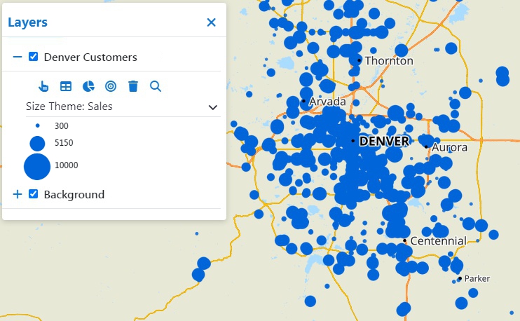
This size theme shows smaller symbols for customers that have lower sales and larger symbols for ones with higher sales
In the theme drop-down you can click ![]() next to a size theme to modify it:
next to a size theme to modify it:
Options include:
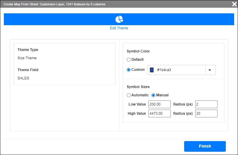
- Symbol Color:
Choose to use the default color or specify a custom color. - Symbol Sizes:
- Choose Automatic to have Maptitude Online determine the low and high values and the size of the corresponding symbols
- Choose Manual to choose the low and high values for the symbol theme and enter the maximum and minimum size for the symbols
Symbol Themes
Symbol themes group the features in a map layer into classes, based on the value of a data field and display each class with a unique symbol. Each class contains all of the features with similar values for the chosen field. This type of theme is useful for showing non-numeric (e.g., territory, political party) data.
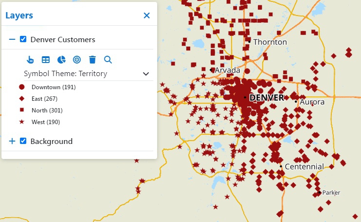
This symbol theme shows customers where different symbols correspond to the territory to which they belong
In the theme drop-down you can click ![]() next to a color theme to modify it:
next to a color theme to modify it:
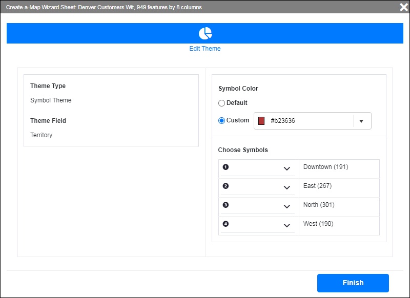
Options include:
- Symbol Color:
Choose to use the default color or specify a custom color. - Choose Symbols:
For each class choose a symbol from the drop-down list
Chart Themes and Cluster Chart Themes
Chart themes place pie or vertical bar charts on map features to illustrate data that go with the respective features. This type of theme is useful for showing numeric data in more than one field (e.g., income classes, sales by quarter, mode of commute).
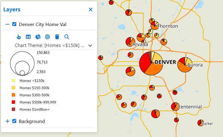
This pie chart theme shows the number of homes in various cities and the values of those homes. The overall size indicates how many homes are in a city and the individual slices indicate the proportion of home values within that city.
In the theme drop-down you can click ![]() next to a color theme to modify it:
next to a color theme to modify it:
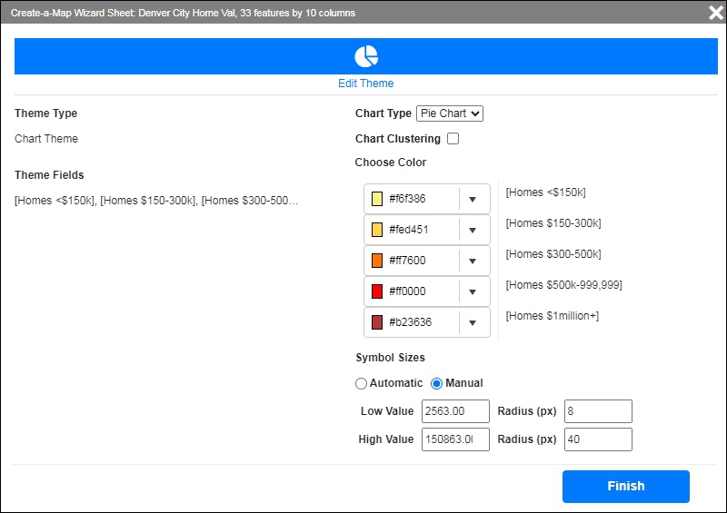
Options include:
- Chart Type:
Choose whether to use a pie chart or a bar chart. - Chart Clustering:
For pie charts, you can choose to group densely located features into pie chart clusters and label the cluster with the number of features within each cluster - Choose Color:
For each pie wedge or bar, choose a color by clicking the drop-down list. - Symbol Sizes:
- Choose Automatic to have Maptitude Online determine the low and high values and the size of the corresponding charts
- Choose Manual to choose the low and high values for the chart theme and enter the maximum and minimum radius/height for the charts
Cluster Themes
Cluster themes group densely located point features into clusters and label the cluster with the number of features in that cluster. This type of theme is useful for visualizing the density of features in different locations. When you click on a cluster, Maptitude Online zooms in on the cluster.
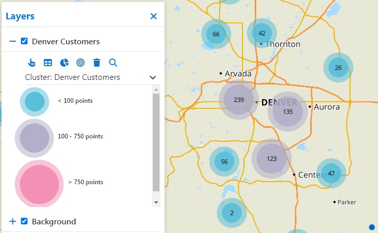
This cluster theme shows clusters of customer locations.
Cluster themes have no user-defined options.
Density/Heat Themes
Density themes use different colors that correspond to the density of point features on a regular grid, optionally weighting each point using a weighting value. This type of theme is useful for visualizing the density of features in different locations and is useful for showing:
- The distribution of customers or clients, optionally weighted by their sales volume
- The distribution of real estate sales, optionally weighted by the sale price
- Hot spots of crime locations
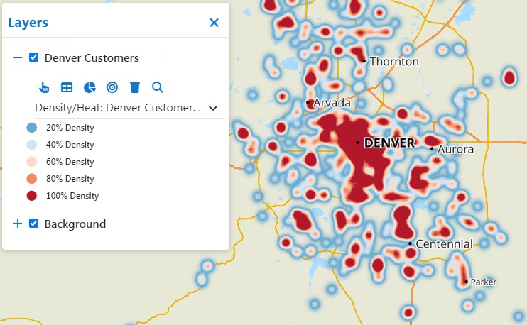
This heat theme shows where customers are more densely located.
Density/heat themes have no user-defined options.
©Copyright Caliper Corporation www.caliper.com