Maptitude Help / Working with Tables, Databases, & Charts / Creating Scatter Plots
Creating Scatter Plots
A scatter plot can be used to examine the relationship between two attributes. You can compare the variables for all records or a selection set using the scatter plot tool. The tool compares data for each record where both data are available.
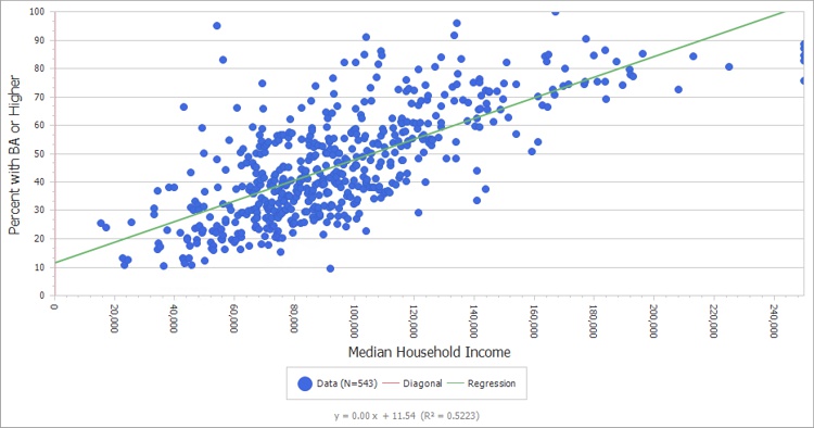
The tool allows customization of the chart and axis titles as well as the option to show the equation of the trendline. The equation may be shown with or without the use of a regression constant.
 To Create a Scatter Plot
- Open the table containing the data to be plotted. If these data are in multiple tables, join them using appropriate ID fields.
- Make the view the active window.
- Choose Dataview>Statistics>Scatter Plots to display the Multiple Scatter Plot dialog box.
- Choose the dataview from the drop-down list and choose whether to plot all records or a selection set from the Selection drop-down list.
- Click
 to open the Choose X-Fields dialog box. Choose the desired fields from the Available X-Fields list and click Add>> to add them to the Selected X-Fields list. The values in these fields will be plotted along the horizontal axis.
 - Click OK to return to the Multiple Scatter Plot dialog box.
- Click
 to open the Choose Y-Fields dialog box. Choose the desired fields from the Available Y-Fields list and click Add>> to add them to the Selected Y-Fields list. The order of Y fields should match the order of X fields you chose in step 5. The values in these fields will be plotted along the vertical axis.
 - Click OK to return to the Multiple Scatter Plot dialog box.
- Enter a title for each chart in the Chart Title column. If you leave them empty, default titles will be used.
- Enter text for the X-axis and Y-axis titles in the respective text boxes. If you leave them empty, the field names will be used as titles.
- Choose any additional options as follows:
| Check this box... | To do this... |
|---|---|
| Show Regression | Shows the regression equation and line |
| Omit Constant | If you chose to show the regression information, it runs the regression without the constant |
| Calculate Relative RMSE | Includes the percent error on each chart |
| Single Chart | Plots the data from multiple fields on the same chart |
| Chart Max | Sets the maximum value to be shown on either axis to the value entered in the adjacent edit box |
| Save to File | Saves each chart to disk as image files of the dimensions entered in the Width and Height text boxes |
- Click OK. If you chose to save images to a file, Maptitude displays the Output File Settings dialog box. Choose a folder to store the files, enter names for the image files in the Short File Name cell of the grid, and click OK.
Maptitude displays the scatter plots in separate windows, including the diagonal (perfect fit) line and the number of data points.
©2026 Caliper Corporation