Maptitude Help / Working with Tables, Databases, & Charts / Creating and Working with Box Plots
Creating and Working with Box Plots
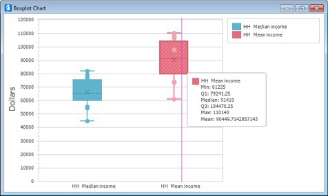
When working with maps or dataviews, you can create a box plot chart by choosing Dataview>Statistics>Box Plot and then specifying the records to use, the series fields, and other settings.
 To Create a Box Plot
- Choose Dataview>Statistics>Box Plot to display the Create Box Plot dialog box.
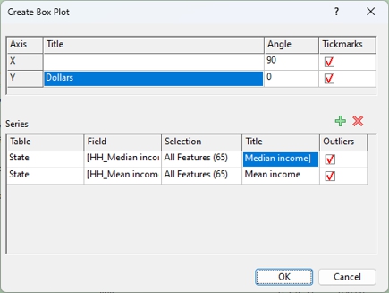
- Optionally, enter a title to display for each axis, the angle of the axis labels, and choose whether or not to display tickmarks.
- Click
 to add a new series/box plot.
 - For each series that you add, do the following:
• In the Table column, choose a table to use from the drop-down list
• In the Field column, choose the field to use for the values
• In the Selection column, choose whether to use All Features or a selection set
• In the Title column, enter a name for the series to display in the legend
• In the Outliers column, check the box if you want to display values for the outliers in the box plot
- Click OK. Maptitude creates a box plot and displays it in a new window.
- Hover the cursor over a box plot to see statistical values for the series.
To Customize a Box Plot
- Right-click on a box plot and choose Edit to display the Chart Designer.
- Click on a chart component in the tree view on the left or in the center chart diagram.
- Use the Options and Properties tabs on the right to modify the component (e.g., change the size, color, font, number format, axis labels, axis ticks, etc.).
- Click OK when you are done.
Try It Yourself: Creating Box Plots
1. Choose File>Open Workspace or click  on the Standard toolbar, then open the RhodeIsland workspace in the Tutorial folder.
2. Choose Dataview>Statistics>Box Plot to display the Create Box Plot dialog box.
3. Click to add a series.
4. Verify that County is chosen in the Table column.
5. Click the cell in the Field column and choose Population from the drop-down list.
6. Change the title to Population.
7. Click OK. Maptitude displays a box plot chart showing the county population distribution.
6. Close the box plot window and click Delete Chart when asked if you want to save the changes.
11. Choose File>Close Workspace and click Don't Save to close the workspace without saving any changes.
Saving and Opening Box Plots
Any box plots that you have open in your workspace are saved as part of the workspace. When you close and reopen the workspace, your box plots will be restored.
You can use the File>Export>Image command or right-click on a box plot and choose Export to save a box plot as a graphic file (e.g., BMP, JPEG, PNG) that can, for example, be added to a document or a web page. For more information, see Saving Maptitude Windows as Graphic Files.
Printing Box Plots
Maptitude prints box plots to any installed printer.
To Print a Chart
- Choose File>Print, click
 on the Standard toolbar, or right-click on the chart window and choose Print Preview. Maptitude displays the Print Preview window.
 - Use the buttons in the Print Preview as follows:
| To do this... | Do this... |
|---|---|
| Print the box plot to the Windows default printer | Click  |
| Print to another printer | Click  , choose the printer settings and click Print , choose the printer settings and click Print |
| Change the page settings | Click  , specify the paper size, page orientation, and page margin, and click OK , specify the paper size, page orientation, and page margin, and click OK |
| Adjust the chart size on the page | Click  , choose a scaling method and size, and click OK , choose a scaling method and size, and click OK |
©2026 Caliper Corporation