Maptitude Help / Working with Tables, Databases, & Charts / Creating and Working with Charts
Creating and Working with Charts
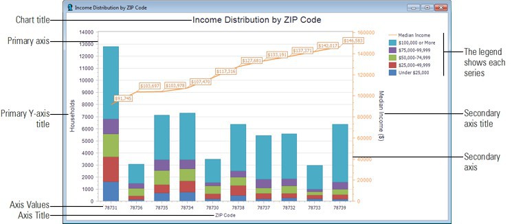
When working with dataviews, you can create a chart by clicking  on the Standard toolbar and then specifying the records to use, the series fields, the type of chart, and other settings. If you are charting more than one series, you can choose to have separate data ranges for the left and right Y-axis by designating a secondary Y-axis. For example, the chart below shows a stacked bar chart showing the household income distribution for several ZIP Codes on the primary axis and a line chart showing the median income in those same ZIP Codes on the secondary axis.
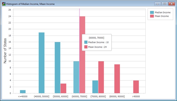
You can also create histograms using the Dataview>Statistics>Histogram Plot command. Histograms can group continuous data into ranges or can group data categorically. For example, the histogram below shows the number of states with median and mean incomes in $10,000 ranges from $40,000 to 90,000. All values outside of those ranges have been grouped together in the <=40000 and >90000 bins.
In addition, you can create logarithmic bar, area, or spline histograms. Log histograms can be created only on a single field in a dataview and will display with a logarithmic x-axis scale. This is especially useful for skewed data with wide value ranges (e.g., population, income, vehicle flow).
- Create a selection set of the records you want to chart or highlight the cells in the dataview of the records and fields you want to chart.
- Click on the Standard toolbar to display the Create Chart dialog box.
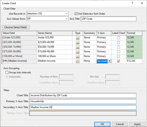
- If you highlighted cells in a dataview, the chart will automatically use the chosen records, otherwise choose to use a selection set or All Features from the Use Records In drop-down list.
- To use the dataview sorting order on the chart data, check the Use Dataview Sort Order box.
- Choose a field to use for the X-axis values from the Axis Values From drop-down list and type a title for the X-axis in the Axis Title edit box.
- If you highlighted cells in a dataview, the highlighted fields will already be chosen in the grid view, otherwise click Choose Series Fields. In the Choose Series Fields dialog box, highlight the fields you want to chart in the Available fields list, click Add>> to select them, and click OK.
- For each series do the following:
• In the Series Name column, enter a name for the series to display in the chart legend
• In the Type column, choose the type of chart to use
• If there are multiple records in your data for the Axis Values field, choose whether to chart the Count, Sum, Maximum, Minimum, or Average value to be displayed in the chart
• In the Label Chart column, check the box if you want to display values for the series in the chart
• In the Y-Axis column, choose whether to use the primary axis, secondary axis, or tertiary axis for the series
- If the X-axis field is a numeric field, you can group the x-axis values into bins by checking the Group into intervals box and making choices as follows:
| To do this... | Do this... |
|---|---|
| Have Maptitude create bins automatically | Choose Automatic from the Axis Grouping radio list |
| Choose a set number of bins | Choose Number of Bins from the Axis Grouping radio list and enter the number of bins |
| Choose the size of the bins | Choose Bin Size from the Axis Grouping radio list and enter a value |
| Group values below a minimum threshold into a bin | Enter the desired minimum value in the Underflow Value box |
| Group values above a maximum threshold into a bin | Enter the desired maximum value in the Overflow Value box |
- Optionally enter a chart title and/or axis titles in the respective boxes in the Titles frame.
- Click Apply to preview the changes or click OK.
Maptitude creates a chart and displays it in a new window.
- Choose Dataview>Statistics>Histogram Plot to display the Create a Histogram dialog box.
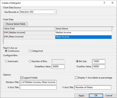
- Choose whether to base the histogram on All Features or a selection set from the Use Records in the Use Records In drop-down list.
- Click Choose Series Fields. In the Choose Series Fields dialog box, highlight the fields you want to chart in the Available fields list, click Add>> to select them, and click OK. The chosen fields are displayed in the grid. The Series Name column shows the names as they will appear in the legend. You can edit those names if you want to change the legend text.
- Use the radio list to choose whether to treat the X-axis values as continuous values or categorical values. If you choose to use continuous values the histogram will group the data into logical ranges or bins. Make bin choices as follows:
| To do this... | Do this... |
|---|---|
| Have Maptitude create bins automatically | Choose Automatic from the Configure Bins radio list |
| Choose a set number of bins | Choose Number of Bins from the Configure Bins radio list and enter the number of bins |
| Choose the size of the bins | Choose Bin Size from the Configure Bins radio list and enter a value |
| Group values below a minimum threshold into a bin | Enter the desired minimum value in the Underflow Value box |
| Group values above a maximum threshold into a bin | Enter the desired maximum value in the Overflow Value box |
- Make additional choices as follows:
| To do this... | Do this... |
|---|---|
| Display or hide the legend | Check or uncheck the Legend Visible box |
| Display the Y-axis as percentages | Check the Display Y-Axis Labels as Percentage box |
| Change the window title, X-axis label, or Y-axis label | Enter the desired text in the respective boxes |
- Click Apply to preview the changes or click OK.
Maptitude creates a histogram and displays it in a new window.
 To Create a Logarithmic Histogram
- Right-click on a single column heading, choose Log Histogram Chart, and choose whether to create a bar, area, or spline histogram chart.
Maptitude creates a histogram that visualizes the data in the chosen field on a logarithmic scale and displays it in a new window.
To Customize a Chart or Histogram
- Right-click on a chart and choose Edit to display the Chart Designer.
- Click on a chart component in the tree view on the left or in the center chart diagram.
- Use the tabs on the right to modify the component (e.g.,change the size, color, font, number format, axis labels, axis ticks, etc.).
- Click OK when you are done.
Try It Yourself: Creating and Customizing Charts
1. Choose File>Open Workspace or click  on the Standard toolbar, then open the RhodeIsland workspace in the Tutorial folder.
2. Right-click on County in the Display Manager and choose New Dataview.
3. Click on the column heading Population to highlight the entire column.
4. Click on the Standard toolbar to display the Chart Data dialog box.
5. Verify that [County Name] is chosen in the Axis Values From drop-down list.
6. Click the cell in the Type column to display the Chart dialog box, choose a Pie chart, and click OK.
7. Check the box in the Label Chart column.
8. Click OK. Maptitude displays a pie chart showing the population distribution.
9. Close the chart window and click Delete Chart when asked if you want to save the changes.
10. Ctrl-click on the Mode: Drove Alone, Mode: Carpool, and Mode: Bus column headings to highlight the three fields. You may need to scroll to the right to see these fields.
11. Click on the Standard toolbar to display the Chart Data dialog box and click OK. Maptitude displays a bar chart with the mode share by county.
12. Choose File>Close Workspace and click Don't Save to close the workspace without saving any changes.
Saving and Opening Charts and Histograms
Any charts that you have open in your workspace are saved as part of the workspace. When you close and reopen the workspace, your charts will be restored.
You can use the File>Export>Image command or right-click on a chart and choose Export to save a chart as a graphic file (e.g., BMP, JPEG, PNG) that can, for example, be added to a document or a web page. For more information, see Saving Maptitude Windows as Graphic Files.
Printing a Chart or Histogram
Maptitude prints charts to any installed printer.
To Print a Chart
- Choose File>Print, click
 on the Standard toolbar, or right-click on the chart window and choose Print Preview. Maptitude displays the Print Preview window.
 - Use the buttons in the Print Preview as follows:
| To do this... | Do this... |
|---|---|
| Print the chart to the Windows default printer | Click  |
| Print to another printer | Click  , choose the printer settings and click Print , choose the printer settings and click Print |
| Change the page settings | Click  , specify the paper size, page orientation, and page margin, and click OK , specify the paper size, page orientation, and page margin, and click OK |
| Adjust the chart size on the page | Click  , choose a scaling method and size, and click OK , choose a scaling method and size, and click OK |
©2026 Caliper Corporation