Maptitude Help / Using Themes to Present Information / Dot-Density Themes
Dot-Density Themes
A dot-density theme uses dots or other symbols on the map to show the values of one or more numeric data fields for an area layer. Each dot on a dot-density map represents some amount of data. For example, in the following map, each dot represents 20,000 people. Densely populated urban areas have many dots and sparsely populated areas have few dots.
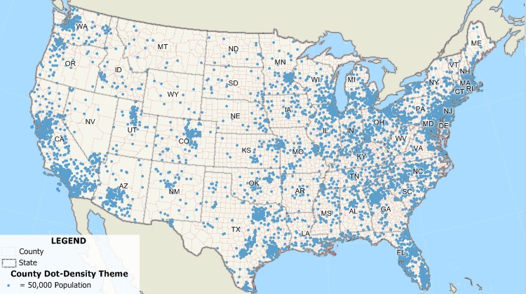
You create a dot-density theme by choosing the area layer you want to map and one or more data fields that you want to see. MapWizard takes care of the rest by picking a dot value that will provide not too many and not too few dots in each area. If you prefer, you can choose the dot value yourself by typing it into the dialog box. You can also choose the symbol you want and customize the text that appears in the map legend.
 |
For a video tutorial see: (Internet connection required) |
 To Add a Dot-Density Theme to a Map
- Choose the area layer you want from the layer list on the Standard toolbar.
- Choose Map>Thematic Mapping>Dot Density or click
 Dot-Density Theme in the thematic mapping drop-down on the Standard toolbar to display the Dot-Density Theme dialog box.
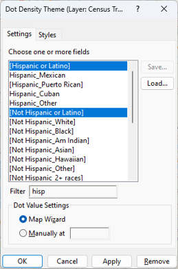
 - Make choices as follows:
| To do this... | Do this... |
|---|---|
| Choose the fields to use | Highlight one or more fields in the scroll list. Optionally, enter text in the Filter box to filter the list of fields. |
| Let Maptitude determine the dot values | Choose MapWizard from the radio list. |
| Set the dot value to a specific value | Choose Manually at from the radio list and enter a value in the text box. |
 |
NOTE: To learn about using the Save and Load buttons, see Saving Theme Settings. |
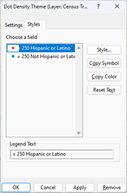
- Click the Styles tab and make choices as follows:
| To do this... | Do this... |
|---|---|
| Change the style of the dots | Highlight a class in the scroll list, click Style, make changes in the Style dialog box, and click OK. For more information on styles, see Using Styles. |
| Copy a symbol to other fields | Highlight a class in the scroll list and click Copy Symbol. |
| Copy a color to other fields | Highlight a class in the scroll list and click Copy Color. |
| Change the text for a class | Highlight a class in the scroll list and edit the text in the Legend Text box. |
| Revert the legend to default legend text | Click Reset Text. |
- Click OK.
Maptitude draws the map with the dot-density theme and displays a legend.
To Create a Dot-Density Theme from a Dataview
- Select the data field you want to map by clicking on the column heading. To use more than one field, shift-click on additional column headings to highlight them.
- Choose Map>Thematic Mapping>Dot Density.
Maptitude creates a new map using a dot-density theme to illustrate the values of the chosen field(s).
 |
To create a theme from a dataview, the data must be connected to a map, otherwise the thematic mapping commands are disabled. To join data to a map use Create-a-Map Wizard or see Joining Your Data to a Map. |
To Temporarily Hide a Dot-Density Theme
- In the Display Manager, click
 next to the theme.
Maptitude hides the theme on the map and displays a  symbol next to the theme in the Display Manager. Click to turn the theme back on.
To Turn Off a Dot-Density Theme
- Choose Map>Thematic Mapping>Dot Density or click Dot-Density Theme in the thematic mapping drop-down on the Standard toolbar to display the Dot-Density Theme dialog box.
- Click Remove.
Maptitude draws the map without the dot-density theme.
Try It Yourself: Creating Dot-Density Themes
1. Choose File>Open Workspace or click  on the Standard toolbar, then open the States workspace in the Tutorial folder.
2. Click Dot-Density Theme in the thematic mapping drop-down on the Standard toolbar to display the Dot Density theme dialog box.
3. Choose [Hispanic Origin] and [Not Hisp.] in the Choose One or More Fields list scroll list and click OK. Maptitude displays a dot-density map showing the distribution of the Hispanic and Non-Hispanic population, with a dot for every 200,000 people.
4. Click again and type 50,000 in the Manually At text box.
5. Click the Styles tab to display the Styles page.
6. Click Style to display the Style dialog box, type 4 in the Size box, choose a darker blue from the Color drop-down list, and click OK to return to the Dot Density Theme dialog box.
7. Click Copy Symbol to copy the smaller symbol to both fields.
8. Click OK to see the theme with the new style of dots for every 50,000 people.
9. Choose File>Close Workspace and click Don't Save to close the workspace without saving any changes.
©2026 Caliper Corporation