Maptitude Help / Using Themes to Present Information / Pie and Bar Chart Themes
Pie and Bar Chart Themes
Pie and bar chart themes place pie or bar charts on map features to illustrate the data that go with each feature.
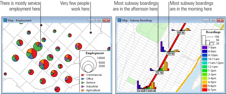
Maptitude has 5 chart styles from which you can choose:
- Pie chart
- Vertical bar chart
- Stacked vertical bar chart
- Horizontal bar chart
- Stacked horizontal bar chart
All but pie charts have a 3D option. Stacked bar charts can only be used if you choose more than one data field.
Chart themes can be created on point, line, and area layers. When you display charts on a line layer, the chart is centered at the midpoint of the line. For point layers, the chart is centered at the location of the point. For area layers, the chart is displayed at the center of the area.
You create a chart theme by choosing the layer you want to map, one or more numeric data fields that you want to see, and the type of chart you want. MapWizard will take care of the rest. If you want, you can control the minimum and maximum size of the charts, and indicate the values to which these sizes should correspond. The size of a pie chart is its diameter, the size of a vertical bar chart is its height, and the size of a horizontal bar chart is its width. Chart sizes are set in points.
 |
For a video tutorial see: (Internet connection required) |
- Choose the layer you want from the layer list on the Standard toolbar.
- Choose Map>Thematic Mapping>Chart or click
 Chart Theme in the thematic mapping drop-down on the Standard toolbar to display the Chart Theme dialog box.
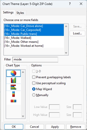
 - Make choices as follows:
| To do this... | Do this... |
|---|---|
| Choose the fields to use | Highlight one or more fields in the scroll list. Optionally, enter text in the Filter box to filter the list of fields. |
| Choose a chart type | Choose one of the applicable charts from the Chart Type scroll list. If you choose a pie chart, you can choose to apply Flannery perceptual scaling by checking the Use perceptual scaling box. If you choose one of the bar chart options, you can check the 3-D box to display them with a 3-D effect. |
| Let Maptitude determine the chart sizes | Choose MapWizard from the radio list. |
| Specify the size of the charts | Choose Manually from the radio list and enter values for the low value and size (in pixels) and high value and size (in pixels). Features with values below the low value will not have a chart drawn. Features with values at or above the high value will have a chart of the maximum size that you set. For bar charts you can also set the width of the bars. |
| Prevent map labels from displaying over charts | Check the Prevent overlapping labels box. Note, areas that are dense with charts will have few, if any, labels on the map. |
 |
NOTE: To learn about using the Save and Load buttons, see Saving Theme Settings. |
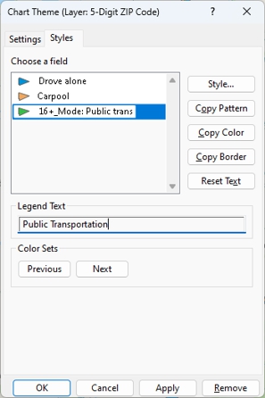
- Click the Styles tab and make choices as follows:
| To do this... | Do this... |
|---|---|
| To browse through the included color sets | Click <<Previous or Next>>. |
| To change the style of a class | Highlight a class in the scroll list, click Style, make changes in the Style dialog box, and click OK. For more information on styles, see Using Styles. |
| Change the text for a class | Highlight a class in the scroll list and edit the text in the Legend Text box. |
| Revert the legend to default legend text | Click Reset Text. |
| Copy a fill pattern to every class | Highlight a class in the scroll list and click Copy Pattern. |
| Copy a fill color to every class | Highlight a class in the scroll list and click Copy Color. |
| Copy a border to every class | Highlight a class in the scroll list and click Copy Border. |
- Click OK.
 To Create a Chart Theme from a Dataview
- Select the data field you want to map by clicking on the column heading. To use more than one field, shift-click on additional column headings. Maptitude highlights the selected columns.
- Choose Map>Thematic Mapping>Chart.
Maptitude creates a new map that uses a chart theme to illustrate the values of the chosen field. If you chose a single field, Maptitude creates a 3D vertical bar chart. If you chose more than one field, Maptitude creates a pie chart.
 |
To create a theme from a dataview, the data must be connected to a map, otherwise the thematic mapping commands are disabled. To join data to a map use Create-a-Map Wizard or see Joining Your Data to a Map. |
To Temporarily Hide a Chart Theme
- In the Display Manager, click
 next to the theme.
Maptitude hides the theme on the map and displays a  symbol next to the theme in the Display Manager. Click to turn the theme back on.
- Choose Map>Thematic Mapping>Chart or click Chart Theme in the thematic mapping drop-down on the Standard toolbar to display the Chart Theme dialog box.
- Click Remove.
Maptitude draws the map without the chart theme.
Try It Yourself: Creating Chart Themes
1. Choose File>Open Workspace or click  on the Standard toolbar, then open the States workspace in the Tutorial folder.
2. Click Chart Theme in the thematic mapping drop-down on the Standard toolbar.
3. Choose [HU Owner Occupied] and [HU Renter Occupied] by clicking and dragging on the Choose One or More Fields list, and click OK. Maptitude displays a pie chart theme showing the ratio of owners to renters in each state.
4. Click again, choose the stacked vertical bar from the Chart Type drop-down list, and click OK to see the same data shown with a bar chart.
5. Choose File>Close Workspace and click Don't Save to close the workspace without saving any changes.
©2026 Caliper Corporation