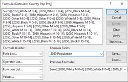
The new U.S. county level projection data contains numerous fields of population data by year, age, gender, and race. You can combine multiple fields (such as all the fields containing "2050" in their name) to create a total field (e.g., total 2050 population).
The following steps outline how to create a formula field that summarizes many fields:
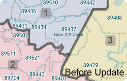
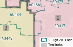
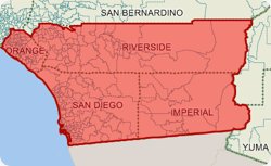
If you have created a territory layer using the Territory Manager and a previous vintage of the ZIP Code layer you may want to update your territories using the new postal geography. Maptitude makes it easy to move your territory layer over to the new and updated ZIP Code boundary layer.
This Tech Tip shows how to work with the Territory Manager in Maptitude to either change your territory boundaries to match the new ZIP Codes or to keep your territory boundaries as they are and assign the ZIP Codes to the territories they are in.
The following steps outline how to update a territory to new ZIP Code geography:
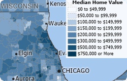
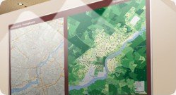
Maptitude 2020 contains new and updated demographic maps accessible from the Demographic Map Librarian.
The following steps outline how to access demographic maps:
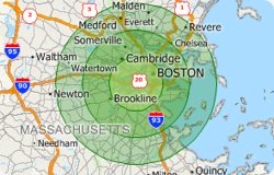
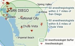
A common use for the Consumer Expenditure Data involves finding the amount spent on a product for a given area. This tech tip explains how to create a temporary radius buffer and get household expenditure data for the encircled area.
The following steps outline how to get household expenditure data in a radius:
 , then click on the map at the center of the location that you want to study.
 , then click No when prompted to save the point to a layer.
 .
.  .
.
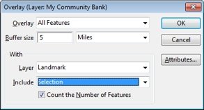
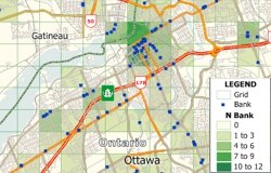
Using a combination of the Banking and Geodemographic Segmentation layers, you can easily examine the demographics that surround one or more banks. (You could substitute any point layer for the bank layer in this tip if you want to find the demographic composition around a store, hospital, waste site, or any other feature.)
The following steps outline how to find the demographic composition around a bank:
 tool from the Selection toolbar and click on the bank to select it. to display the Demographic Settings dialog box and choose Segmentation from the With Layer drop-down list. If you also want to count the number of banks within the buffer, choose US Bank from the Layer drop-down list and None from the Subtotal By drop-down list.
 The resulting report shows a breakdown of the communities surrounding your selected bank. You can use the Demographic Handbook included with the Geodemographic Segmentation data package for an in-depth description of each segment and subsegment. If you chose to count the number of banks within the buffer, it will also include that total.
You can create a glow map using any point layer. You can also create a point layer from any area layer that can subsequently be used in a glow map.
Maptitude 2019 allows you to choose the demographics shown in your reports. You can specify any of the hundreds of included variables that range from race by income to employment and housing characteristics.
The following steps outline how to customize the demographics in your reports:
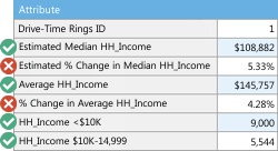
Any reports that you create (e.g., by right-clicking on a shape and choosing Export to Excel, by checking the Create Report box in the Buffers or Overlays dialog box, or by clicking ![]() in the Drive-Time Rings toolbox) will now include the fields that you chose.
in the Drive-Time Rings toolbox) will now include the fields that you chose.

While we continue to make Maptitude the easiest and most capable business mapping application, we also provide custom consulting, training, and data production services. Let us know your requirements and we'll evaluate your project and provide competitive pricing.
Alternatively, you can purchase consulting services or training at fixed hourly rates.
The ZIP Code business count data for Maptitude 2018 are accessible as a free download. In this tech tip we describe how to install the layer and add it to a map.
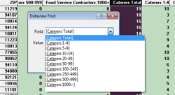
Within a dataview, you can use the Find button to search for a specific field. This is particularly useful for the ZIP Code Business Count layer because it contains far more fields than most layers. (NOTE: Step 3 of this tip explains how to find a particular field in a long drop-down list.)
The following steps outline how to find a field in a dataview:
The Business Count Data can be summed to other layers so that you can create thematic maps at the county or state level.
The following steps outline how aggregate the free ZIP Code business count data to the state layer:
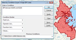
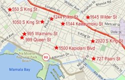
In addition to creating territories by manually selecting the areas to add in the map, you can use the Select by Condition tool in the Territory Manager to add areas that satisfy a certain condition. This can be very useful when selecting areas that are grouped together in ranges. In this tech tip we describe how to create a territory from a range of ZIP Codes.
The following steps outline how to create territories with the Select by Condition tool:
If you already have a territory map that you wish to add to, skip to Step 5.
 .
. to add them to a territory. If you would like to try a different range, click
  and repeat steps 5-6 with a different range.
The AADT traffic volume layer for Maptitude 2018 is accessible as a free download. In this tech tip we describe how to install the layer and add it to a map.
Please note: The AADT data is for the visualization of traffic counts, and is not used with the routing tools. The routing tools in Maptitude 2018 already use historical traffic conditions (calculated using billions of anonymous measurements from cell phones and vehicle sensors) to determine the speeds used when creating directions, travel times, and travel distances.
The following steps outline how to download and install the free AADT layer for Maptitude:
The AADT layer comes with a default size theme suitable for nationwide mapping. However, you can create a new size theme that better displays traffic counts for a zoomed in area.
The Highway Exit and Interchange Locations layer for Maptitude 2018 is accessible as a free download. In this tech tip we describe how to install the layer and add it to a map.
The healthcare map layers for Maptitude 2018 are accessible as a free download. There are four layers as part of this download: Healthcare Organizations, Healthcare Providers, Hospitals, and Primary Care Service Areas. In this tech tip we describe how to install the layers and add them to a map.
The following steps outline how to download and install the free health data layers for Maptitude:
Australia, Canada, United States, and United Kingdom point of interest map layers for Maptitude 2018 are accessible as a free download. In this tech tip we describe how to install the layers and add them to a map.
The following steps outline how to download and use the free point of interest layers:
The business map layers for Maptitude 2018 are accessible as a free download. In this tech tip we describe how to install the layers and add them to a map.
The following steps outline how to download and use the free business layers:
For additional help with the Business Layers please see: https://www.caliper.com/pdfs/caliper-business-data-2018.pdf
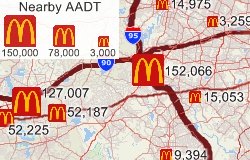
Users who want to know how traffic can impact their locations can use the tools in Maptitude for this type of analysis. One tool that works well for this is the "tagging" tool. With the tagging functionality, a user can get the value of the nearest traffic count, the highest traffic count within a defined radius, a total traffic count within a defined radius, and the distance to the nearest traffic count.
The following steps outline how to tag your locations with AADT data:
The first step to tagging is to create columns to populate. These can be added as blank columns in your spreadsheet before you import or added to the data in the map. Below are the steps to add the columns in Maptitude:
Tagging with the nearest traffic count:
Tagging with the highest traffic count within a radius:
Tagging with the Total AADT within a radius:
Tagging with the distance to the nearest traffic count:
If you have created a territory layer using the Territory Manager and a previous vintage of the ZIP Code layer you may want to update your territories using the new postal geography. Maptitude 2018 makes it easy to move your territory layer over to the new and updated ZIP Code boundary layer.
This Tech Tip shows how to work with the Territory Manager in Maptitude 2018 to either change your territory boundaries to match the new ZIP Codes or to keep your territory boundaries as they are and assign the ZIP Codes to the territories they are in.
The following steps outline how to update a territory to new ZIP Code geography:
Maptitude 2018 can import waypoints from MapPoint and Streets & Trips. A point layer is created that can be used with the Routing Manager to create directions.
Maptitude keeps all of the MapPoint stop attributes such as name, stop number/sequence, overnights, whether the stop is a start/intermediate/end type stop, stop times, whether a quickest or shortest route, and preferred arrival and departure times. The Maptitude Routing Manager can use all of these attributes to recreate your route.
The following steps outline how to import your MapPoint Waypoints and create a route with them:
Maptitude 2018 makes it easy to name and identify your drive-time rings, and to quickly export a demographic report for those rings.
The following steps describe how to to create named drive-time rings and export the result:
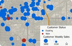
Maptitude can link your point layers with your data, and you can update your point layers with changes to your source data. You could choose this option if your data change frequently and you want a map that reflects the latest information. (e.g., You have an Excel file that contains addresses and weekly sales information on your stores. You may want to link the data if you open and close stores frequently or if you want to keep the map updated with the latest weekly sales information.) When you link your data, you MUST choose a column that contains unique IDs for each record in your database or spreadsheet.
The following steps describe how to to create and update a linked point file:
To quickly create a demographic map you can use the Demographic Map Librarian. Maptitude ships with a library of economic, social, housing, and demographic maps that you can choose from.
The following steps describe how to to open and synchronize two county demographic maps:
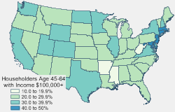
Maptitude 2017 includes 68 fields of data on age of householder by household income. The householder income data is accessible on most of the boundary layers included with Maptitude 2017.
The following steps describe how to create thematic maps using this data:
The PLSS and TXSS map layers for Maptitude 2017 are accessible as a free download. In this tech tip we describe how to install the layers and add them to a map.
The following steps outline how to download and install the free PLSS and TXSS layers for Maptitude:
The June release of Maptitude includes new and improved global geocoding tools. Please contact us if you require this functionality and are not seeing it in your version of Maptitude 2017.
To zoom the map to a country or city:
A density grid is a way to visualize and analyze point data by transforming the points into a regular grid. Each resulting grid cell is assigned a value that is determined by the density of nearby points, optionally weighting each point using a weighting value.
Density grids are useful for showing hot spots of crime, mapping the concentration of healthcare providers, and analyzing the pattern of clients around a store weighted by the cost of their purchases.
This Tech Tip shows how to work with the Density/Heat Layer tool in Maptitude 2017:
The steps below show how to create a density map of the concentration of physicians, but you can use any point layer (such as customers or crime locations) as the basis for your map in step 5.
Maptitude 2017 makes it easy to create Excel reports. You can create a radius and quickly see information on all the locations within the circle. This includes locations in all layers apart from those in restricted HERE layers.
Once you have downloaded the free health data here, you can analyze healthcare locations using the export to Excel tools.
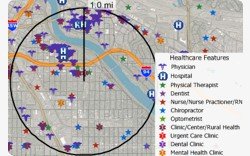
This Tech Tip shows how to work with the Radius and Export to Excel tools in Maptitude 2017 to find all of the healthcare providers, clinics, physicians, and/or hospitals within any radius of any location in the United States.
Maptitude 2017 makes it even easier to create territories from your MapPoint files.
Territory creation was one of the best features of Microsoft MapPoint and has been improved in Maptitude 2017! Not only can you import territories that have no data fields, but you can also create territories with State and County information in separate fields, which was the MapPoint default.
Once you have chosen to open a MapPoint PTM file, Maptitude automatically walks you through the simple steps to create your territories. A territory layer is created that can immediately be used to create Excel reports with a demographic breakdown sheet, plus sheets for any other data that you have mapped and that fall within your territories.
The following steps outline how to import a PTM territory layer:
Maptitude 2017 makes it easy to identify alternative service suppliers, backup field representatives, and the closest locations.
The new Distance and Travel Times Tables tool allows you to choose a layer of origins and destinations and calculates the distance or time taken to travel between them. For example, you could work with a point layer of stores and a separate point layer of customers and create a table of the drive times to the various stores for each customer. Alternatively, you can use selection sets of origins and destinations from a single point layer.
The results can be viewed in Excel or Maptitude, allowing you to easily sort to identify the closest locations.
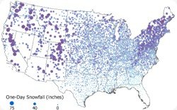
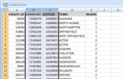
To create the December 2016 snow fall featured map, we accessed data from the National Centers for Environmental Information. The data included longitude and latitude fields and we used these columns to locate a point for every county. This Tech Tip shows how to map CSV coordinate data with Maptitude 2016.
With Maptitude you can create drive-time or straight-line catchment/market areas using Network Partitioning or Areas of Influence, respectively. This Tech Tip shows how to create drive-time based areas of influence with Maptitude 2016.
The following steps outline how create drive-time catchment areas:
With Maptitude you can create straight-line or drive-time catchment/market areas using Areas of Influence or Network Partitioning, respectively. This Tech Tip shows how to create straight-line based areas of influence with Maptitude 2016.
The following steps outline how create straight-line catchment areas:
Maptitude allows you to create drive-time rings/zones for intervals smaller than 5 minutes. This Tech Tip shows how you can do this with Maptitude 2016.
The following steps outline how to build drive-time rings of under five minutes:
If you would like to see the geographic area that services 80% of your target demographic then you can visualize this information in Maptitude. By building rings to your target value, you can see if your competitors serve the same population with a smaller geographic footprint, and you can explore those locations without coverage.
The following steps outline how to build nationwide buffers to a particular value:
Maptitude can work with data from a variety of other sources including the General Transit Feed Specification (GTFS). Using GTFS data, you can map public transportation/transit routes and locations from agencies all over the world.
The following steps outline how to create import GTFS data with Maptitude 2016:
Maptitude doesn't have a specific Import tool for GTFS data, but you can use a download of a GTFS archive to construct a map layer of the route.
1: Download the GTFS archive and extract its contents to any suitable folder.
2: Map all of the point locations in the file shapes.txt file you extracted:
3: Connect the points into their respective routes by doing the following:
4: Color-code the routes
If you have time series data you can visualize this information in Maptitude. By creating a thematic map for each field of data in your time series you can then add an image for each map to an animated GIF that you can share with others or embed on a website .
The following steps outline how to create an animated GIF with Maptitude 2016:
The best animated GIF will be comprised of maps that are all the same size, so when possible work from just one map to create your animated GIF file.
The new Routing Manager and Drive Time Rings Toolbox have maximum values for the number of stops/waypoints and for the maximum number of rings, travel time, and travel distance. However, if you have a PC with 64-bit Windows and over 8gb of RAM then you will likely be able to increase these limits.
The following steps outline how to change the routing and drive-time ring settings:
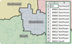
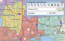
The new Territory Manager make it easy to add all the ZIP Codes in a State or County to the territory with which you are working. You can also remove all the ZIP Codes from a territory using one or more Counties or States. This functionality saves time, and allows you to easily manage territories, whether they encompass entire states or only a few ZIP Codes.
The following steps outline how to add a group of features to a territory:
 tool in the Territory Manager and click on a
county/state that you want to include in a
territory. Maptitude finds all of the ZIP
Codes in the feature you chose and highlights them.
tool in the Territory Manager and click on a
county/state that you want to include in a
territory. Maptitude finds all of the ZIP
Codes in the feature you chose and highlights them.
 to save the changes to the territory.
The new Routing Manager make it easy to create and manage your routes. Being able to control the characteristics of the route and each waypoint, such as itinerary and driving speeds, is a critical step in the planning of your routes. This was one of the best features of Microsoft MapPoint and is new in Maptitude 2016!
The following steps outline how to set schedule options when routing with Maptitude:
The new territory tools make it easy to create and manage your territories. Being able to access and share your territory definitions, such as postal/ZIP Codes by territory, is a critical step in the definition of your boundaries. This was one of the best features of Microsoft MapPoint and is new in Maptitude 2016!
The following steps outline how to export your territory definition list:
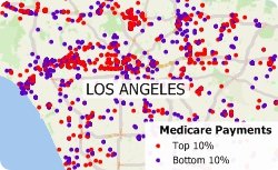
Maptitude allows you to filter data based on dollar amounts. Maptitude even has tools that automatically group your data into naturally occurring clusters that can then be filtered. We will show how to do this by filtering physicians by Medicare payments.
The following steps outline how to filter data by using a theme:
Maptitude allows you to see how big the area is that you will need to visit in relation to the number of healthcare providers that you want to target. Maptitude can create rings so that they contain a particular value such as number of doctor offices. For a video tutorial see: Creating Overlays and Buffers.
Each record in the healthcare layers has up to 15 taxonomy codes for services provided. Therefore, to filter the records, you will need to create a filter that checks each of the taxonomy fields for the value of interest to you.
Maptitude allows you to filter healthcare locations by taxonomy code. You will first need to download the five free healthcare layers here. These map layers include the taxonomy codes and descriptions for each location, e.g., Psychiatric Hospital (283Q00000X), Military Hospital (286500000X), General Acute Care Hospital Children (282NC2000X), Physical Therapy (261QP2000X). You can also filter using Medicare charges and payments.
The following steps outline how to filter the healthcare data:
Each record in the healthcare layers has up to 15 taxonomy codes for services provided. Therefore, to filter the records, you will need to create a filter that checks each of the taxonomy fields for the value of interest to you.
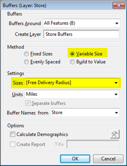
Maptitude allows you to create "variable size" rings/radii that are created automatically at a size specified for each location. For example, you can build buffers based on transmitter range for telecommunication towers, the free delivery areas for different restaurants, or the predefined service areas for a list of stores.
The following steps outline how to create variable rings using data stored in your spreadsheet:
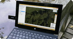
This Tech Tip was written using a Microsoft USB GPS device connected to a Microsoft Surface Tablet running Windows 8.1 Pro, using Maptitude 2015 64 BIT Version with the 2015 USA Country Package.
The following steps outline how to use a USB GPS device with Maptitude:
The GPS information can be shown directly on the screen for immediate reference or saved to a file for future use. It can also be used to collect positions for a geographic file.
Whether you need a wall-sized map, city-wide street level detail, or large area coverage, Maptitude has the tools to get the job done. In this tech tip we describe how to use Layouts to create the custom output you require
The following steps outline how to create large prints from a Maptitude layout:
| To do this... | Do this... | What will happen: |
| Place the map in WYSIWYG mode | Uncheck the Use actual point sizes and Print at fixed scale boxes | The printed map will be an exact match of the one in the original map window. The scale of the map will change and the size of labels, line widths, and point symbols change depending on whether the map is larger or smaller than the original map window. |
| Show the same geographic region in the printed map but preserve the size of labels, line widths, and point symbols | Check the Use actual point sizes box and uncheck the Print at Fixed Scale box. | The printed map will show the same region and the scale will be larger or smaller depending on whether the map is larger or smaller than the original map window. The point size of labels, line widths, and point features, however, will remain the point size specified in the map window regardless of the size on the page. More or fewer labels may be visible on the printed page than in your original map window depending on whether the map is placed larger or smaller. |
| Print the map at the same scale as the map window | Check the Print at fixed scale box | The map will be placed in the layout at the same scale specified in the map. If the printed map is smaller than the original map window, less area will be visible. If the map is larger, then more area will be visible. |
| Have the map fill the area you dragged on the layout | Uncheck the Keep map’s aspect ratio box. | The printed map will fill the rectangle you dragged and display more than the region shown in the original map window. |
| Keep the aspect ratio of the layout map the same as in the map window | Check the Keep map’s aspect ratio box. | The map will be displayed as large as it can to fit in the rectangle you dragged while showing just the geographic area visible in the original map window. |
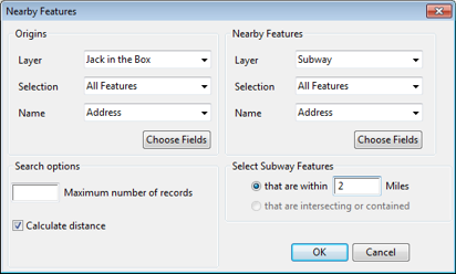
Identifying franchise locations is critical to understanding the competitive landscape. In this tech tip we describe how to find competitor locations that are within 2 miles of existing or proposed retail sites.
The following steps outline how to use the Nearby Features Tool add-in:
MapPoint users can migrate their data to Maptitude 2015 via a simple File-Open. The ability to easily access MapPoint pushpins and territories will be valuable to users that have invested in MapPoint, but who now need to move to Maptitude following the discontinuation of the Microsoft product. The steps below will show you how to open the popular POI MegaFile for Microsoft Streets and Trips (USA) and AutoRoute (Europe).
Note: Requires Maptitude 2015 and Microsoft MapPoint North America or MapPoint Europe, respectively.
The following steps outline how to download and open the MapPoint POI MegaFile:
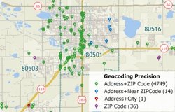
New in Maptitude 2015 is a Locate Wizard that will automatically map your locations and apply the next best level of accuracy for unfound locations. In previous versions of Maptitude, when you located records by address, you then had to run locate by address again to try nearby postal codes, then run locate by postal code and/or city with remaining unfound records. The Locate Wizard allows you to spend more time analyzing your data and less time figuring out how to get your information into a map. You can control exactly which locate methods you want to apply and once your records are located, Maptitude reports the method used to place each pushpin.
The following steps outline how to locate your records with the Locate Wizard:
| By Address and ZIP Code | Locates records where the number, street, and ZIP Code in your data exactly match those in the Maptitude street file |
| By Address and Nearby ZIP Code | Locates records looking for a number and street match in a nearby ZIP Code to the one specified in your data |
| By Address and City/State | Locates records looking for a number and street match anywhere in the city specified in your data |
| Scattered within the ZIP Code | Locates the records centered or scattered within the ZIP Code specified in your data |
| Scattered within the City | Locates the records centered or scattered near the city center specified in your data |
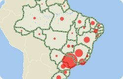
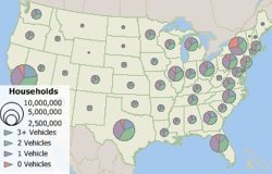
Proportional symbol maps scale the size of simple symbols (usually a circle or square) proportionally to the data value found at that location. They are a simple concept to grasp: the larger the symbol, the "more" of something exists at a location. The default setting in Maptitude is to scale the circles directly proportionate to the data.
The following steps outline how to make a bubble map using Maptitude:
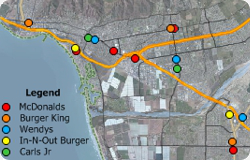
When conducting market research, competitor analysis, and territory/franchise alignments, it is critical to understand the geographic context of your service area. Maptitude makes it easy to evaluate any of the thousands of business locations provided with the software.
For example, you may want to visualize the locations of competitors near to your existing or proposed sites. You can do this by using the Selection tool and the store Name field included in the Landmark layer.
The following steps outline how to map businesses by name using the Maptitude Landmark layer:

When conducting an analysis such as energy market research or when siting new power plants or industrial facilities, it is critical to understand the geographic context of your assets. Maptitude makes it easy to geographically evaluate the risks and opportunities in today's energy markets. For example, you may want to explore wind potential when choosing sites for wind turbines.
There are many sources of data for energy markets including the U.S. Energy Information Administration (EIA). This exercise will walk you through downloading and mapping the National Renewable Energy Laboratory (NREL) map layer for onshore 50 meter tower wind potential.
The following steps outline how to add layers downloaded from other websites:
 .
.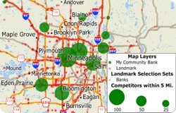
When conducting market research, competitor analysis, and territory/franchise alignments, it is critical to understand the geographic context of your service area. Maptitude makes it easy to evaluate any of the hundreds of business locations provided with the software.
For example, you may want to count the number of nearby competitors to your existing or proposed sites. You can do this by using the Overlay tool and the industry type field included in the Landmark layer. Once counted, you can visualize the results with a map that helps tell the story necessary to make your business case.
Masking is a technique that makes the area you want to highlight on your map stand out. This helps your map readers focus on the area that's important on the map. With masking, you can partially or completely hide the surrounding background.
While the Mask tool allows you to see one or more states, counties, ZIP Codes, or any other region, you may want to create a custom area of interest. By using the Click Buffer tool with the Mask tool you can create a map that shows only the information that is important to your message.
The following steps outline how to create a custom cropped map:
Maptitude includes a wealth of data that can be recombined to create new variables using the flexible formula building tools included with the software. For example, the Maptitude United States Country Package provides data on age, race, gender and ethnicity for 2010, 2012, 2015 and 2020. By exploring the differences in these values it is easy to visualize those areas that have grown or that are likely to grow.
Maptitude includes a wealth of data that can be recombined to create new variables using the flexible formula building tools included with the software. For example, the Maptitude United States Country Package provides data on age, race, gender and ethnicity for 2010, 2012, 2015 and 2020. By exploring the differences in these values it is easy to visualize those areas that have grown or that are likely to grow.
The following steps illustrate how to map business locations using corporate logos:
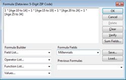
Maptitude provides many age-based demographics including total population, current and future age group numbers, and age brackets broken down by education, gender, birthrate, health insurance coverage, poverty status, and more. The age-based data provided with Maptitude are often segmented into ranges (e.g. under 18, or 35-39). Formula fields allow you to combine these populations into the target groups that you need to reach.
Caliper Corporation leads the industry in the processing and release of Census data. Since 1995 Maptitude mapping software has made it easy to access a wealth of Census data for entire countries. Unlike many other mapping and GIS software packages that require users to purchase data separately, Maptitude includes demographics so you can start mapping straight away. In addition to Census sources, Maptitude includes extensive non-Census information. These data, such as Caliper's proprietary purchasing power estimates, are among the most accurate available from any source and significantly more reliable than U.S. Census data. The included data alone are worth many multiples of the software's purchase price. Maptitude allows you to visualize and present this information in ways useful to your organization.
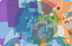
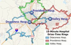
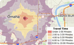
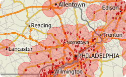
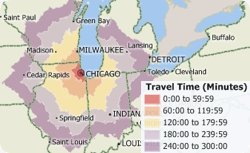
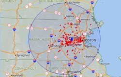
Travel time is the most realistic way of describing market areas and access to services. A franchise may want to define their territories based on the time required to reach their customers. Emergency services may want to map their response time coverage for an area. The drive-time tool ("Network Bands") in Maptitude 2014 supports these types of analysis based on the creation of realistic catchment areas, and with a single click can create a professional demographic report (see video here).
The creation of drive-time rings allows you to determine which areas can be accessed within a particular drive-time or drive-distance. Using this tool you can calculate the market characteristics and demographics around your locations, and estimate the duration of services such as repair or delivery calls. You will also be able to better describe the convenience of your locations in terms of time rather than as a crude straight line measurement. The output of drive-time rings differs significantly from the more simplistic rings ("Buffers") that define areas based on straight-line ("as the crow flies") distances.
Corporate and government relocation is a growing segment of the real estate industry. Corporate mergers, reorganizations, and upsizing/downsizing often prompt a move to a new address. An office move is an event that typically takes place several times in the lifecycle of a company, on average once every 5 to 10 years. If you're planning on moving your business it is critical to find commercial real estate that meets the requirements and goals of your organization. Do you want to relocate near to the homes of upper management, or do you want a more central location to reduce average employee commute time?
The Weighted Center of gravity tool involves plotting all of your locations on a map and then finding a central location that is closest to those points with the highest weighted demand. For example, if you are considering relocating a store, Maptitude can create a trade area around your customers and weight the center by their sales volume to determine a new candidate location. Alternatively, you may have a database of client employees. You can use Maptitude to see the best central location based on the density and distribution of the addresses. These could be weighted by seniority, allowing you to better explore potential site locations by considering staff characteristics.
The following steps outline how to create a weighted center for your locations:
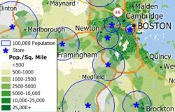
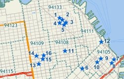
Because most retail outlets target particular socio-economic groups, it is useful to be able to visualize the reach of stores in relation to target demographics. Maptitude analysis tools can determine the area required to be able to service a target population such as people in a particular age and income group. By identifying these market areas, retailers can better asses their store placement and competition.
Maptitude can create rings so that they contain a particular value such as population, income, or area. The width of each ring is computed by Maptitude on the fly. For a video tutorial see: Creating Buffers with Maptitude.
Because most crime data have specific locations, it is easy to add the locations of accidents, citation issuances, arrests, registered sex offenders, suspects, and crime locations to a map. Maptitude analysis tools then let you determine spatial patterns and hotspots for various types of crimes.
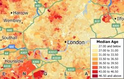
Thematic maps use distinctive colors, symbols, and styles to show information such as population, sales, or income. The different styles highlight the similarities and differences among locations. When data are portrayed in a thematic map, the information becomes easier to see, understand, and interpret.
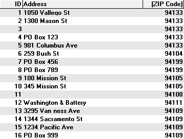
Often you may have customer data that contains ZIP/Postal codes without addresses. One way you can use your data with Maptitude is to locate your data on a map by creating a new layer that contains a point for every record in your table. In this case you could use the Locate by Postal/ZIP Code command to locate your data.
 |
 |
 |
 |
|
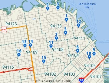
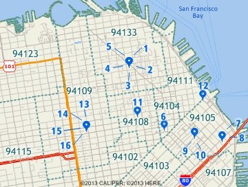
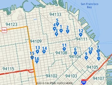
If you locate by ZIP Code this table of customers, which includes P.O. boxes and missing addresses... |
This is the result of scattering evenly within the ZIP Code area. ZIP Code 94199 has no area so records 7 & 8 are not located. |
This is the result of centering the records. All records are located, but records in the same ZIP Code are on top of each other. |
This is the result of scattering close to the point ZIP Code. All records are located and more individual features will be visible. |
Maptitude locates the records and displays a message summarizing the results. Maptitude also displays the locations in a point layer on a map, and creates a new selection set filter called "Postal/ZIP Codes Not Found" for any records that could not be located. If you used the Scattered Evenly inside the area option, you can repeat the above steps and choose one of the other methods to locate the additional Postal/ZIP Codes.
One way you can use your data with Maptitude is to locate your data on a map by creating a new layer that contains a point for every record in your table. If your data have address values, then you can use locate by address for the greatest accuracy. You should be able to locate most of your records using the normal settings. The Locate by Address command has other settings to help you deal with situations that you may encounter and to deal with records that could not be located with the normal settings.
Below are some situations and how to solve them using the other settings:
Maptitude locates the records and displays a message summarizing the results. Maptitude also displays the locations in a point layer on a map, and creates a new selection set filter called "Address Not Found" for any records that could not be located. You can repeat the above steps by choosing a different method to locate additional addresses.
If some addresses still were not found after trying all of the Locate by Address options, use one of the other Locate commands. You can locate your records manually By Pointing, By Postal Code, and By City.
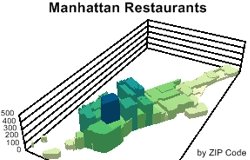
A 3D heat/color theme (Prism Map) uses 3D and color to show the relative values of a single data field. Prism Maps can only be created on an area layer, such as counties, states, or sales territories.
The following steps illustrate how to show areas in 3D using the Prism Map tool in Maptitude 2013:
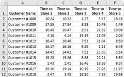
Often there is a need to assign the areas that are closest to a location. For example, you may have a list of stores or sales representatives and would like to see all the postal areas color-coded based on which location they are closest to. Maptitude lets you fill a field in a map layer table with data from another layer by using the Edit-Fill-Tag tool. You can, for example, fill in one column in a table of customers with the distance to the nearest store and a second column with the name of the nearest store (Maptitude Video...).
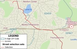
You use the Shortest Path toolbox in Maptitude to find your best route. In Maptitude 2013 you can now view the resulting routes as a selection set to allow you to save them as part of your Workspace, and to better manage/modify the paths.
The following steps outline how to create routes with the selection option:
The Map My Own Data tool in Create-a-Map Wizard now allows you to both locate a table of coordinates (including longitude/latitude) with auto-detection of the best fields to use, and add a new layer to an existing map. These new Maptitude 2013 features reduce the number of steps required to produce your maps.
The following steps illustrate these new features by locating coordinate data on an open map:
When managing territories it is often useful to see demographic totals (e.g., population, school-age children) and a count of the number of combined zones (such as ZIP/Postal Codes). In addition, there is a need to control the toggling between territories of your zones, allowing you to manage territory overlap.
The following steps walk you through these tasks in Maptitude 2013:
| Choose this... | To do this... |
| Do not select features already included in other sets | To prevent selected features from being selected |
| Remove features from any other sets | To add features already in other selection sets and remove them from any other selection sets |
| Allow sets to overlap | To add features to the selection set without regard to other selection sets |
You can rename selection sets and change styles as well as perform many other actions to customize your territories. You can also use the Create Districts command to create a new area layer based on the selection sets.
It is often useful to see your data with a regular grid. For example you could count the number of your facilities per square mile or see how the average home value varies over a square kilometer grid.
The following steps outline how to create a grid and count features in each cell:
Maptitude creates a table with the overlay data, joins it to the grid layer, and displays the joined view in a dataview. The [N layer_name] field contains the count of point features in each grid cell. You can add a color theme using the count field in the grid layer to see the overlay results on the map. You may need to change the drawing order or apply transparency to the theme styles ensure that no layers are obscured.
In Maptitude, chart themes are drawn in the natural order of fields in a Dataview. Creating a chart theme from the map does not allow you to change this order. Creating a chart theme from a Dataview, however, does allow you to create chart themes with bars in any order.
To use the theme in another map, make the layer the working layer in the other map, click the Chart Theme button on the Standard Toolbar, and click Load. Maptitude displays the Load Area Chart Theme dialog box. Click the From Workspace radio button, choose the chart theme to copy, and click OK twice to close both dialog boxes.
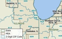
Maps are composed of different types of information and Maptitude organizes all of these map features into layers. There are layers that are not used in the default maps such as U.S. Metropolitan Statistical Areas (MSAs), 5-digit ZIP Code points, and 3-Digit ZIP Codes. These layers are included with Maptitude and can be added to any map.
The following steps walk you through adding other layers to a map:
You can use any picture file, including those in formats such as GIF, ICO, TIF, BMP, JPG, PNG, and EMF, as the fill style for area features.
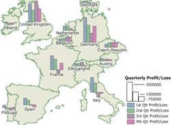
Maptitude provides many tools that allow you to thematically visualize and differentiate your data (see the training video). These include thematic maps and selection filters. The Map Theme tools support several types of theme on each map layer, allowing data to be categorized based on more than one field, such as quarterly revenue losses and gains.
Maptitude allows you to save a map as an Enhanced Metafile (*.EMF). An Enhanced Metafile is a graphics file format that contains vector graphics and prevents any image fuzziness. Another benefit of saving a map as an EMF is that the image can be ungrouped in applications such as Microsoft Office.
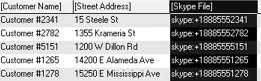
Maptitude lets you link all types of information to features on a map. You can link map features to documents, programs, or sites on the Internet. In this Tech Tip we will look at how to phone your customers using Skype by simply clicking on them in a map.
Once you have a point layer of your data on a map:
 to
activate the Info Link tool.
to
activate the Info Link tool.
Pattern themes allow you to easily create a map showing locations using either an alphabetical letter or a number, with a legend that automatically categorizes such locations by name.