| Mapping, GIS, & Transportation Software Solutions |
| Mapping, GIS, & Transportation Software Solutions |
It is ten years since the Great Recession and the economy has sustained growth for the longest period on record. We use maps to explore how this growth is playing out across the USA, revealing patterns that may not otherwise be obvious.
We first looked at growth in total number of jobs between June 2010 and June 2019. We found that 41% of the new jobs were in only 20 metropolitan areas.
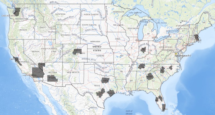
This would be unsurprising given that most people are urban dwellers and cities are drawing more of the population to them. Maps are a great way to emphasize this: The red areas in the map below cover half of America. No this isn’t an optical illusion; half of all Americans live in the 27 urban areas highlighted.
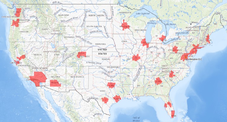
However, the top 20 employment growth Metropolitan Statistical Areas (MSAs) identified accounted for only 22% of the total population of the USA. These so called “superstar” cities are concentrated in the rapidly expanding urban areas of the south and along the coasts.
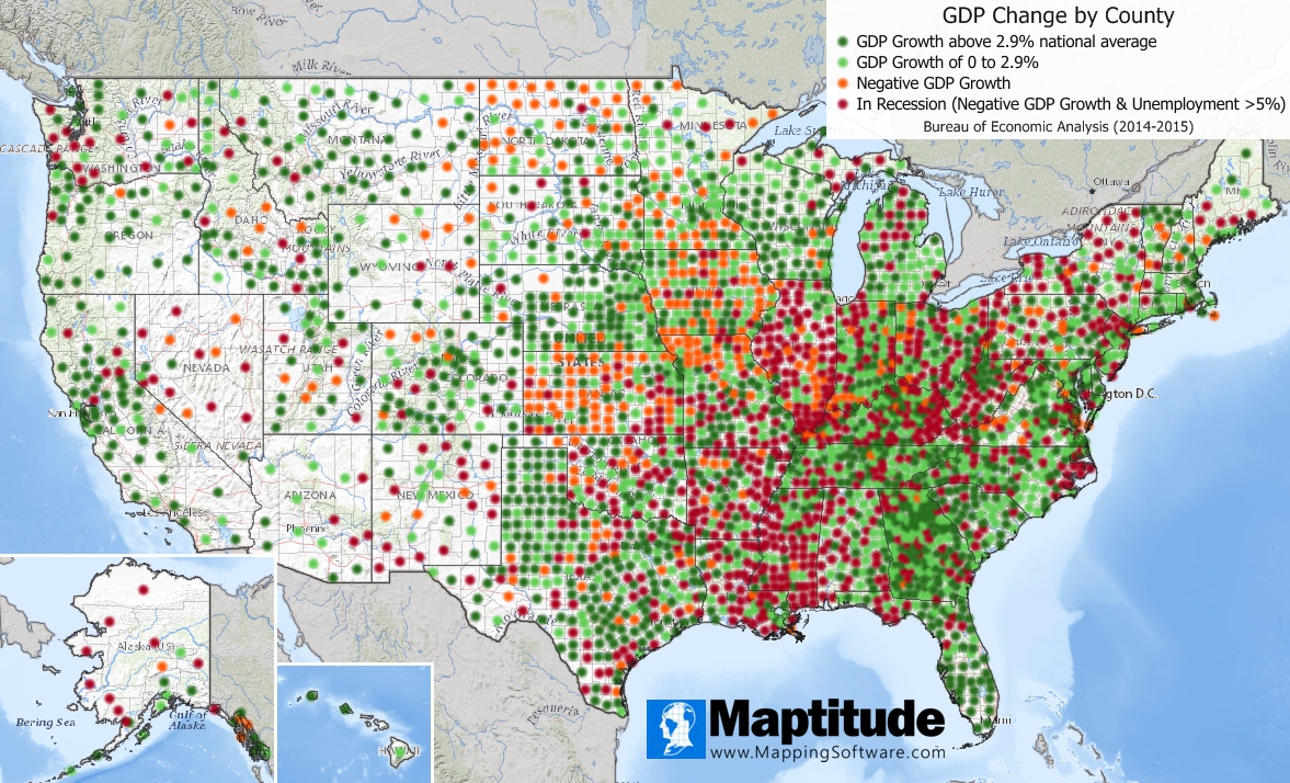
Digging a bit deeper, we pulled the latest data available for county gross domestic product (GDP). This analysis revealed that nearly a quarter of all counties nationwide were in recession.
According to our analysis, through the end of 2015 approximately one quarter of the nation's 3,242 county economies were exhibiting signs of recession. Our findings are based on GDP and unemployment rates, where GDP is the market value of the goods and services produced in a year in each county. The counties identified as being in recession had a GDP decline between 2014-2015 and an unemployment rate of over 5% for the same period.
 Source:
Census American Community Survey (ACS); Bureau of Economic Analysis;
Maptitude mapping software
Source:
Census American Community Survey (ACS); Bureau of Economic Analysis;
Maptitude mapping software
The map shows distinct differences: While a small number of places are doing very well, many others are struggling. This pattern shows a widening geographic gap between a few richer cities and the rest of the country.
For comparison, the Bureau of Economic Analysis, the government agency that compiles gross domestic product data, said the nation's economy grew 2.9% in 2015, the strongest growth since 2005. Only 35% of counties (1,126) equaled or exceeded this national rate. In comparison, the counties performing economically well saw impressive growth. The top 10% had economies that grew by 8.4% to 72% between 2014 and 2015.
The bottom third of U.S. counties saw their economies shrink, some seeing as much as a 38% change in GDP for 2014 to 2015. For example, St. Louis City, MO, saw a 9.3% decrease in GDP coupled with a 9.4% unemployment rate. For another 20% of counties, growth was not above 1.65% during that period.
"We are seeing new urban areas expanding their share of jobs while other areas, even other large urban areas, are not enjoying the benefits of one of the best economies in history," said Stewart Berry, VP of Caliper Corporation, a data mapping software and business consulting company, adding that "geographical differences tell a different story than national figures alone can explain."
Home | Products | Contact | Secure Store