A mapping software such as Maptitude supports the analysis, and data collection and data management, of information related to pandemics, epidemics, and contagions. Mapping tools are very useful for seeing patterns in such data and in providing analytical tools that help you visualize and understand the causes of a disease outbreak.
A GIS uses cluster identification tools that enable location-based intervention. The progression of an outbreak can be monitored with a GIS, allowing you to track changes in the curve of the number of new cases. You can then share and export your results directly from within the mapping application.
 |
“Maptitude Pros: Ease of use, logical sequence of steps for mapping procedures, quick making of several types of thematic maps, well designed procedure for spatial overlay - a critical feature for public health work. You really can teach yourself how to use it even for the most complicated problems. It remains the least expensive, comes with a ton of data, has excellent tech support done by people who get interested in what you are trying to do. I am a public health scientist, epidemiologist, who studies the spatial/ geography of disease. This includes dealing with questions concerning disease clusters, the impact of air quality in some neighborhoods versus others, access to medical care and where people work, etc.”
|
"Example of a simulated dataset with an artificial cluster area (box) containing Nt treatment cases (black dots) and surrounding Nc control cases (grey dots) at the address level. Black squares with inscribed dots indicate ZIP code centroids to which address level cases would be spatially aggregated. Note: Nc cases drawn from underlying population of cases to retain actual spatial location and event date is randomized. Nt cases are randomly located within the cluster box area and event date is forced into a 3-month time period. Number of Nt cases is calculated as a function of the underlying at-risk population within the cluster box area and randomly chosen relative risk value."
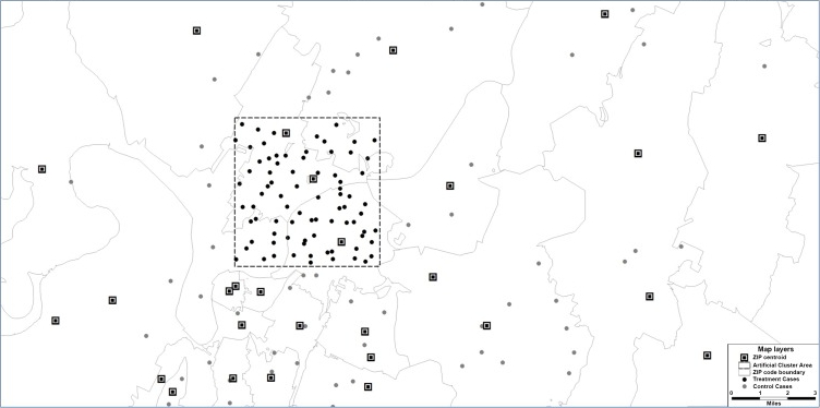
Example of a simulated dataset containing an artificially created infectious disease
cluster
(Stephen Jones & Martin Kulldorff,
Influence of Spatial Resolution on Space-Time Disease Cluster Detection)
Track and compare the spread of infectious diseases such as Zika, Ebola, COVID-19, or SARS over time.
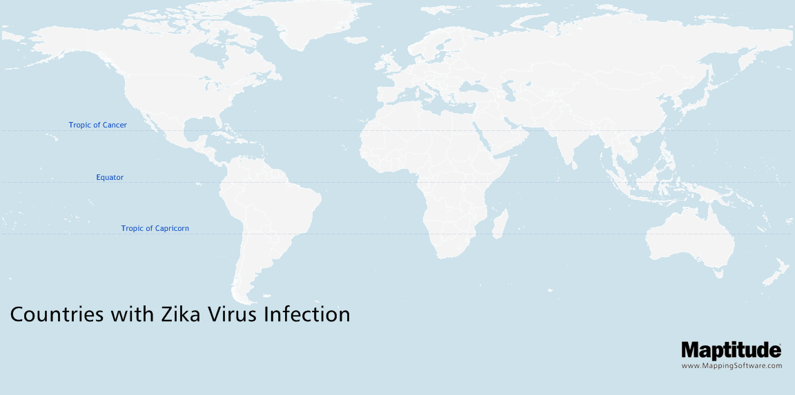
Map the temporal spread of diseases such as Zika, COVID-19, or Ebola
"Considerable underreporting exists in the reporting of zoonotic infectious diseases which limits the ability to comprehensively track disease incidence over space and time at a meaningful scale. Large health care organizations contain important disease case information that can be used as a source of data for analyzing and monitoring of arthropod-borne zoonotic diseases such as Lyme and West Nile."
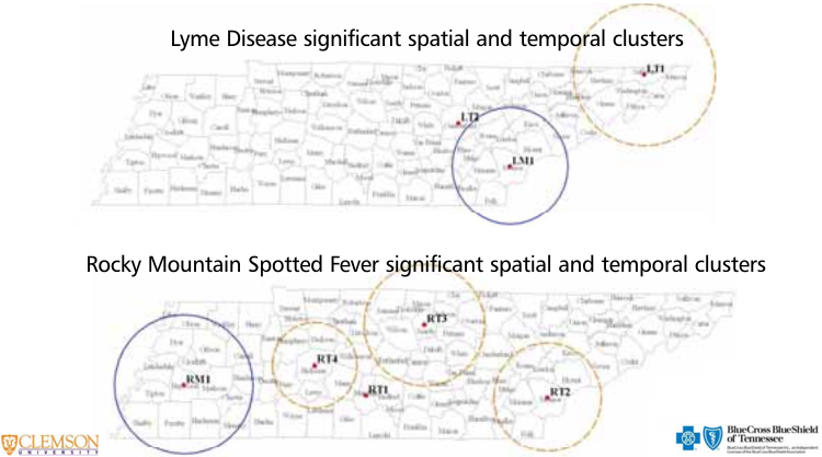
Spatial and temporal clusters
of insect-borne diesease
(Stephen Jones PhD, Blue Cross
Blue Shield of Tennessee)
"Geographic distribution of penicillin nonsusceptibility among pneumococcal isolates at 33 hospitals in the Delaware Valley in 1998. The figure is a proportional symbol map (bubble plot). Each hospital location is represented by a circle with an H in the center at the corresponding longitude and latitude of the hospital. The radius of the circle is directly proportional to the proportion of penicillin-nonsusceptible pneumococci at each hospital in 1998. The range is 0% to 67%. Hospitals with <10 isolates in 1998 were excluded. An insert magnifies the geographic distribution of hospitals clustered in the center of Philadelphia."
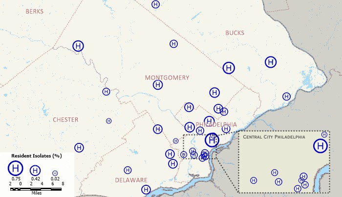
Geographic distribution of penicillin nonsusceptibility at 33 hospitals
(Joshua Metlay et.al.,
Hospital-reported Pneumococcal Susceptibility to Penicillin)
To explore the cholera epidemic in the summer of 1854 in Soho, London, hand drawn paper maps were used to identify where cholera deaths were concentrated, and which water pump was closest to each cholera death.
The epidemiologist John Snow spot mapped the cholera cases onto a map of London streets, and was able to discern a pattern in the outbreaks. This pattern led to the conclusion that the cholera infections could be attributed to the water being drawn from the Broad Street pump. John Snow’s study was pivotal in demonstrating the importance of tracking diseases using geographical data. Modern technology can much more easily create spot maps that can be used to track disease outbreaks. The use of geographic information systems (GIS) software allows a point pattern analysis to be mapped and thematically visualized. You can see the concentration of cases by space and time.
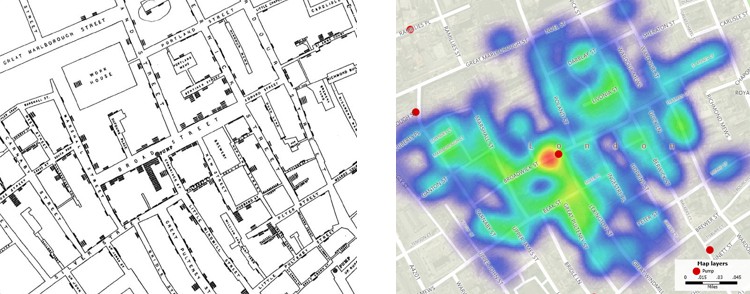
John Snow's map and a GIS map
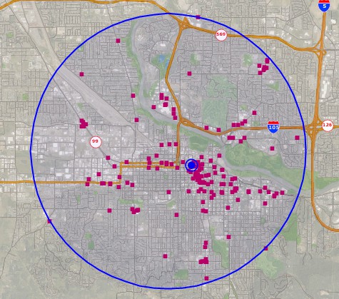
Maptitude provides tools to identify the central location among a point distribution. These range from the simple weighted center, to location-allocation centers based on transportation costs and weights at each point, such as number of positive disease tests.
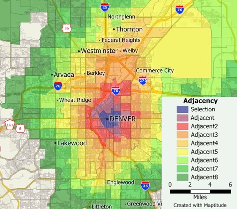
At risk areas, such as those towns adjacent to an outbreak, can be visualized using GIS software such as Maptitude.
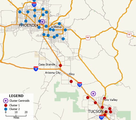
Maptitude mapping software can be used to identify clusters of health events for further investigation and analysis.
Spatial autocorrelation analysis can show whether correlation exists between the locations of disease incidence. Overdispersion caused by environmental hazards, infectious agents, or variations in genetic susceptibility, all of which may vary spatially, can be explored using hypothesis tests that check for autocorrelation using the Moran’s I test included with Maptitude.
Maptitude also allows you to explore relationships in your infectious disease data using regression and binary logistic regression.
Soho
Cholora Tutorial
The objective of this tutorial is to use
several spatial analysis methods to analyze where cholera deaths
were concentrated and which water pump was most likely the
source of the cholera outbreak.
Check out these research articles to learn more about mapping contagious disease clusters and for other health related research:
Request a demo or download a trial of Maptitude to see how visualizing health data can benefit your organization!
Home | Products | Contact | Secure Store
