Maptitude Online, a GIS mapping software, includes a powerful
cluster map feature that automatically creates clusters for your
data. With Maptitude cluster maps, you can visualize patterns that
would be hard to spot on a normal pin map. The software dynamically
recalculates clusters as you navigate the map, ensuring that you
always see an optimal grouping of points at each
zoom level.
Free Trial Request a Demo
What are Maptitude Online Cluster Maps?
Cluster maps in Maptitude help you make sense of
densely plotted locations, whether you're analyzing
customers, facilities, or any large set of points on a map, all
while maintaining clarity and context.
Cluster maps:
- Are interactive thematic maps
- Group many nearby points into a single symbol (or "cluster")
- Simplify complex geographic data
Instead of displaying hundreds or thousands of overlapping
markers, a cluster map consolidates points based on proximity and
labels each cluster with the number of points it contains. This
makes it much easier to interpret dense location data at a glance,
because you immediately see where concentrations of data are highest
without losing the ability to drill down for details as you zoom in.
Free Trial Request a Demo
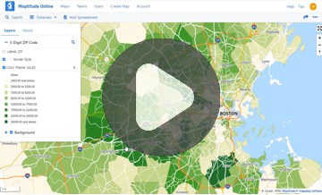
Try an
Interactive Cluster Map
This interactive cluster map shows the
locations of earthquakes of magnitude 2.0 or higher
Free Trial Request a Demo
Key Features and Benefits of Cluster Maps
- Simplified Visuals for Dense Data:
Cluster maps
reduce
map clutter by aggregating points that are close together into one
marker. This simplification makes patterns in heavy datasets
immediately visible. For example, instead of hundreds of overlapping
dots in a city, you might see a single cluster labeled "150,"
instantly conveying that 150 data points are in that area. This
approach makes it easier to spot trends and outliers without
manually sifting through noise.
- Dynamic Clustering on Zoom:
Maptitude Online cluster maps are fully dynamic and scalable. As you
zoom in or out, clusters automatically recalibrate, zooming in
reveals smaller clusters or individual points, while zooming out
combines points into larger clusters. This scalable analysis means
you can seamlessly transition from a high-level overview to a
detailed view, all on one map. The map clusters update in real time,
so you're always viewing an appropriate level of detail for the
current map scale.
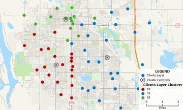
- Quantitative Insight at a Glance:
Each
cluster symbol is labeled with a number to indicate how many points
it represents. In addition, the size or color of cluster symbols can
reflect the quantity or magnitude of data in that cluster, providing
instant visual cues about density. For instance, a larger or more
prominently colored cluster might indicate a higher concentration of
points (or a higher total value, if you choose to weight clusters by
an attribute like sales volume). This quantitative representation
helps you quickly identify hotspots and compare different regions.
- Category Breakdown with Pie Cluster Symbols:
Maptitude also
supports clustered pie chart themes, allowing you to visualize
composition within clusters. If your points have categories or
multiple data fields (e.g. customer types or product mix), you can
choose a pie chart theme and enable chart clustering. The map will
then show pie chart clusters, each pie represents the grouped data,
with slices for each category, and is labeled with the total count
in that cluster. This feature is especially useful for understanding
the makeup of clusters (for example, a cluster of sales might be
broken down by product category in the pie chart). It combines the
benefits of clustering with multi-variable charting.
- Interactive Exploration:
Cluster maps encourage users to interact.
You can click on or hover over a cluster to get more details (for
example, to see a list of included locations), or simply zoom in for
a closer look. Because clusters are dynamically generated, they
effectively guide you to areas of interest, when you see a cluster
with a high number, you might zoom in there to investigate further.
This interactive drill-down capability turns your map into an
exploratory tool, where broad patterns lead you to finer analysis.
In an interactive setting, cluster maps excel at helping users
navigate large datasets.
- Built-In Demographic Context:
Maptitude comes with extensive demographic data and map layers that
you can overlay under or alongside your clusters. This means you can
view your clustered data points in context, for example, seeing
customer clusters against a background of population density or
income levels by region. By overlaying boundaries (like ZIP Codes or
territories) with demographic shading, you gain insights such as
"Are my customer clusters located in high-income areas?" or "This
service request cluster overlaps with a densely populated region."
Maptitude makes it easy to add these layers, and even calculate
demographic summaries for the areas around your clusters. This
integration of cluster maps with demographic and geographic context
helps you not only see where things are happening, but also
understand why and who is in those areas.
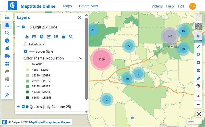
By layering a cluster theme of earthquakes with population data on ZIP Codes, you can see that West Texas earthquakes are centered away from high population areas
Free Trial Request a Demo
Industry Applications of Cluster Maps
Cluster mapping is a versatile technique that delivers value in
many fields. Here are some industry applications and examples of how
cluster maps can be used:
- Business Intelligence & Sales:
Companies with large customer datasets or sales records use
cluster maps to identify regional concentrations of customers
and prospects. For instance, a business can map all its customer
addresses and use a cluster map to see which metropolitan areas
have the highest customer counts. This helps with targeted
marketing and sales strategies, sales teams can focus on
"hotspot" regions indicated by large clusters of customers.
Cluster maps also assist in spotting underserved areas (places
with few or no clusters) for business expansion.
- Retail Planning:
In retail, cluster
maps help visualize where stores, shoppers, or competitors are
clustered. A retailer might plot all its store locations and use
a cluster map to see clusters of stores in high-density markets,
ensuring they haven't over-saturated an area. Likewise, mapping
all customer purchase locations can reveal clusters of high
demand, guiding decisions on where to open a new store or target
a local promotion. By showing overlapping trade areas or
clusters of transactions, retail planners can optimize store
placement and inventory distribution.
- Logistics & Service Delivery:
Delivery
companies and service providers often deal with thousands of
addresses (for deliveries, pickups, service calls, etc.).
Cluster maps can highlight groups of stops or clients in close
proximity. For example, a logistics manager might see that
deliveries naturally form a cluster in a particular suburb,
indicating an opportunity to assign those to the same route or
depot. By identifying clusters of delivery points, companies can
plan more efficient routes (servicing one cluster at a time) and
even decide where to position warehouses or fulfillment centers
to best serve those clusters. This leads to improved route
optimization and resource allocation.
- Public Sector & Safety:
Government
agencies and public safety officials use cluster maps to analyze
incidents and resource needs. For instance, law enforcement can
create a cluster map of crime incidents or 911 calls to see
where incidents are concentrated. Large clusters might indicate
crime hotspots or neighborhoods that need increased patrols.
City officials could cluster citizen service requests (like
pothole reports or permits) to identify areas with higher demand
for city services. In emergency management, cluster maps of
incident reports (fires, medical calls, etc.) help in
strategizing where to station emergency response teams. By
visualizing these clusters, the public sector can allocate
police, fire, medical, or maintenance resources more effectively
to the communities that need them most.
- Healthcare & Epidemiology:
In
healthcare analysis, cluster maps are valuable for mapping
patient data, disease outbreaks, or healthcare facilities.
Epidemiologists can plot disease case locations and use cluster
maps to quickly spot outbreak clusters, revealing areas of high
infection that might warrant targeted interventions. Healthcare
networks might map all their clinics or hospital admissions;
clustering shows which regions have the most patients seeking
care. This can highlight gaps in coverage (areas with many
patients but no nearby clinic) or help in planning new
facilities. Similarly, public health officials might cluster
maps of vaccination rates or chronic illness cases to identify
communities that need outreach or additional services. The
cluster map provides an intuitive view of health data
distribution, supporting data-driven decisions in health policy
and resource deployment.

|
"We believe Maptitude is a promising suite of capabilities
that would likely yield the greatest opportunities for
scalable clustering analysis. We believe
the capabilities of Maptitude are promising when compared to
Microsoft Excel–based mathematical clustering because
Maptitude provides greater information integration,
including the ability to layer information.”
Austin Clark & Corey M. Arruda
Naval Postgraduate School
Monterey, California
|
 |
“Maptitude is user friendly and economical. The software
makes it easy to show key components in your data. It pinpoints the location and is visually appealing.
I used
it for a cancer cluster investigation and also use it in another industry to show sales.”
Debbie Pullen
Data Research Analyst, Kristen Renee Foundation
Tampa, Florida
|
Free Trial Request a Demo
How to Create a Cluster Map in Maptitude Online
Creating a cluster map in Maptitude is straightforward. You can
turn a raw dataset of locations into an insightful cluster
visualization in just a few steps:
- Map Your Data Points:
Start by
importing or plotting your location data in Maptitude. You can
use the built-in Create-a-Map Wizard or add data to an existing
map. For example, load a spreadsheet of addresses (customers,
stores, incident locations, etc.), Maptitude will geocode the
addresses and display them as points on the map.
- Apply the Cluster Theme:
Once your points are on the map, it
only takes a few clicks to create a cluster map. In the map's
Display Manager or layer settings, click "Add Theme" and choose
Cluster Theme for your point layer. You don't even need to pick
a field, clustering is based on location only. After you click
Finish, Maptitude will automatically group densely located
points into clusters and label each cluster with the number of
points it contains. Immediately, your map will transform from a
scattering of individual dots to a cleaner view with numbered
cluster symbols.
- Explore the Clusters:
With the cluster theme applied, take
advantage of the interactive map to explore. Zoom in to break
clusters apart into smaller clusters or individual data points.
Zoom out to see broader patterns as points aggregate into larger
clusters. You can pan around to examine different regions, the
clusters will update on the fly. Use the dynamic nature
of cluster maps to dive deeper: large cluster over a city? Zoom
in to see which neighborhoods contribute to it. Sparse coverage
in an area? Pan around or zoom out to see if those points form a
cluster.
- Add Context (Optional):
To get more insight from your
cluster map, you can overlay additional data. For instance, add
a boundary layer such as ZIP Codes, counties, or sales
territories, and include some demographic or statistical data
for those areas. Maptitude lets you shade these areas (using a
color theme or heat map) or label them with values. By doing
this, you can observe how your clusters relate to external
factors (e.g., do customer clusters align with high-population
areas or high-income ZIP Codes?). You could also add other point
layers (like competitor locations or service centers) to see
them in relation to your clusters. Maptitude layering and
theming capabilities are flexible, so you can combine cluster
maps with other map themes (heat maps, pie charts, territory
boundaries, etc.) for a richer analysis.
That's it, with these steps, you have a cluster map! You can now
save your map, export it as an image for a report, or even share it
interactively using Maptitude Online. The result is a clean,
informative visualization that conveys both the big picture and the
fine details of your location data.
Try Cluster Maps in Maptitude
Cluster mapping is a powerful capability, and the best way to
appreciate it is to try it with your own data. Maptitude offers a
free 1-month trial of the full software, so you can experiment with
cluster maps firsthand (no credit card required). We encourage you
to
sign up for the free trial
and use this guide to create a cluster map step-by-step.
If you'd like a guided tour, you can request a live demo from
the Maptitude team, we'll be happy to show you how cluster maps and
other features can meet your needs. Whether you're dealing with
sales data, epidemiological data, or service locations, cluster maps
in Maptitude will help you turn that raw data into actionable
insights. Get started today and see how clustering can reveal the
story in your map data!
Free Trial Request a Demo
Frequently Asked Questions about Cluster Maps:
What is a cluster map?
A cluster map is a type of
map that groups close-together points
into a single symbol for easier
visualization. In a cluster map (sometimes
called a bubble map), each
cluster represents a set of individual locations
that are near each other. The cluster is usually
drawn as a circle (or bubble) and labeled with a
number indicating how many points it contains.
This technique helps prevent overlapping markers
on a map. For example, if you have 500 customer
addresses in one city, a cluster map might show
a single circle labeled "500" rather than 500
tiny dots on top of each other. As you zoom into
that city, the single cluster would gradually
break apart into smaller clusters or individual
point markers, revealing more detail. In
summary, a cluster map allows you to see
patterns in dense data by consolidating
points and is especially useful when mapping
large datasets (hundreds or thousands of
locations).
How does Maptitude Online create map clusters?
Maptitude creates map
clusters automatically using its built-in
Cluster Theme functionality.
When you apply the Cluster Theme to a point
layer, Maptitude examines the geographic
distribution of your data and groups points that
are within a certain proximity into clusters.
Each cluster is displayed as a colored circle
(with semi-transparent sizing) and a label
showing the number of points in that cluster.
The clustering in Maptitude is dynamic: it
recalculates as the map view changes.
Technically, as you zoom or pan, the software
adjusts which points are grouped together based
on the current scale, so the clusters always
reflect an appropriate grouping for the view.
You don't need to set any parameters for
distance or number of clusters, Maptitude
algorithms handle it. The result is an
interactive map where nearby points are
replaced by a cluster symbol labeled
with their count, giving you an instant sense of
density. If you need to see the individual
points, you can just zoom in and Maptitude will
dissolve the cluster into the actual locations.
This on-the-fly clustering makes it very
convenient to visualize large datasets without
manual intervention.
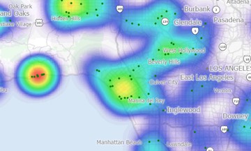
How is a cluster map different from a heat map?
Both cluster maps and heat
maps are techniques to visualize dense point
data, but they work in different ways and are
used for different purposes. A cluster map uses
discrete symbols (clusters) with counts to
represent groups of points. In contrast, a heat
map (or density map) creates a continuous
color-coded surface to indicate the intensity of
points in an area.
Here are some key
differences:
- Visualization style:
Cluster maps show distinct circles with
numbers, whereas heat maps show smooth color
gradients (for example, blue-to-red shades)
over areas. A heat map might color an area
red if many points are nearby, versus blue
for fewer points. There are no counts or
discrete groupings shown in a basic heat
map, just intensity of color.
- Interpretation: In a
cluster map, you can see exact counts per
cluster (e.g., "20 incidents in this
cluster"). A heat map is more about visual
density, you infer relative intensity by
color shade, but you don't get an exact
number unless you use a legend or query the
data. Heat maps are great for spotting
general hotspots and gradients, while
cluster maps are great for keeping track of
actual totals and precise cluster locations.
- Interactivity: Cluster
maps are inherently interactive with zoom
(clusters split apart as you zoom in). Heat
maps typically remain the same when zooming
(they just focus on a smaller area),
although you can change their radius or
intensity settings.
- Use cases: Use a
cluster map when you want to maintain a link
to actual data points and counts, for
example, showing how many customers are in
each city area, or how many incidents in
each neighborhood, with the ability to drill
down. Use a heat map when you want to
emphasize the continuous spread or influence
of points, for example, seeing the gradient
of event intensity or customer density
across a region, without needing exact
figures per spot.
In practice, Maptitude supports both methods.
You could even use them together: for example, a
heat map underlay to show general density, with
cluster markers on top showing specific counts
in key locations. Both are useful, it just
depends on whether you need precise cluster
information (choose cluster map) or an overall
smooth density visualization (choose heat map).