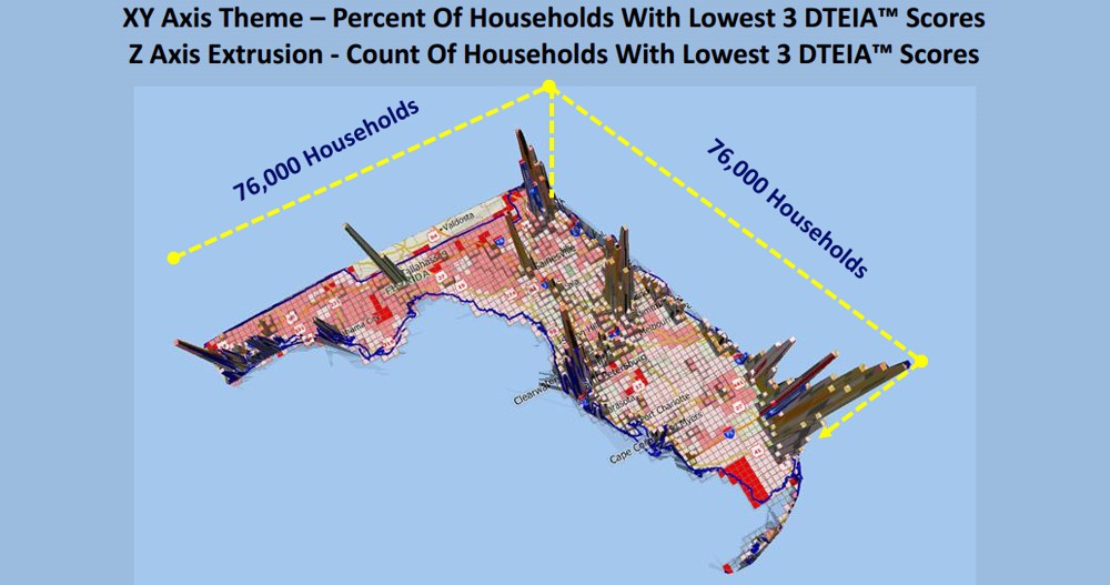
The maps show DTEIA™ Scores (a measure of student performance). Using Maptitude, the data are aggregated to 6x6 square mile grids and mapped in 3D over a 2D surface. This allows an appreciation of those areas that have a high percent, and/or a high count, of underperforming households.
See more map infographics Learn more about Maptitude
Map: Created by Grant Ian Thrall Ph.D. with Maptitude Mapping Software by Caliper, January 2014
Home | Products | Contact | Secure Store