Maptitude is the best mapping software for business intelligence! This map shows the percent of the population voting in favor of leaving the European Union by District in the United Kingdom. Districts shown in red were in favor of the United Kingdom leaving the EU (pro-Brexit) and Districts shown in blue were in favor of the United Kingdom remaining in the EU (opposed to Brexit).
If you need a custom map for your story, blog, or website, contact us because we offer a limited number of free custom maps on a first-come, first-served basis! See our Featured Maps for inspiration.
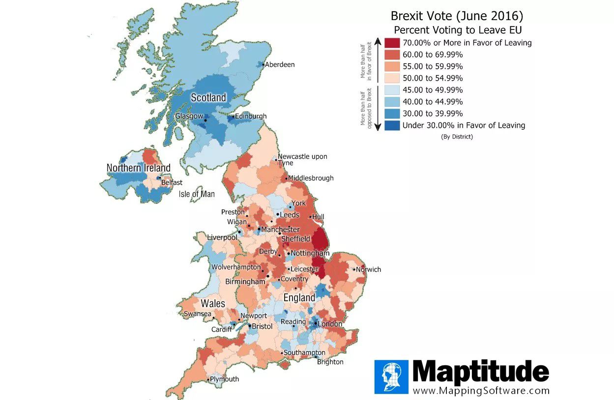
Map: Created with Maptitude Mapping Software by Caliper, June 2016
Home | Products | Contact | Secure Store
