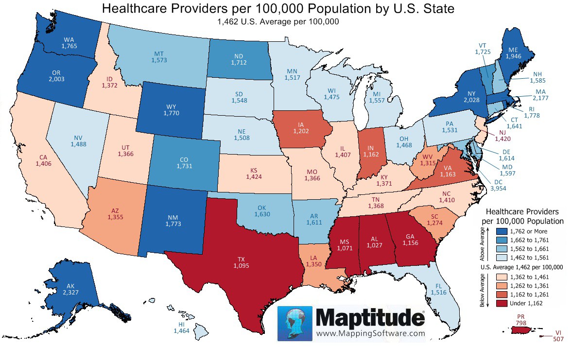
Maptitude is the best mapping software for business intelligence! This month's featured map shows the number of healthcare providers per 100,000 people and is drawn from the Maptitude USA Country Package ZIP Code layer. States with more than the national average of healthcare providers per capita are shown in shades of blue, and states with fewer are shown in shades of red. Washington DC has by far the highest ratio of healthcare providers, followed by Alaska, Massachusetts, and New York. The Virgin Islands, Puerto Rico, Alabama, and Mississippi have the lowest ratios of healthcare providers.
If you need a custom map for your story, blog, or website, contact us because we offer a limited number of free custom maps on a first-come, first-served basis! See our Featured Maps for inspiration.
Map: Created with Maptitude Mapping Software by Caliper, March 2017
Home | Products | Contact | Secure Store
