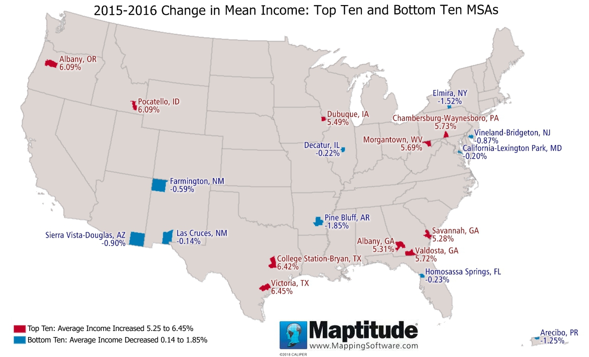
Maptitude is the best mapping software for business intelligence! This month's featured map uses the Maptitude 2018 percent change in mean income data for the United States. This data is available for ZIP Codes, MSAs, Counties, States, and many other layers. The ten metropolitan areas (MSAs) with the greatest positive and negative changes between 2015 and 2016 are shown in the map below. The largest increase in mean income was in Victoria, Texas at (6.45%), followed by College Station/Bryan, Texas (6.42%), and Albany, Oregon and Pocatello, Idaho (6.09%). Pine Bluff, Arkansas (-1.85%) had the largest decrease in mean income, followed by Elmira, New York (-1.52%), and Arecibo, Puerto Rico (-1.25%).
Map: Created with Maptitude Mapping Software by
Caliper, March 2018
Source: ACS 2015 and ACS 2016
Home | Products | Contact | Secure Store
