Maptitude is the best mapping software for business intelligence! Maptitude mapping software supports mapping data in numerous formats allowing you to incorporate data from numerous sources into your maps.
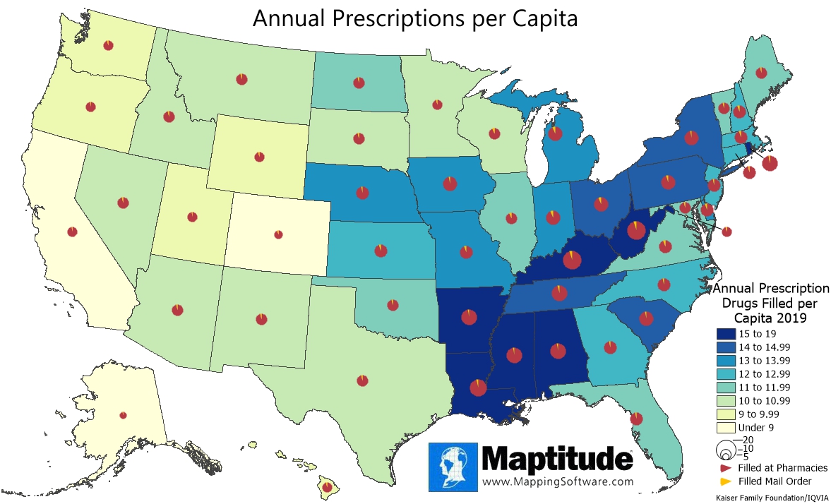
This Maptitude map shows the annual prescription drugs filled per capita in each state along with the breakdown of where those prescriptions were filled. States with the highest number of prescriptions per capita are shown in dark shades of blue and states where rates are lower are shown in lighter shades of yellow and green. Annual prescriptions per capita ranged from a low of 6.7 in Alaska to a high of 19.0 in Kentucky. In all states, the number of prescriptions filled at pharmacies was over 93%. Ohio had the greatest share of mail order prescriptions with 6.7% and Alabama the smallest with 2.9%.
If you need a custom map for your story, blog, or website, contact us because we offer a limited number of free custom maps on a first-come, first-served basis! See our Featured Maps for inspiration.
Map: Created with Maptitude Mapping Software by
Caliper, June 2022
Source: Kaiser Family Foundation/IQVIA
#Maptitude #Medicare #Spending
Home | Products | Contact | Secure Store
