Maptitude is the best mapping software for business intelligence! Maptitude mapping software supports mapping data in numerous formats allowing you to incorporate data from numerous sources, including public data sources such as the National Highway Traffic Safety Administration (NHTSA), in your maps.
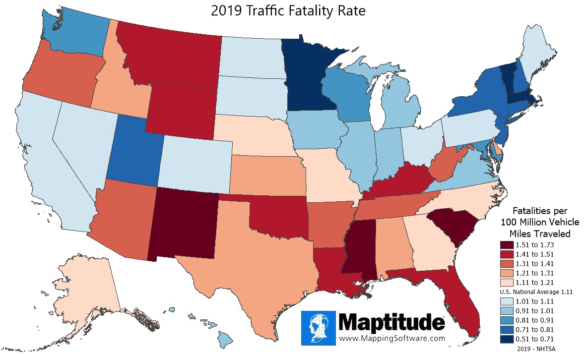
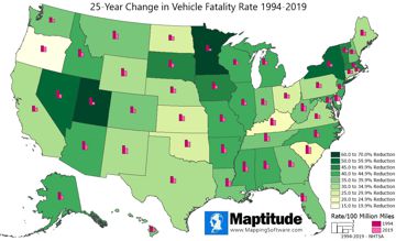
This Maptitude map shows the traffic fatality rate per 100 million miles driven. The national average is 1.1 fatalities per 100 million vehicles miles travelled. States in shades of red had rates that exceeded the national average, with South Carolina (1.73), Mississippi (1.56), and New Mexico (1.53) having the highest fatality rates. States in shades of blue had rates below the national average, with Massachusetts (0.51), Minnesota, (0.60), and Vermont (0.64) having the lowest fatality rates. A companion map shows how fatality rates have changed over the course of 25 years.
If you need a custom map for your story, blog, or website, contact us because we offer a limited number of free custom maps on a first-come, first-served basis! See our Featured Maps for inspiration.
Map: Created with Maptitude Mapping Software by
Caliper, Janauary 2022
Source: NHTSA 2019
#Maptitude #Traffic #Highway #Safety
Home | Products | Contact | Secure Store
