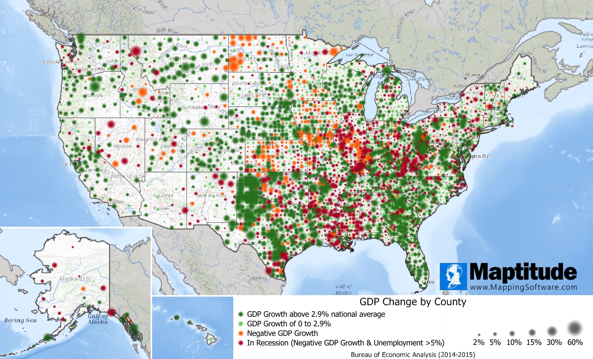
Maptitude is the best mapping software for business intelligence! This month's featured map shows GDP change by county for 2014-2015. Counties where GDP increased are shown in green, and those that increased over the 2.9% national average are shown in dark green. Counties that saw their GDP decrease are shown in orange, and counties that had a decline in GDP and an unemployment rate over 5% are shown in dark red.
GDP is a critical economic measure and having this data at the county level is unprecedented. We include the most current version of county-level GDP and unemployment data for free with Maptitude. Read more about this map here.
If you need a custom map for your story, blog, or website, contact us because we offer a limited number of free custom maps on a first-come, first-served basis! See our Featured Maps for inspiration.
Map: Created with Maptitude Mapping Software by Caliper, September 2019
Home | Products | Contact | Secure Store
