

Author:
Stewart Berry
Images: Dan Martin
A good mapping software application or GIS (Geographic Information Systems) provides a library of default maps and styles out-of-the-box that allow you to create presentation-ready and professional looking maps. These predefined settings can help you rapidly create a useful map, but if you take a little more time, you can make some minor modifications that uncover the trends hidden in your data. There is no one-size-fits-all approach to creating a map, but the best maps share a common concept. Some map aesthetics are influenced by historical maps and art styles. Others are entirely contemporary. However, good maps have a distinct style that focuses on the story being told, conveying it to the reader in a clear, engaging, and comprehensive format. Here are some tips and tricks for producing eye catching and informative maps!
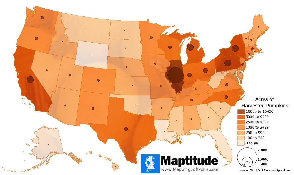
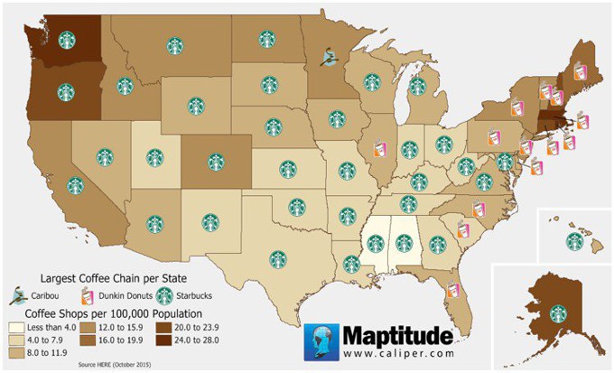
Maptitude has a plethora of color ramps to assist you in displaying your data, including choices that are color-blind friendly. Choosing a color ramp that corresponds to the context of your data helps to clarify your message. For example, a map of pumpkin harvest by state uses shades of orange where darker shades indicate states that produced more pumpkins and a map of coffee shops by state uses shades of brown where darker shades indicate states with more coffee shops. In these examples, we're choosing colors that are directly related to the message we're attempting to communicate.
 |
 |
Remember that:
The Maptitude Create-a-Map Wizard creates maps with a standard map background that should be suitable for most situations. However, you may want to consider adding imagery to the background of your map to provide additional reference to viewers. If you are using the United States Country Package, you also have the option of using the light and dark theme overview maps that are available in the Demographic Map Librarian.
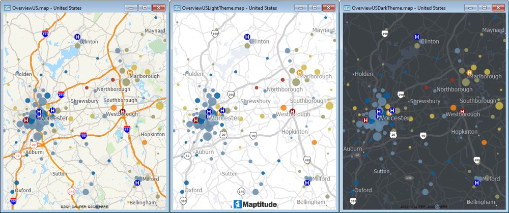
In general, when using images in the background, consider the following:
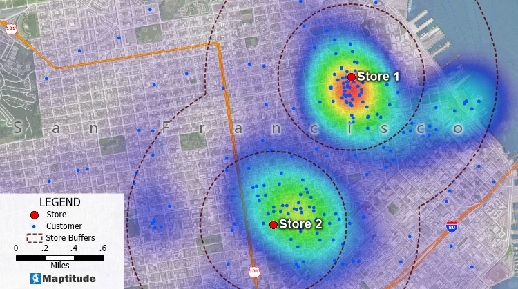
In this map, the image is displayed with 45% opacity so that the colors of the landmark areas show through and the customers, labels, buffers, and heat map are still legible
Maptitude can combine information about map features to create a map that illustrates the patterns in the data. This is called a thematic map. Thematic maps use distinctive colors, symbols, and fill styles to portray data such as population, customer visits, or income. The different styles highlight the similarities and differences among map features.
In some types of thematic map, Maptitude changes the appearance of each feature based on its characteristics. In other thematic maps, Maptitude displays charts or symbols for each feature to illustrate comparative information. When data are portrayed in a thematic map, the information becomes easier to see, understand, and interpret.
Color Theme |

Pattern Theme |
Dot-Density Theme |
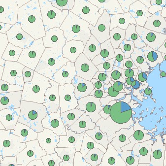
Chart Theme |
Size Theme |
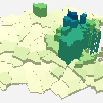
3D Theme |
|
Chart Theme |
Size Theme |
3D Theme |
Below we discuss the best practices for the
most common types of thematic map visualizations.
Color themes (also called choropleth maps) and pattern/symbol themes work in the same way. They both group the features in a map layer into classes, based on the value of a data column. Each class contains all the features with similar values for the chosen field. When the map is drawn, the classes are displayed using different colors, patterns (area and line layers), or symbols (point layers).
In general, for color themes:
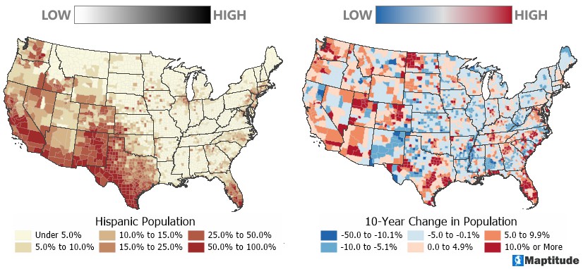
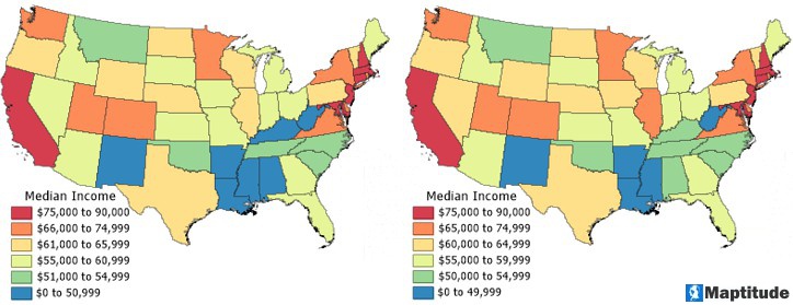
When mapping thematically, try changing the theme to see your data in a new way. If you are mapping something with important high or low values, try the default light-to-dark color ramps with the "Swap Start and End" option to have the darker color represent the highest or lowest values. Also, the "Break at" option lets you choose a "Via" color so that you can emphasize extreme values, as described in this chart:
| Color Theme Options | When to Use It | Example |
|
|
Show a range from low to high | Map home values showing the range from lowest to highest |
|
|
Differentiate positive and negative values or above and below a mean | Map home values and differentiating areas above and below the mean home values of the entire region with emphasis on the areas with the highest and lowest values |
|
|
Standard deviation theme where you want to highlight values around the mean | Map home values and you want to highlight the areas that are more statistically average |
|
|
Standard deviation theme where you want to highlight the outliers | Map home values and you want to highlight the areas that are outliers of less and more expensive areas |
Each theme method has color ramps designed for use with that theme and which are applied automatically to your map. In Maptitude, you can scroll through different color ramps, clicking Apply to see how they look. This allows you to assess whether the map's colors provide the best impact for your target audience.
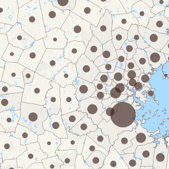
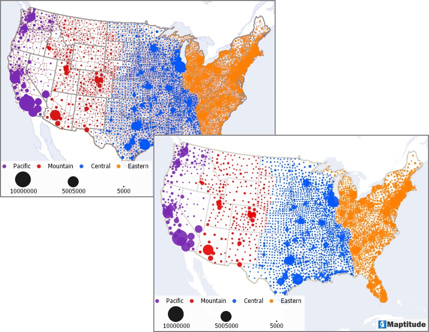
A size theme uses symbols of different sizes or lines of different widths to show the value of your data. Two general recommendations for size themes are to:
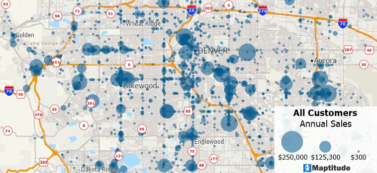
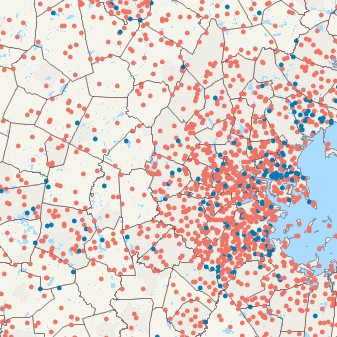
A map of customer locations with a size theme indicating the annual sales for each customer. A semi-opaque style makes it possible to see individual customers in dense locations or near customers with larger annual sales.
Because we are attempting to comprehend and communicate the patterns inside our data, we must be selective in how we assign color or symbol sizes to ensure that the chosen values make things clear. While all the theme tools allow you to ignore data above and below certain values, this technique is especially useful when used with size themes.
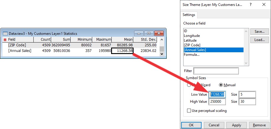
When using size to represent your data using the low/high value settings to adjust the map is especially useful for seeing the patterns hidden in our spreadsheets. Setting the Low Value to the average value is a simple approach to identify and display trends. This will draw attention to any numbers that are above average. To get the mean value that we will use as the input, we need to first open the dataview (Dataview>New Dataview) for our working layer and to choose Dataview>Statistics>Summary. You can then type or copy and paste the average into the Low Value item in the theme window.
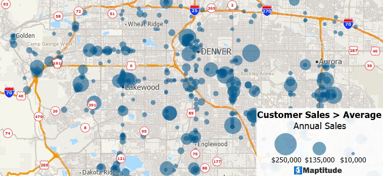
The map below depicts the customer data above, but only for the customers that exceed the average sales. This second map presents a clearer indication of where sales are higher without the noise of the many smaller customers.
Pie and bar chart themes are a type of thematic map that use pie or bar charts on map features to illustrate the data that go with each feature. Some general recommendations for chart themes are to:
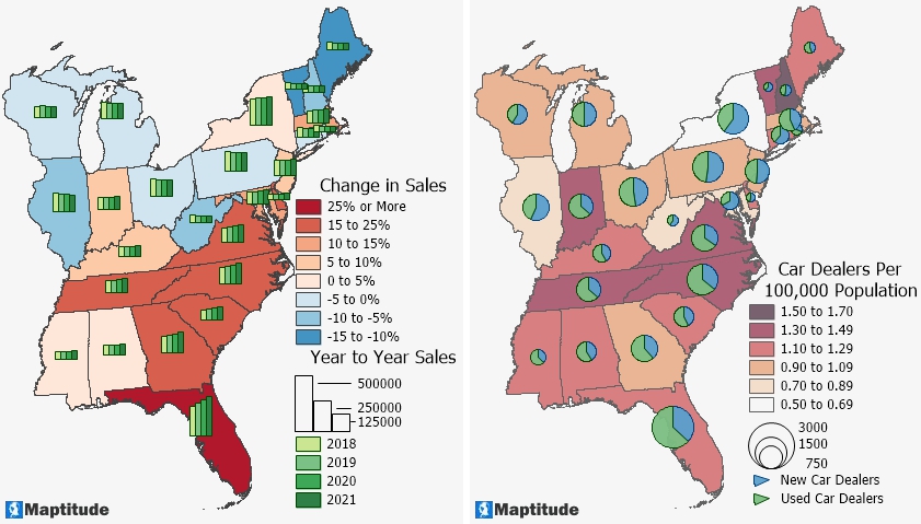
The bar chart theme on the left shows the change in sales by state over four years. The size of the pies in the map on the right indicates the total number of car dealerships in each state and the wedges indicate the portions of new and used car dealerships. The colors used in the themes contrast with the color themes and a minimum size has been set so that it is still possible to identify the sales trends in states with lower sales and the new and used car proportions in states with relatively few total dealerships.
Setting features or borders to be partially transparent can improve the readability of your maps by allowing the viewer to focus on the relevant data without too much distraction. As already noted above, applying some transparency to your size themes can allow overlapping features to still be seen. But there are other useful cases for applying transparency to your map.
Outlines on polygons might be distracting and pull your audience's attention away from the main thrust of your map. By adjusting the opacity of your area boundaries you can focus more attention to the map topic. Change your borders or circular outlines, for example, to a less opaque value or to a color that complements the prevailing map colors. If the borders or outlines don't support your message, try using 100% fill transparency to only leave the feature outline.
For example, the first map below contains a size and color theme on counties, but the strong county outlines conflict with the pattern it wishes to portray. By making the county boundaries mostly transparent and the state boundaries somewhat lighter, the data patterns in the second map are much clearer.
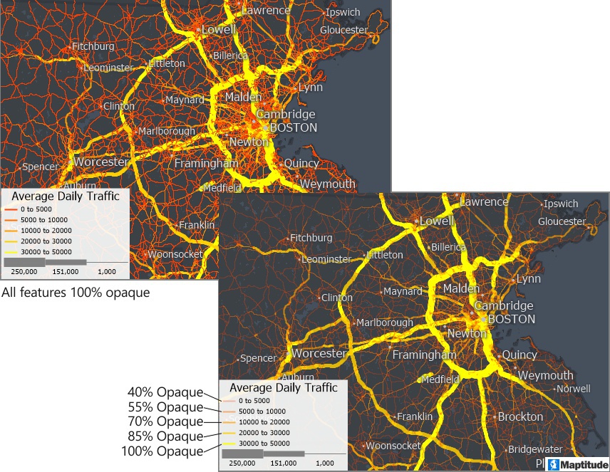
Transparency can also be used to highlight trends in your thematic data and make patterns more comprehensible. To change the transparency, modify the opacity for each class in the theme on your data. Making the transparency setting gap wider between the highest and lowest theme classes produces a more vivid transparent effect.
For example, the first map below contains a size and color theme of traffic on highways where all of the highways are 100% opaque. By making some of the theme classes transparent, the busiest roads are more apparent and the less busy ones fade into the background.
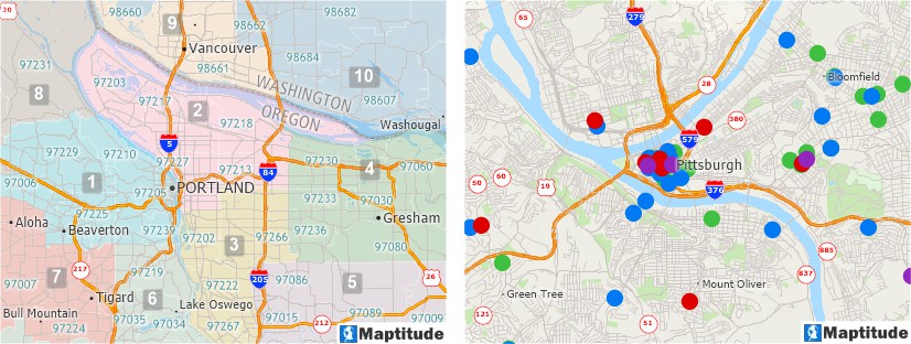
Showing two attributes in the same map is easy with Maptitude using both color and size. A map can show any number of themes and can even combine several types of themes on a single layer such as a sales territory layer with a color theme of total annual sales and a size theme showing sales for this quarter.
For example, if you want to explore the pattern of high-income households, size can show the total number earning over $100,000, while the color can highlight where the highest percentage exist. This method highlights areas that have both a high count and percentage of affluent households.
In general, to spot patterns more rapidly in a bivariate thematic map:
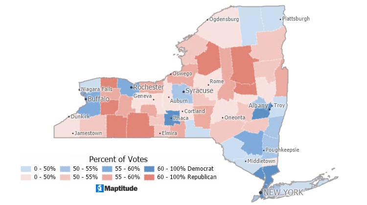
Maptitude has a tool to help you pinpoint the largest value between multiple attributes. The Color Theme (Multiple Fields) add-in provides you with a way to visualize and compare multiple fields of data. Also known as plurality maps, predominance maps, relationship maps, bivariate maps, or multivariate maps, multiple field themes can reveal patterns and let you see how items are connected. This is achieved using a method known as multivariate choropleth mapping, in which multiple color ramps merge to display all pattern combinations in a grid-like legend. This tool allows you to rapidly view predominating values in your dataset. You can pick up to 10 numeric characteristics that all have the same unit of measurement (the denominator).
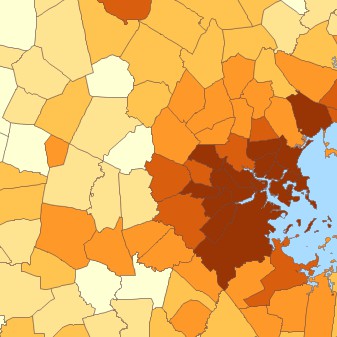
An election map or a voter registration map are good examples of how this technique can be useful. A voter registration map simply tells you which of two or more parties has the highest percentage of registered voters. For example, the map below shows party predominance by New York counties, as of February 2021. Darker colors indicate a high majority of voters for that party and lighter colors indicate that a party has a slimmer majority or just a plurality of voters within the county. A political scientist could use the tool to determine where there is a strong political party base.
Cartographic labeling is the technique of positioning text on a map in relation to map features, which collectively reflect real-world characteristics and attributes. Text successfully used in maps generates maps that are clear, instructive, and appealing.
When you label features, Maptitude automatically decides exactly which locations should be labeled and where the text should be placed. Each time the map is drawn, Maptitude displays the most effective combination of labels. There are several ways to make labels clearer and more comprehensible, such as:
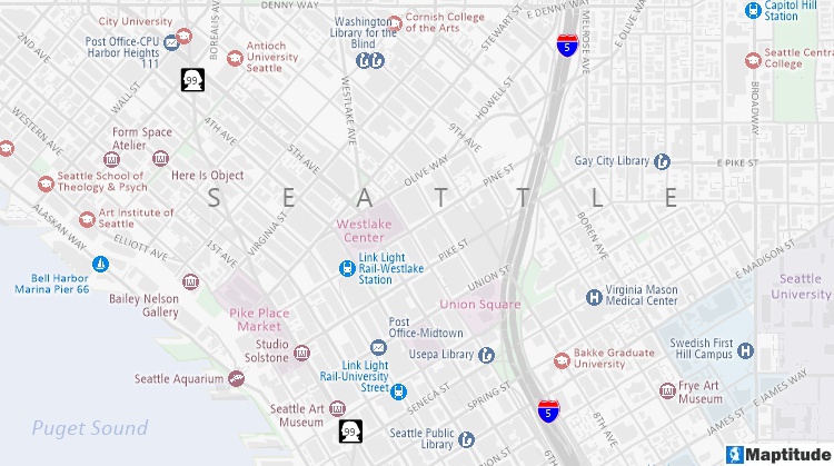
This map uses a variety of label features: The "SEATTLE" label is stretched, Interstate 5 and Washington Route 99 use highway shields, the streets and landmarks have white halos, and all of the labels use colors relative to the features that they reference.
Maps use a legend to describe the symbols, colors, and styles used in a map. Legends have sections for the title, layers, filters, themes, styles, scale, and footnote.
Maptitude creates and maintains the legend automatically. The map styles are listed with subtitles followed by individual items. You can choose a title, footnote, border, background, styles, and which sections to include in the legend. You can show only the items necessary to convey your map story and move more important items toward the top of the legend. You can also control the legend’s border and background, or even make the legend transparent and borderless so it fits seamlessly on your map.
Another point to consider when creating legible legends, is to round off the values in color and pattern theme classes. For example, changing the automatically calculated classes of:
• 0-491, 492-1021, 1022-1480
to a customized manual theme with classes of:
• 0-500, 501-1000, 1001-1500
Maptitude lowers the burden required for creating engaging and inspiring maps that allow you to leverage the value held within your data. By integrating with key geographic, demographic, and healthcare datasets, Maptitude provides a one-stop wizard-driven interface. Maps are an intuitive way to convey and analyze large amounts of data. Maptitude can support all the above analytics and comes with or supports all the data used in the examples shown, as well as information for almost any industry and sector you would need to map.
Learn more about Maptitude to see how you and your team can make informative and insightful!
Schedule a Free Personalized Demo
Home | Products | Contact | Secure Store
