
Author: Richard Marsden
Maptitude can also be used plot earthquakes, examine patterns in earthquakes, and even look for correlations with other factors such as oil industry activity.
Earthquake catalogs from recent years can be downloaded from the US Geological Survey at http://earthquake.usgs.gov/earthquakes/search/. For the following maps, the data is downloaded as a CSV (comma separated value) file, and imported into Maptitude as a point layer. Available information includes date/time, location, magnitude (proportional to the log of the energy), and depth.
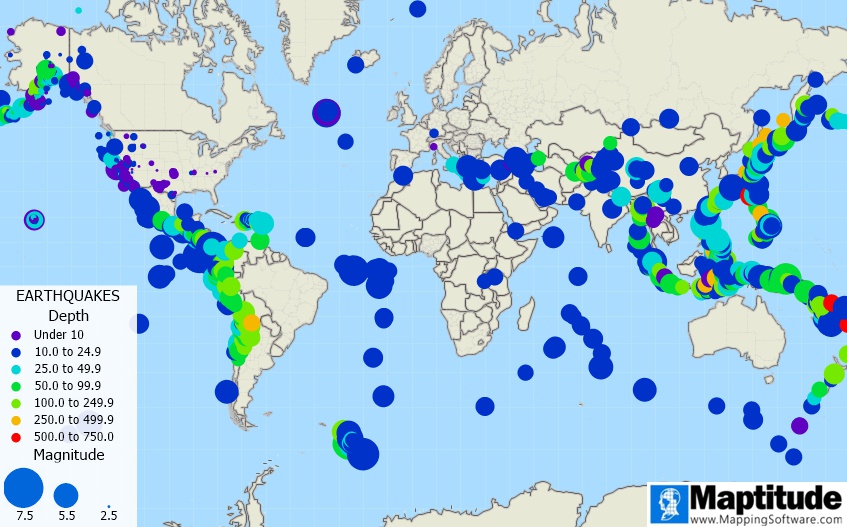
Here we plot all earthquakes from 2015 with a magnitude greater than 4.5:
Map of earthquakes for 2015. Size denotes magnitude (a modern scale that replaces 'Richter Scale') and the color denotes depth (in km).
This map has been plotted using the Eckert IV equal area projection. Circles indicate earthquakes. These are sized according to the magnitude (a modern scale that replaces 'Richter Scale'). The circles also indicate the depth (in kilometers). Most earthquakes are red and shallow (less than 61km deep), whilst a few are very deep (greater than 500km). Most of the earthquakes mark out the plate boundaries – the Mid-Atlantic Ridge is particularly clear. Mountainous areas (e.g. the Alps and Himalayas) also have quite a few earthquakes.
We can zoom into an area to see more detail. Here is Tonga:
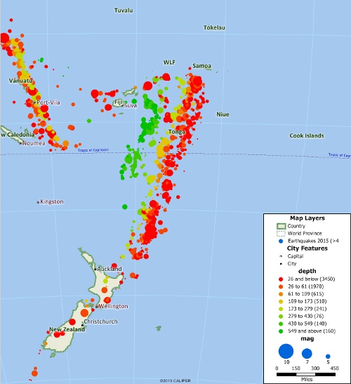
Detail view of Tonga and New Zealand. Notice that the earthquakes have a steady westward progression from red (shallow) to green (deep).
The vast majority earthquakes are shallow because they only occur where the crust is brittle. The deep crust and mantle are hot and ductile, so they exhibit plastic creep rather than brittle failure. An exception occurs at subduction zones where a slab of cold ocean crust is being pushed deep into the mantle. Tonga happens to lie on a very fast and active subduction zone, and is the most seismically active place in the world. Here the earthquakes pick out the subducting ocean slab as it gets deeper to the west. This is known as the Benioff Zone, and was actually discovered before plate tectonics.
This process explains the yellow earthquakes to around 100km deep, but beyond this, the subducting slab should have warmed up and become ductile. This would explain the 'gap' between the yellow and deep green earthquakes, but not the reason for these very deep (>430km) green earthquakes. These are thought to be due to sudden high pressure phase changes in the crustal minerals leading to the formation of spinel followed by perovskite. These depths agree with lab experiments.
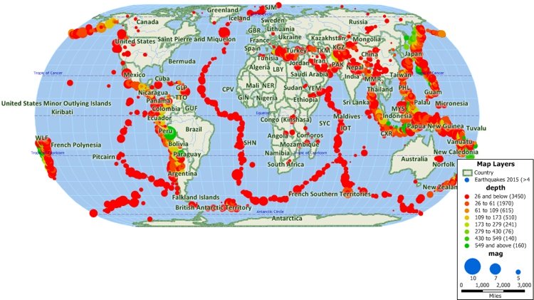
Oklahoma has recently seen a lot of seismic activity, and the largest earthquakes have even made it onto the world maps (see above). Despite a lot of public speculation that these earthquakes are due to hydraulic fracturing (aka 'fracking') of oil wells, the recent Science paper "Oklahoma's recent earthquakes and saltwater disposal", Walsh, F., Zoback, M. 2015 (Sci. Adv. 2015;1:e1500195) makes a convincing case that the cause is due to saltwater disposal wells. This water is natural water that is produced with the oil and is far too saline to dispose of in a water course. This process of injecting the waste well water has been going on for decades but in recent years the volumes have increased significantly. The water is a function of the oil field and not whether the oil well was fracked or not.
The oil companies are required to report their UIC (Underground Injection Control) well injection volumes to the Oil and Gas Division of the Oklahoma Corporation Commission, and the collated reports can be downloaded. This data requires some cleaning up before Maptitude can display it, but this is easily achieved with a Python script. Here is a map of injection volumes (barrels) for 2014 with earthquakes for 2014-15:
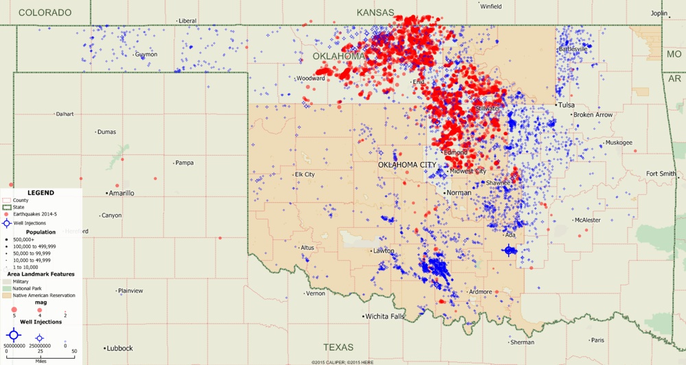
Oklahoma earthquakes for 2014-5 (red) and injection well volumes for 2014 (blue).
There is usually a delay between the start of water injection and the first earthquakes, hence the choice of 2014-5 for the earthquakes to plot alongside the injection volumes for 2014.
The wells (blue symbols) are sized according to the total injected volume (barrels) for the year. The earthquakes (red circles) are sized according to their magnitude.
As you can see there is some correlation, but there are a lot of areas of widespread water injection that have few earthquakes.
It is thought that the earthquakes are primarily caused by water injection into a deep geological formation known as the 'Arbuckle'. In the next map we use a Maptitude selection set to only display the wells that injected water into the Arbuckle:
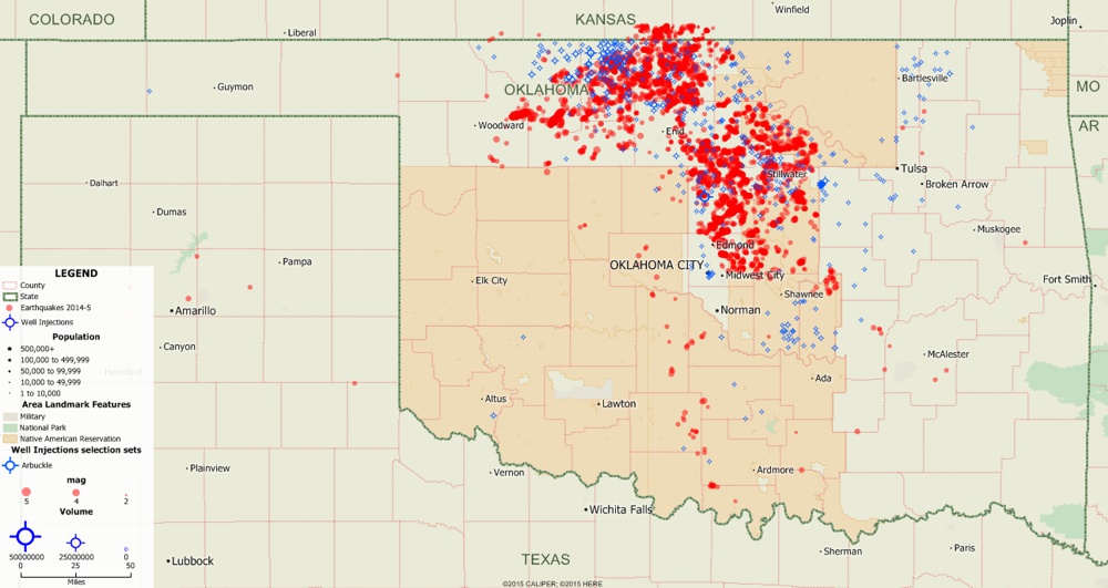
Water injection wells that injected water into the Arbuckle Formation in 2014 (blue) and earthquakes for 2014-5.
Here we see there is a much better spatial correlation between the injection wells and the earthquakes.
Walsh & Zoback and the Oklahoma Geological Survey have also identified other contributing factors, such as the orientation of regional stress with respect to the dormant faults; but these maps give you an idea how spatial correlations can be visually tested with Maptitude.
Learn more about Maptitude to see how you and your team can use Maptitude for your business mapping needs!
Schedule a Free Personalized Demo
Home | Products | Contact | Secure Store
