
Author: Richard Marsden
This example uses Caliper® Maptitude® to analyze the Florida results of the 2000 US Presidential Election.
During the 2000 Presidential Election, the results for Florida came under close scrutiny and argument, with the final result being decided by the courts. Amongst the accusations was the charge that a lot of people in the county of Palm Beach were confused by the so-called "Butterfly Ballot" (2 column Votomatic machine) and accidentally voted for Pat Buchanan when they intended to vote for Al Gore. Can Maptitude be used to refute this charge, or can it provide supporting evidence?
The data used for this demonstration was collated by Brett Presnell from the University of Florida’s Department of Statistics; and is available from Carnegie Mellon's StatLib (Sample data sets) website. This dataset lists the final certified counts for each county as reported by the Florida Division of Elections for each county, excluding the Federal Absentee votes. Included in each county’s record is the type of voting machine in use.
Here, the data has been imported into Maptitude and the votes have been plotted as column charts for each county. We are interested in the votes for Buchanan relative to the other minority candidates. Bush and Gore are ignored on this map due to their large numbers of votes relative to the minority candidates.
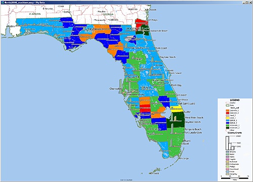
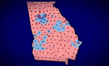
Plot of voter returns for all candidates except Bush & Gore, overlain on a map of voting machine technology
The counties have been colored according to voting machine or system that was used. The same chroma (color) has been used for the same machines, with lighter colors for single column and darker colors for two columns. For example, Votomatic machines are colored green, and the 2 column Votomatic (aka ‘Butterfly Ballot’) is dark green. We quickly see that the only two counties using the 2 column Votomatic were Palm Beach and Duval (Jacksonville area).
Straight away, we see that Palm Beach has an anomalously high count for Buchanan when compared to the surrounding counties. In fact, Buchanan received more votes in Palm Beach than in any other county. Note that these are absolute vote counts — Palm Beach also had a high number of total votes cast.
When compared with other counties in southern Florida, we see that Buchanan did get a high proportion of votes at Palm Beach and that this was the only county using the ‘Butterfly Ballot’. But when we look further north, we see that the only other county with the ‘Butterfly Ballot’ (Duval) has a low proportion of votes for Buchanan. Also, a number of counties in the Florida Panhandle have a lot of votes for Buchanan but none of them used the ‘Butterfly Ballot’. So, at this stage the evidence does not appear to support the hypothesis that the ‘Butterfly Ballot’ was at fault, unless there are also other factors at play.
Perhaps the political leaning of a county is a major factor? For example the high Buchanan votes in the Florida Panhandle could be due to that area naturally leaning to the right. Similarly, Duval might have relatively low numbers of people voting for Buchanan because few were trying to vote for Gore and making the mistake. Of course this means the county would also be leaning to the right and we would expect more people to intentionally vote for Buchanan.
We have the total votes cast for Bush and Gore in the same dataset, so we can divide one by the other to give a measure of how left-leaning or right-leaning a county is. We can then look for correlations between this and the Buchanan vote. We expect high Buchanan votes to correlate with Right-leaning counties and that any observed anomalies might be due to the voting machine being used.
This map colors the counties according to whether they had more votes for Bush (red) or Gore (blue). This is performed in Maptitude using a formula field to divide the Bush’s count by Gore’s: if the ratio is greater than one, then more people voted for Bush and the county is colored red.
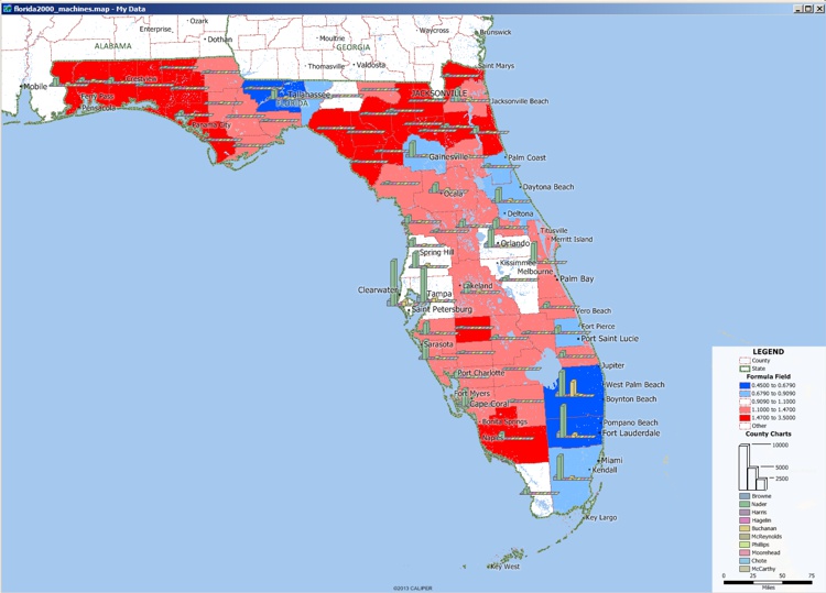
Plot of candidate votes overlain on a shaded map of political leaning. Political leaning is calculated by dividing Bush’s votes by Gore’s votes.
As expected, the Pan-handle counties tended to vote for Bush. It is reasonable to infer that these counties lean to the political right, hence explaining the higher votes for Buchanan. Indeed this can be seen across the entire State. Most of the counties that had high numbers of votes for Buchanan also voted for Bush rather than Gore. Those that voted for Bush but with low counts for Buchanan may have been more centrist and only leaned slightly to the right.
Palm Beach voted for Gore and is hence probably left leaning. It is unlikely that a left leaning county would have such a high number of votes for the right wing Buchanan.
We can take this analysis further and use a Scatter Plot to see if there is a correlation between the Bush/Gore Ratio and the % Buchanan Vote count. Maptitude is capable of plotting layer and/or data view data in a non-geospatial chart such as a graph or a scatter plot:
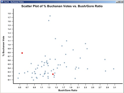
Scatter plot of county Buchanan Votes vs Political Leaning (ie. Bush/Gore ratio). Counties using the 2 column Votomatic machines are in red. Palm Beach is the red square on the left, Duval is in the right of the main cluster.
Here we use the percentage Buchanan vote instead of the absolute count. This corrects for the high number of votes (due to higher population) at Palm Beach.
The 2 column Votomatic machines are colored red. Palm Beach is the outlier to the left, whilst Duval is on the right of the main cluster.
Even though the percentage correction lowers the Palm Beach anomaly, this county is clearly still an outlier. At about 0.8%, it is the highest of any county that voted for Gore. The next highest is slightly above 0.5%.
Ideally if there were more counties using the 2 column Votomatic machines, this analysis could be applied further. A predictive model that attempted to estimate mistaken Buchanan votes could be created and tested. Unfortunately with only two counties using this system, any kind of correlation is very limited in significance.
The above is a simplified analysis. There are, of course, many other potential factors. However, it does demonstrate the relative ease with which geographic hypotheses can be constructed and tested with Maptitude.
Learn more about Maptitude to see how you and your team can benefit from mapping software!
Schedule a Free Personalized Demo
Home | Products | Contact | Secure Store
