Maptitude is the best mapping software for business intelligence! By combining the free Maptitude Consumer Expenditure Data and the Maptitude 2021 relationship map tool, variations in spending by region can be easily compared for powerful market insights. Here we explore which areas are spending more on different types of alcoholic beverages. The map shows which of the three types of beverages accounts for a plurality of spending in each county. It is clear that consumers spend more on beer in most U.S. counties with beer spending exceeding half of all alcohol spending in several counties in southern and western Texas and New Mexico. 171 counties spend the most on wine, and only three counties in the U.S. (Kenedy TX, King TX, and Kalawao HI) spend the most on distilled spirits.
If you need a custom map for your story, blog, or website, contact us because we offer a limited number of free custom maps on a first-come, first-served basis! See our Featured Maps for inspiration.
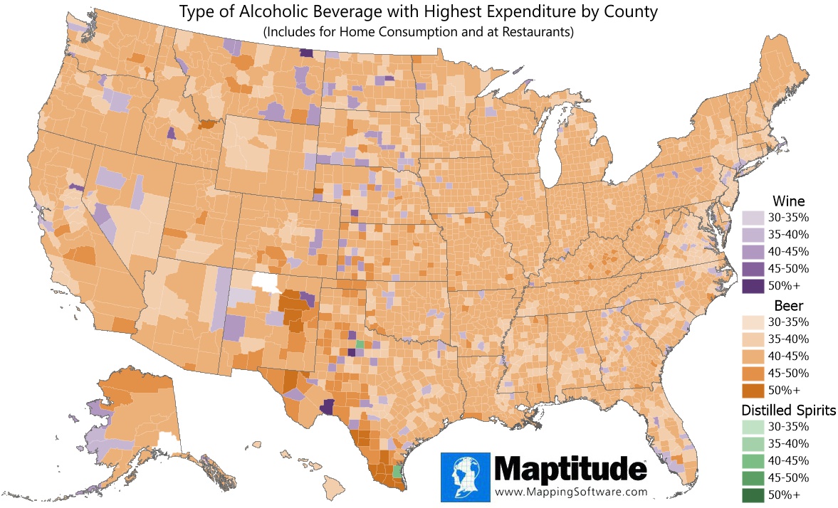
Map: Created with Maptitude Mapping Software by Caliper, April 2021
#Maptitude #expenditures #beer #wine #alcohol #spending
Home | Products | Contact | Secure Store
