This Maptitude map shows the per capita 2010 carbon dioxide emissions by country in metric tons.
If you need a custom map for your story, blog, or website, contact us because we offer a limited number of free custom maps on a first-come, first-served basis! See our Featured Maps for inspiration.
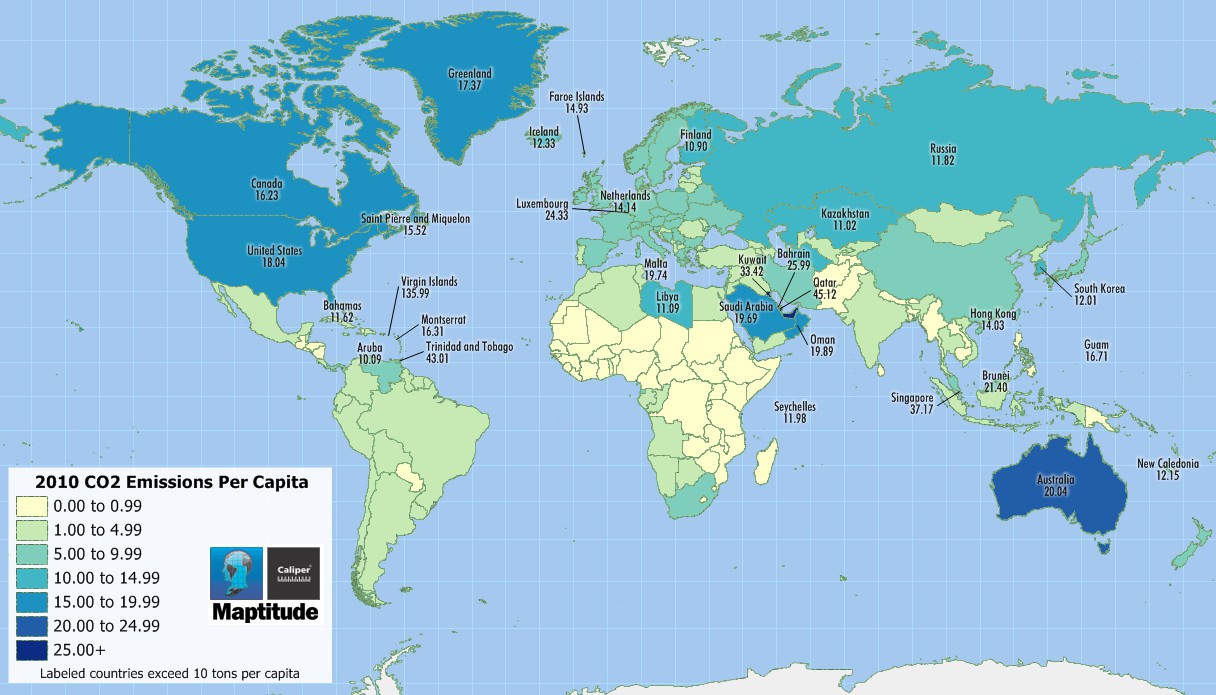
Map: Created with Maptitude Mapping Software by Caliper, December 2015
Home | Products | Contact | Secure Store
