Maptitude is the best mapping software for business intelligence! By combining the free Maptitude Consumer Expenditure Data and the Maptitude 2021 relationship map tool, variations in spending by region can be easily compared for powerful market insights. Here we explore which areas are spending more on healthcare versus dining out.
If you need a custom map for your story, blog, or website, contact us because we offer a limited number of free custom maps on a first-come, first-served basis! See our Featured Maps for inspiration.
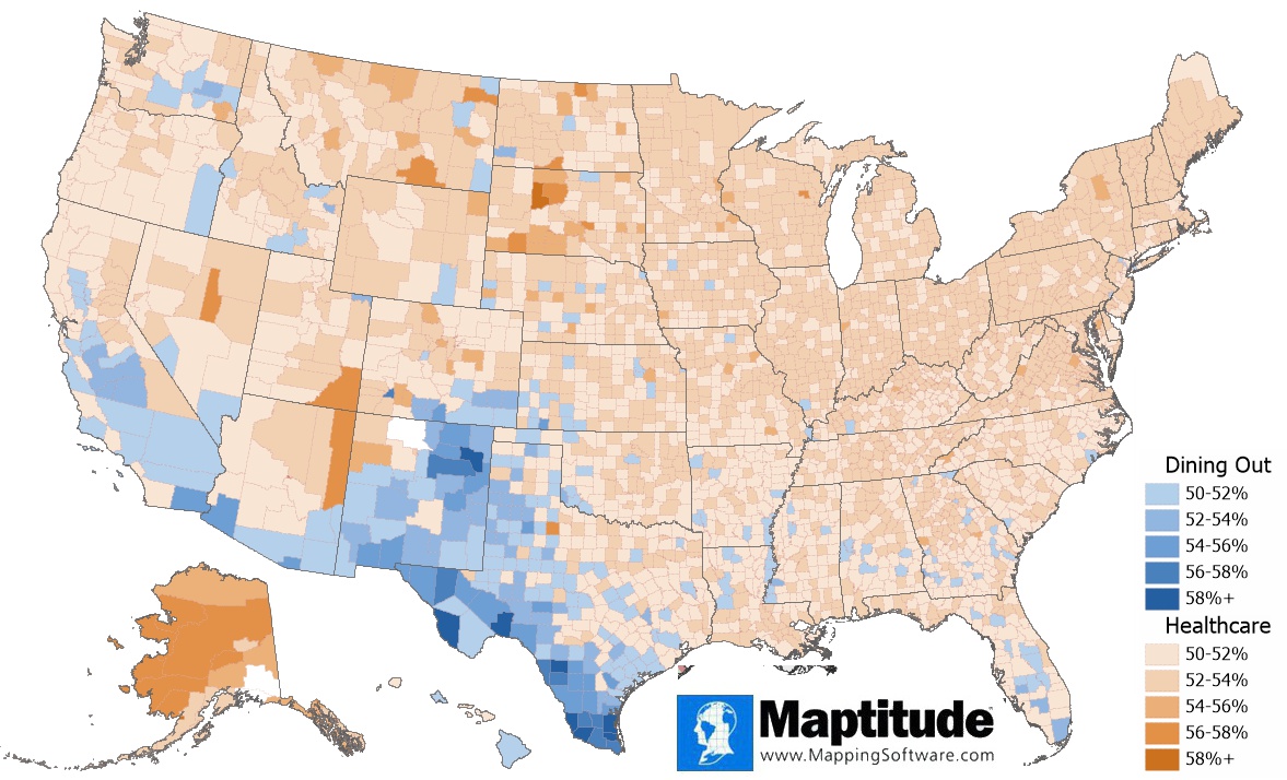
Map: Created with Maptitude Mapping Software by Caliper, April 2021
#Maptitude #expenditures #healthcare #restaurant #spending
Home | Products | Contact | Secure Store
