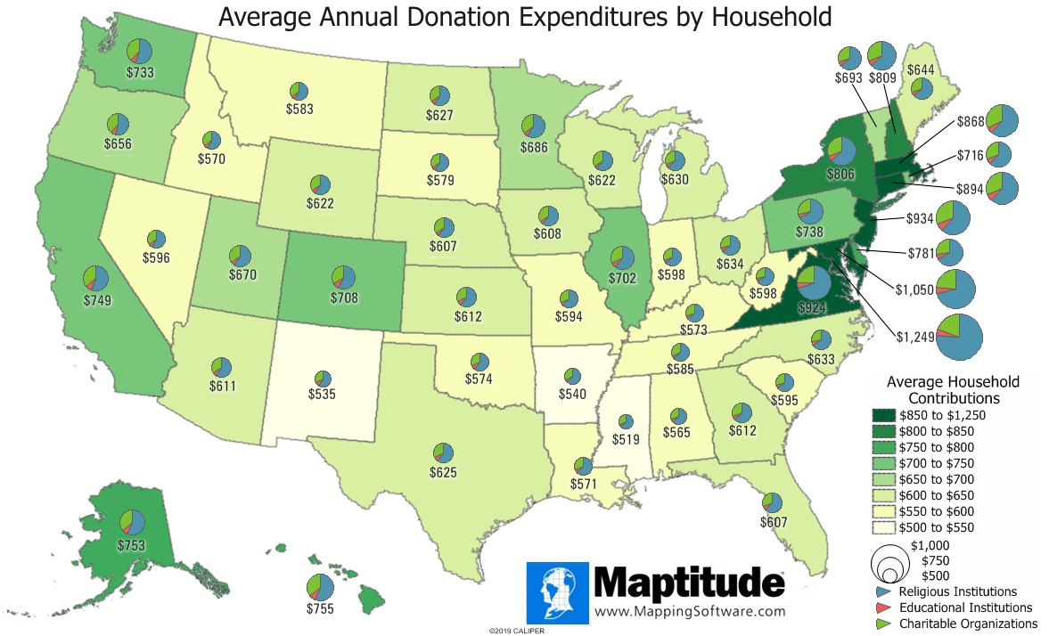
Maptitude is the best mapping software for business intelligence! This map shows the average annual household expenditures on charitable, educational, and religious contributions by state. The District of Columbia, Maryland, New Jersey, and Virginia have the highest contributions to these causes.
The pie charts show the distribution of donations to the three causes and show some regional variability. Donations to religious institutions account for the majority of these expenditures in all states, however residents on Oregon, Washington, California, and Hawaii choose to allocate just over 50% to religious institutions while residents of Washington DC, Maryland, Virginia, Delaware, and West Virginia allocate over two-thirds (67.1 to 76.3%).
Expenditures on donations are just some of the expenditure categories available for Maptitude. Users of the current version of Maptitude can download a free Census-tract level area layer with 395 fields of average annual household expenditures on items such as appliances, beverages, clothing, food, furniture, insurance, medical expenses, principal and interest on loans, recreation, transportation, travel, utilities, and more.
If you need a custom map for your story, blog, or website, contact us because we offer a limited number of free custom maps on a first-come, first-served basis! See our Featured Maps for inspiration.
Map: Created with Maptitude Mapping Software by Caliper, November 2019
#Maptitude #expenditures #donations #charity
Home | Products | Contact | Secure Store
