
Author: Richard Marsden
I was recently experimenting with the new Maptitude data of Zip Code Business Counts. Free for existing customers, this data lists the total number of businesses by type (NAICS code) for every zip code in the USA. This data represents a huge number of data fields, and it is recommended that users read Caliper’s matching PDF guide. They have also provided some useful sub-category totals.
I plotted a map using the sub-total of the Geophysics category – an industry I used to work in. Here is the result:
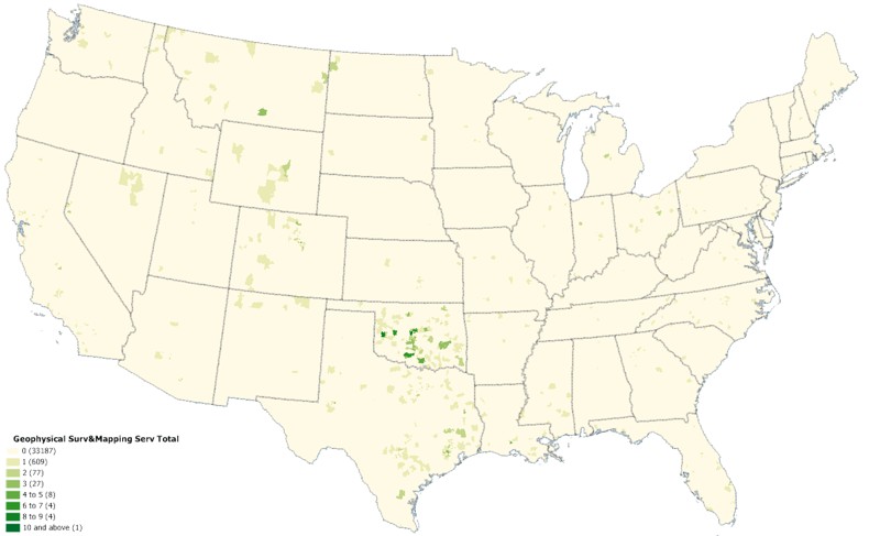
Plot of Number of Geophysics Companies in each ZIP Code
Of course geophysics companies are not that common, so most of the map is white (zero companies). But what is happening in Oklahoma!? When we think of geophysics we might think of California (earthquakes) or Houston (seismic exploration for the oil industry). Well, Oklahoma is seeing a mini oil&gas boom, but so are other places such as the Bakken Formation (Montana / North Dakota). Also, where is Houston?
Houston does in-fact have a ‘hotspot’ of geophysics companies, but the problem is that the choropleth map tends to hide it. Large zip codes (e.g. rural Oklahoma) cover a larger area than Houston zip codes which are much smaller. Oklahoma zip codes may have a similar number of companies but they are spread over a larger area, despite being more obvious to the human eye.
An alternative map is more appropriate. A 3d Prism Map shows the Houston hotspot:
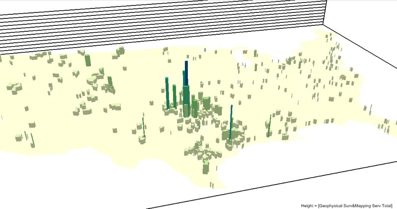
Geophysics Companies as a Prism Map
As well as Houston, you can also see a spike in Midland, Texas – this is the classic Texas oil patch.
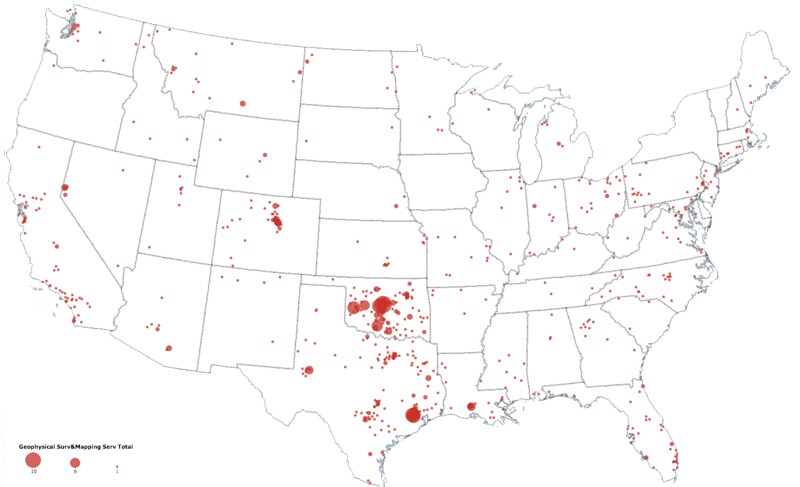
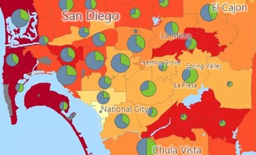
Geophysics companies with Sized Circles
Note that although Houston appears with a large circle, this circle hides other circles. A similar problem is seen in Oklahoma. The solution here would be to aggregate the data.
These maps demonstrate a common problem of choropleth maps. This problem of large areas tending to visually dominate small areas is very common in election maps, and is especially noticeable in the US with its two party system. Recent national US elections have never varied more than a few percent between the Democratic and Republican parties. However, Democratic votes tend to be concentrated in urban areas (small areas with high populations), and Republican votes tend to be concentrated in rural areas (large areas of low population). The result is a choropleth map that is very red (Republican) when in reality the votes are pretty evenly balanced.
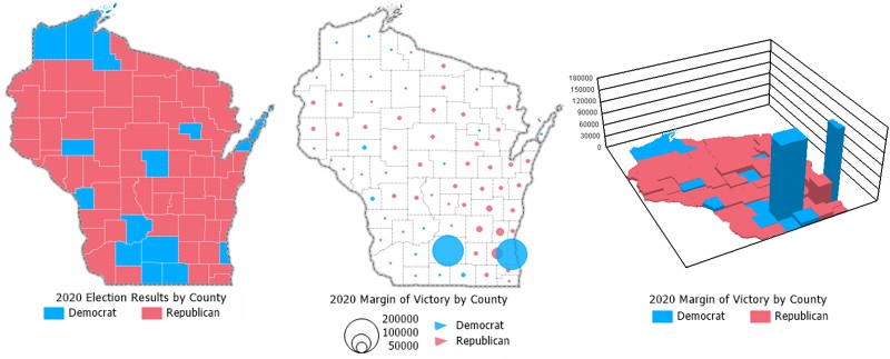
The solution to these choropleth problems is to use one of the approaches above which does not show the size of the underlying data areas. Ideally you would not use shapes with such unbalanced sizes. If the raw data was available, you would aggregate it to evenly sized ‘bins’ (typically squares or triangles) to produce a better representation of the data.
*Maptitude is a replacement for the discontinued MPCluster, MileCharter, and MPMileage plugins
Learn more about Maptitude to see how you and your team can use Maptitude for your business needs!
Schedule a Free Personalized Demo

Home | Products | Contact | Secure Store
