Last Updated: March 5, 2025
Maptitude has a tool to help you pinpoint the largest value between multiple attributes. The Color Theme (Multiple Fields) add-in provides you with a way to visualize and compare multiple fields of data. Also known as plurality maps, predominance maps, relationship maps, bivariate maps, or multivariate maps, multiple field themes can reveal patterns and let you see how items are connected.
This is achieved using a method known as multivariate choropleth mapping, in which multiple color ramps merge to display all pattern combinations in a grid-like legend. This tool allows you to rapidly view predominating values in your dataset. You can pick up to 10 numeric characteristics that all have the same unit of measurement (the denominator).
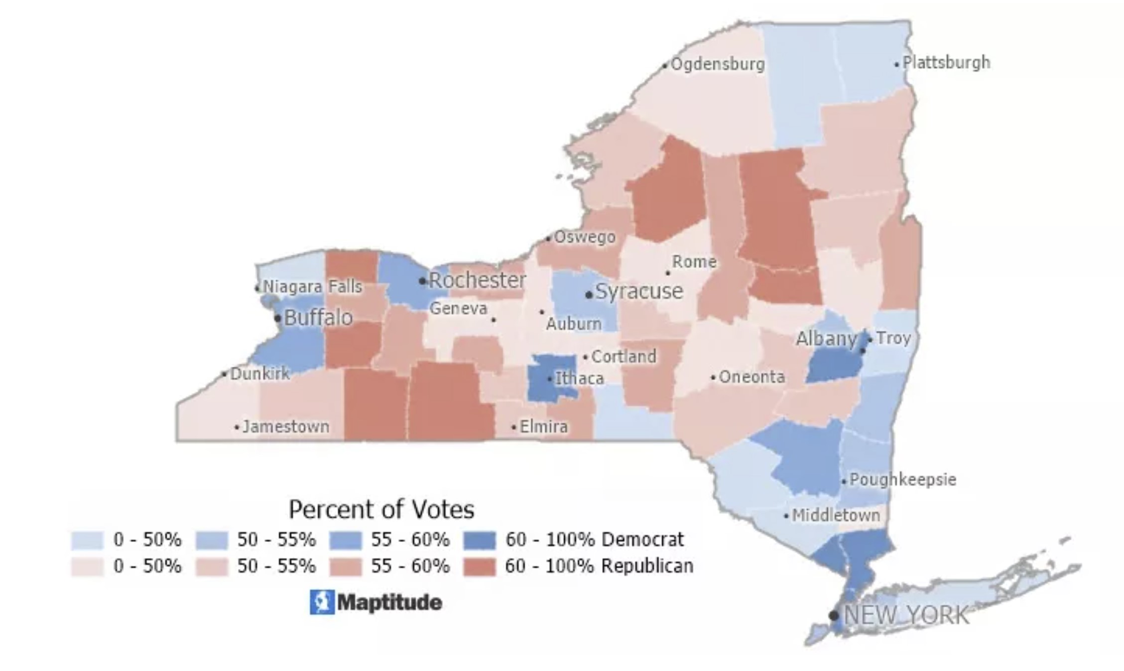
An election map or a voter registration map are good examples of how this technique can be useful. A voter registration map simply tells you which of two or more parties has the highest percentage of registered voters. For example, the map below shows party predominance by New York counties, as of February 2021. Darker colors indicate a high majority of voters for that party and lighter colors indicate that a party has a slimmer majority or just a plurality of voters within the county. A political scientist could use the tool to determine where there is a strong political party base.