
Author:
Stewart Berry
8 January 2025
In 2025, the emphasis on interactivity and user engagement in map creation has reached new heights, with tools introducing advanced visualization techniques, AI-powered insights, and seamless cross-platform accessibility.
Static maps are relics of the past. In today's data-driven world, businesses need interactive experiences that unlock insights, inform decisions, and engage audiences. But with a multitude of online mapping tools vying for attention, choosing the right one can be a challenge. This guide dives into the top 5 contenders, each offering unique strengths to help you create impactful interactive maps.
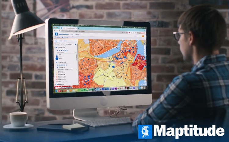
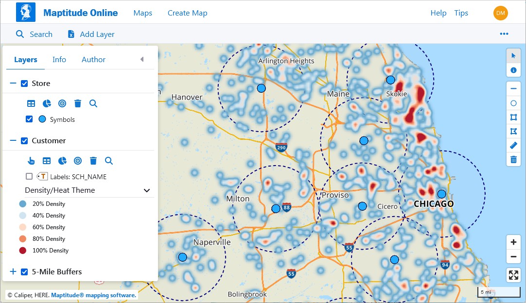
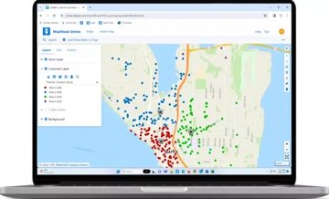
Maptitude stands out for its intuitive interface and seamless data import capabilities, ensuring accurate and accessible data visualization. It's not just about dots on a map; it's about interactive heatmaps revealing customer hot spots, choropleths painting the geographic landscape of demographics, and dynamic visualizations that tell compelling data stories.
Beyond aesthetics, Maptitude is a powerful decision engine. It empowers you to:
Collaboration thrives with the Maptitude Online web-based platform, making sharing interactive maps a breeze. Teams can explore data visualizations in real-time, fostering informed discussions and collaborative decision-making.
Maptitude remains a top choice for creating interactive maps, with 2024 updates enhancing its data visualization and accessibility features. New support for hierarchical territories allows users to manage complex geographic structures, such as regions, districts, and sales territories, directly on interactive maps. Additionally, Maptitude Online enables users to share maps as web applications, making it easier to collaborate on map projects across teams. With updated demographic and geographic data, Maptitude continues to offer the most comprehensive tools for building engaging, data-driven maps.


|
“Great product for the money. It is a very easy product to use and the online function makes it easy to share with clients.”
|

|
“The program allows you to create beautiful maps effortlessly. The maps can be tweaked and customized to convey the information to your targeted audience. For me, this makes Maptitude an excellent visual communication resource.”
|
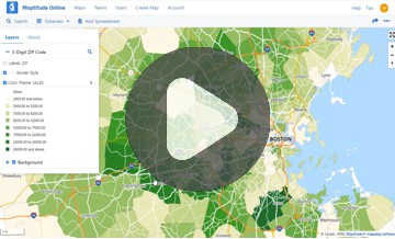
This interactive map lets you see household income by ZIP Code and 30-minute proximity to major airports.
For complex data analysis, ArcGIS Online reigns supreme. Its robust geospatial tools and vast template library cater to professionals and researchers who demand in-depth data exploration. However, its subscription model and potentially overwhelming interface might not suit casual users or smaller projects.
ArcGIS Online expanded its interactive mapping capabilities with updates in 2024. The June 2024 Update introduced the ArcGIS Web Editor, a web-based editing tool for seamless map updates, while the November 2024 Update enhanced the Map Viewer with new templates and an Express mode for building web apps. These features simplify the creation of detailed, interactive maps and make ArcGIS Online a versatile option for professionals and organizations.
Clean aesthetics and user-friendliness are CARTO's forte. Its drag-and-drop interface and intuitive design make it perfect for beginners who want to create beautiful maps without technical hurdles. However, its feature set might feel limited for advanced users seeking more customization options.
CARTO made significant improvements in 2024, focusing on interactive data visualization. New dynamic point clustering using H3 spatial indexes allows users to analyze large-scale datasets effectively, while the introduction of the _carto_point_density styling property provides advanced visualization options for point-based data. Improved URL parameter sharing in Builder maps simplifies the reuse and customization of maps for different audiences, making CARTO a powerful tool for analysts and map creators.
Developers, rejoice! Mapbox boasts stunning visuals and a powerful API, enabling you to build custom map experiences with ease. Its extensive plugins and integrations cater to your needs, allowing for personalized maps and seamless website integration. However, the steep learning curve and focus on customization might not be accessible to everyone.
Mapbox introduced several enhancements in 2024, solidifying its role as a developer-centric platform for creating advanced interactive maps. Its Winter Release 2024 expanded Asian data coverage with over 21,000 new boundaries, while the Spring Release 2024 improved 3D styling by adding custom-designed landmarks for over 100 cities and 15 airports. The latest version of Mapbox GL JS introduced features like indoor mapping and precipitation visualization, enabling innovative and dynamic map experiences. These updates make Mapbox ideal for users seeking customization and real-time interactivity.
On a tight budget? Zeemaps offers a free tier with surprisingly powerful features. Its intuitive interface and affordable pricing make it ideal for individuals, educators, and small businesses who need a basic but effective tool. However, its limited data storage and lack of advanced features might not be sufficient for larger projects or complex data sets.
Zeemaps introduced updates in 2024 to improve its customization options for creating interactive maps. Users can now upload custom images as map markers, visualize radius-based areas using pinned circles, and access an expanded palette of colors for map customization. While best suited for smaller projects, these features enhance the platform's usability for basic interactive map creation.

Maps are powerful tools for communication, education, and decision-making, and their influence continues to grow in our increasingly interconnected world.
Interactive maps have become the go-to tool for bringing data to life, engaging audiences, and uncovering hidden insights. But with so many options at your fingertips, choosing the right type of interactive map can feel like navigating a maze. To help you on your journey, let's explore some of the most common types and their potential applications:
1. Heatmaps: These vibrant visual displays reveal the intensity of a data point across a geographical area. Hotspots practically jump off the screen, highlighting areas with high activity, customer concentration, or potential risk. Imagine pinpointing areas with the most website traffic, identifying crime hotspots in a city, or visualizing temperature variations across a region.
2. Choropleths: These thematic maps use color gradients to depict the distribution of a specific data point across different geographical units. Think of regions painted with hues that represent population density, income levels, or election results. Choropleths instantly reveal geographic patterns and trends, making them ideal for comparing data across different locations.
3. Bubble Maps: Forget flat circles! These interactive maps allow bubbles to grow and shrink based on data values, offering a captivating way to visualize variations in multiple dimensions. Imagine bubbles representing sales volume pulsating on a map or tracking the size and movement of hurricane systems over time.
4. Line Maps: These dynamic maps connect points with lines, revealing trends, relationships, and movement across space and time. Picture visualizing migration patterns of a bird species, tracking delivery routes in real-time, or showcasing the spread of a disease through interconnected nodes.
5. Pie Charts & Donut Charts: Ever wanted your pie charts to interact with a map? These interactive maps embed pie or donut charts within geographical locations, offering a localized view of data distribution. Imagine visualizing budget allocation across different departments within a city or analyzing customer preferences in specific regions.
6. Scatter Plots: These interactive maps overlay data points on a map, allowing you to explore relationships and identify correlations between different variables. Picture investigating the correlation between crime rates and income levels in different neighborhoods or analyzing the relationship between temperature and crop yields across a region.
7. Network Maps: These maps visualize connections and relationships between entities, revealing complex networks and interactions. Imagine mapping the flow of goods across a supply chain or showcasing the interconnectedness of social media users within a specific community.
As we move into 2025, the tools featured here continue to set the standard for creating interactive maps, enabling users to visualize, share, and analyze geographic data with unprecedented ease and precision. Choosing the right tool depends on your specific needs. Consider factors like your target audience, technical expertise, budget, and desired functionalities.
Maptitude stands out for its balance of user-friendliness, powerful features, and data-driven insights. Whether you're a business leader seeking informed decisions, a researcher uncovering hidden patterns, or a marketer crafting targeted campaigns, Maptitude is your interactive map companion.

|
“A picture speaks a thousand words. Being able to create a sales tool in a few clicks is priceless.”
|

|
“At my company we're pretty heavy into automation. Maptitude offers very user friendly automation of maps. We have clients that need maps created for over 300 stores. Imagine having to manually create 300+ maps. Maptitude can generate those maps in about 20 minutes.”
|

|
“We are able to do things with Maptitude that we had not dreamed of doing before (using MapPoint and Territory Mapper). There are so many possibilities, that you can easily create a mapping solution that perfectly meets the need of your business model.”
|
Ready to experience the power of data exploration? Dive into Maptitude and discover a world where your data takes center stage.
Learn more about Maptitude to see how you and your team can benefit from mapping software!
Schedule a Free Personalized Demo
 Check out our G2 Reviews
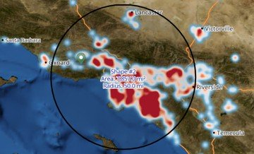
Home | Products | Contact | Secure Store
