Last Updated: March 5, 2025
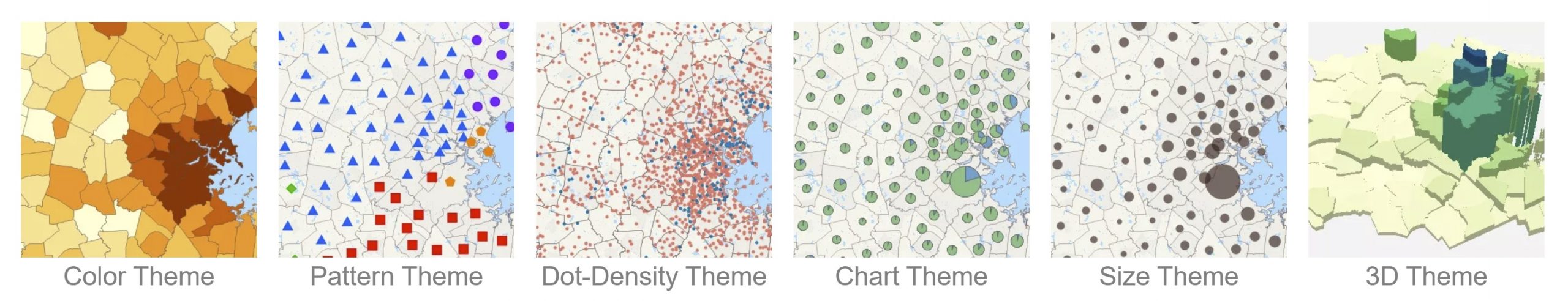
Maptitude can combine information about map features to create a map that illustrates the patterns in the data. This is called a thematic map. Thematic maps use distinctive colors, symbols, and fill styles to portray data such as population, customer visits, or income. The different styles highlight the similarities and differences among map features.
In some types of thematic map, Maptitude changes the appearance of each feature based on its characteristics. In other thematic maps, Maptitude displays charts or symbols for each feature to illustrate comparative information. When data are portrayed in a thematic map, the information becomes easier to see, understand, and interpret.
Below we discuss the best practices for the most common types of thematic map visualizations. For details on how to set up thematic maps, see: https://www.caliper.com/learning/media/how-to-make-a-thematic-map-in-maptitude/
How do I use color, pattern, and symbol themes?
Color themes (also called choropleth maps) and pattern/symbol themes work in the same way. They both group the features in a map layer into classes, based on the value of a data column. Each class contains all the features with similar values for the chosen field. When the map is drawn, the classes are displayed using different colors, patterns (area and line layers), or symbols (point layers).
In general, for color themes:
- Lighter colors are best for themes on area layers
- Darker colors will be more legible with themes on point layers
- When creating color themes/heat maps, choosing a light color for low values and a darker color for higher values makes intuitive sense of the data for people viewing your map
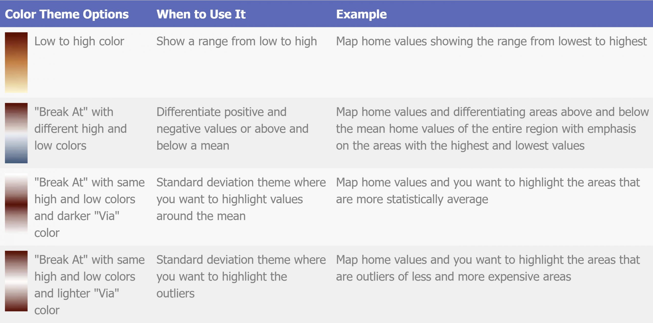
- Using the “Break at” option emphasizes outlier values and better differentiates positive and negative values or values above and below a mean
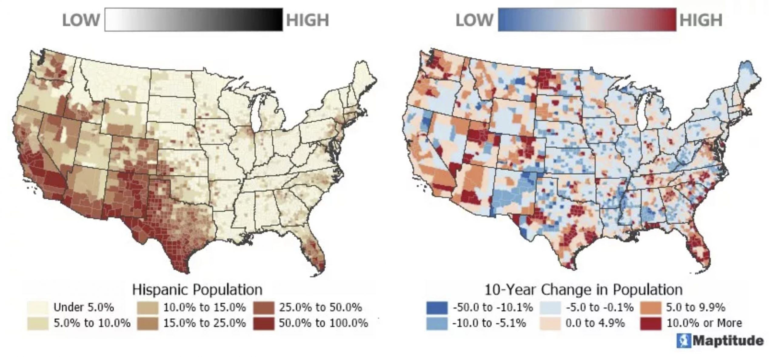
When mapping thematically, try changing the theme to see your data in a new way. If you are mapping something with important high or low values, try the default light-to-dark color ramps with the “Swap Start and End” option to have the darker color represent the highest or lowest values. Also, the “Break at” option lets you choose a “Via” color so that you can emphasize extreme values, as described in this chart:
Each theme method has color ramps designed for use with that theme and which are applied automatically to your map. In Maptitude, you can scroll through different color ramps, clicking Apply to see how they look. This allows you to assess whether the map’s colors provide the best impact for your target audience.
How do I use size themes?
A size theme uses symbols of different sizes or lines of different widths to show the value of your data. Two general recommendations for size themes are to:
- Make the range big enough to differentiate values, but not so large that they completely obscure the map
- Consider using a transparent style so that overlapping features are seen
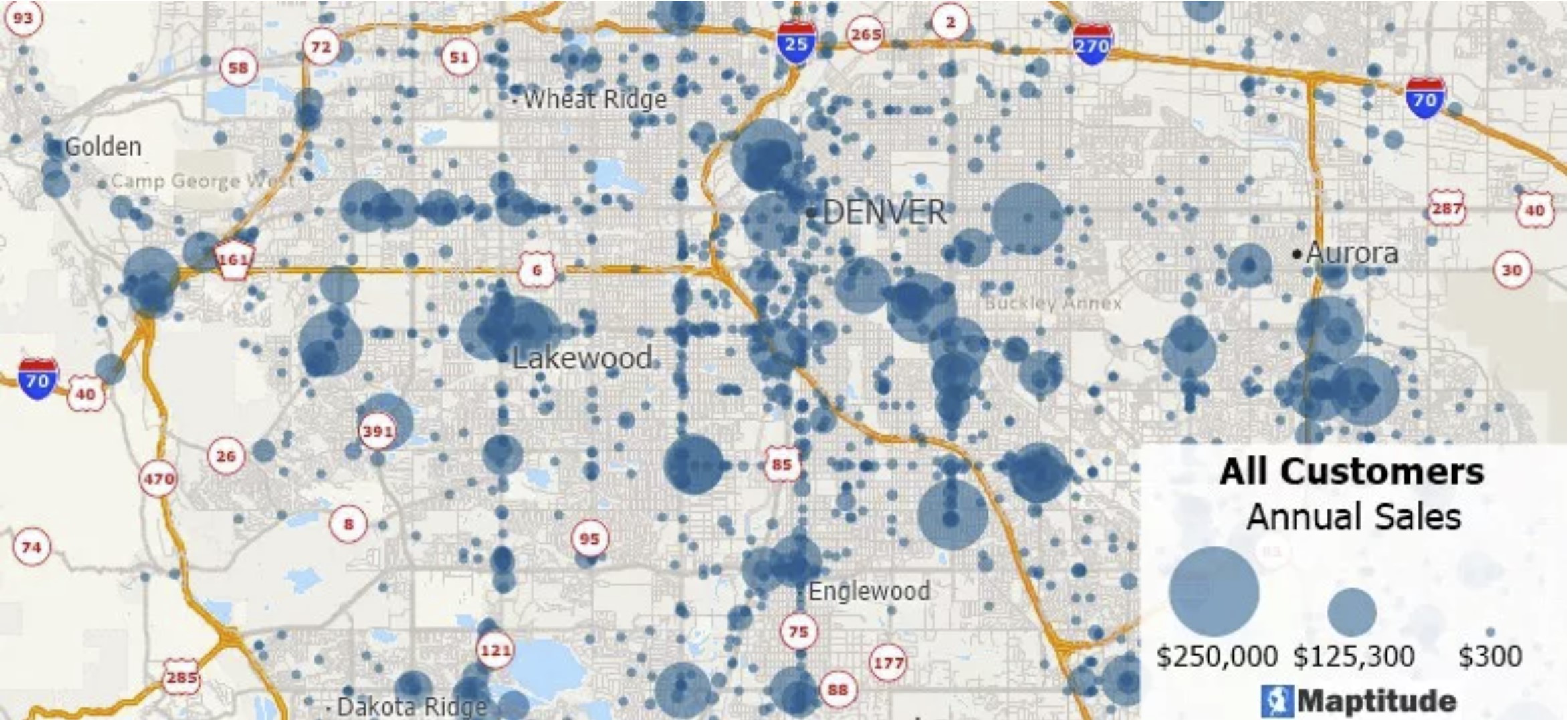
A map of customer locations with a size theme indicating the annual sales for each customer. A semi-opaque style makes it possible to see individual customers in dense locations or near customers with larger annual sales.
Because we are attempting to comprehend and communicate the patterns inside our data, we must be selective in how we assign color or symbol sizes to ensure that the chosen values make things clear. While all the theme tools allow you to ignore data above and below certain values, this technique is especially useful when used with size themes.
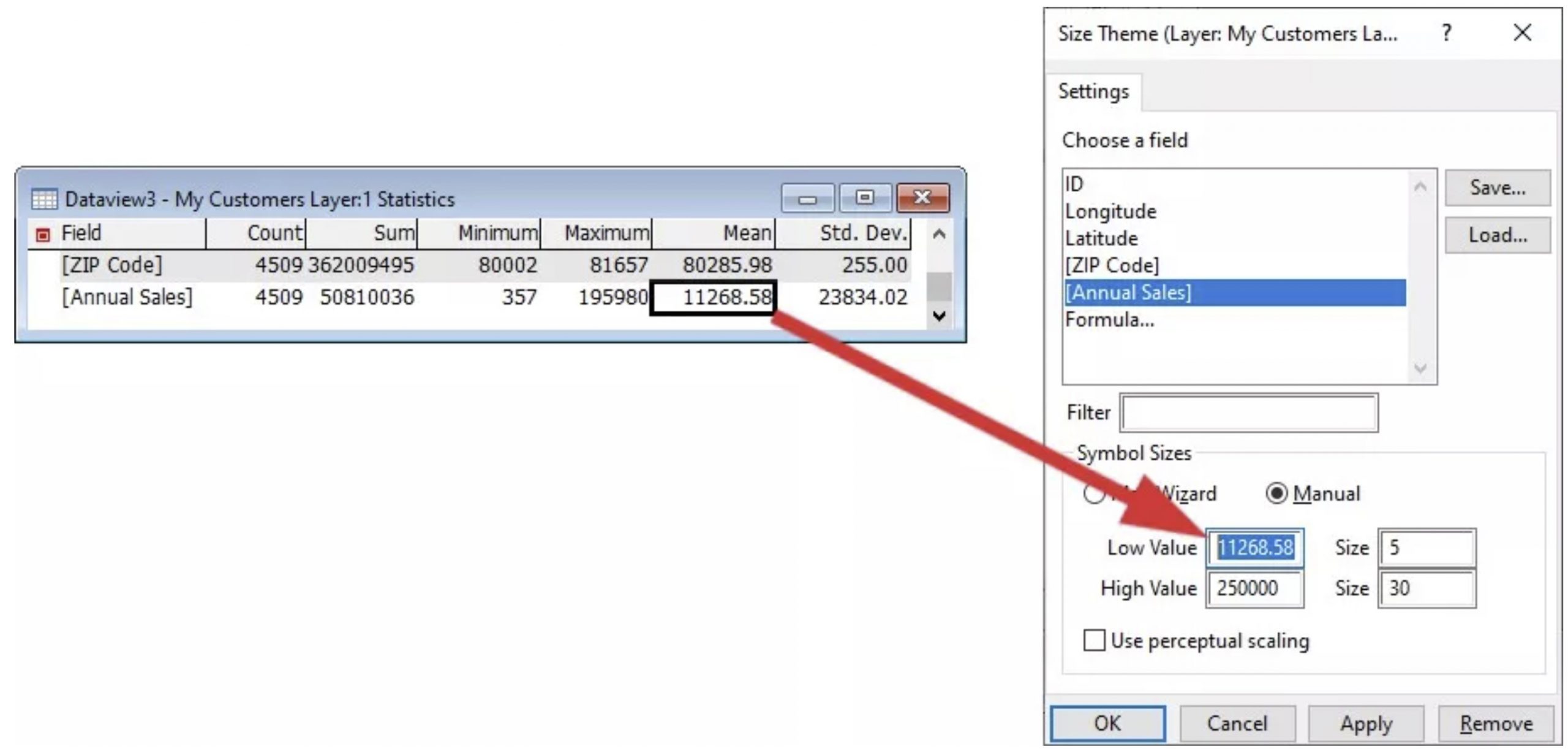
When using size to represent your data using the low/high value settings to adjust the map is especially useful for seeing the patterns hidden in our spreadsheets. Setting the Low Value to the average value is a simple approach to identify and display trends. This will draw attention to any numbers that are above average. To get the mean value that we will use as the input, we need to first open the dataview (Dataview>New Dataview) for our working layer and to choose Dataview>Statistics>Summary. You can then type or copy and paste the average into the Low Value item in the theme window.
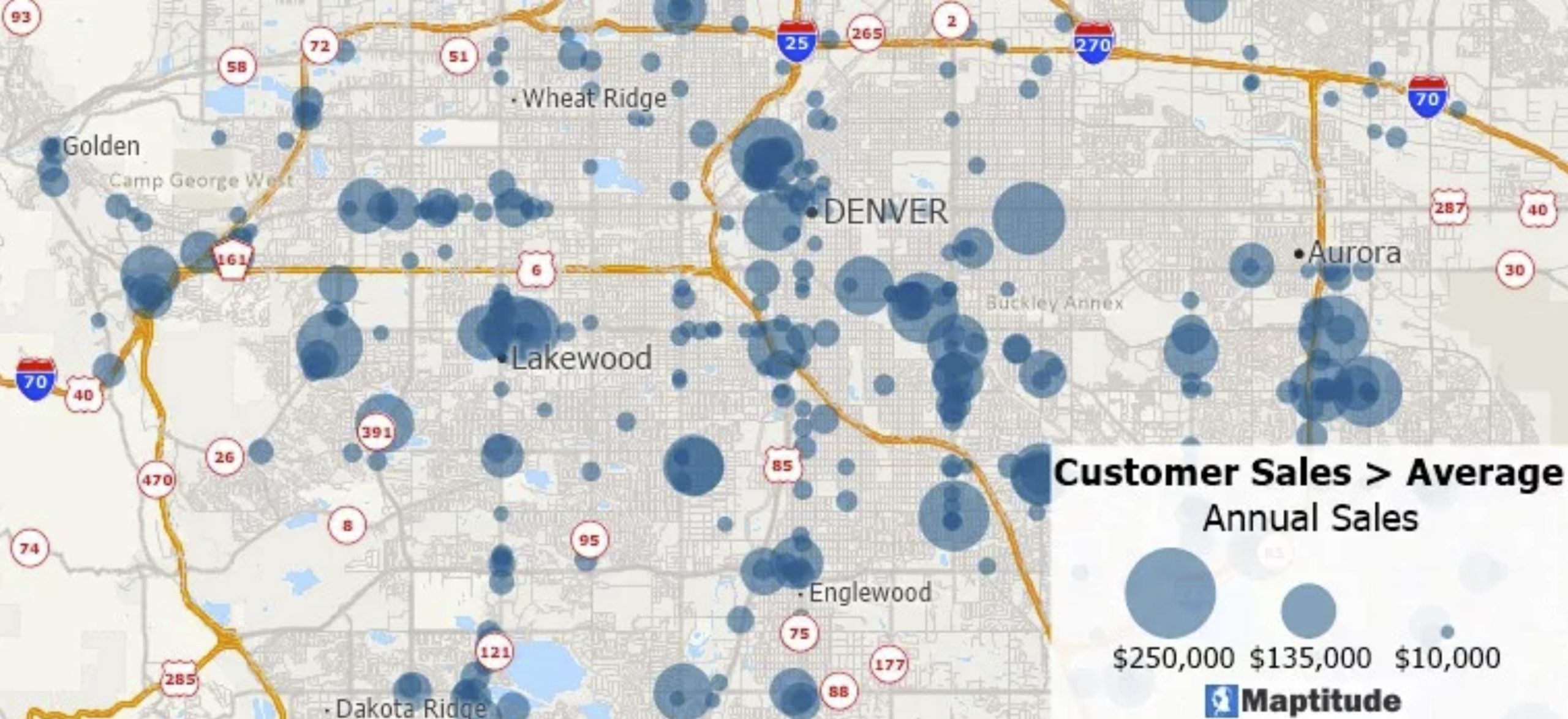
The map below depicts the customer data above, but only for the customers that exceed the average sales. This second map presents a clearer indication of where sales are higher without the noise of the many smaller customers.
How do I use chart themes?
Pie and bar chart themes are a type of thematic map that use pie or bar charts on map features to illustrate the data that go with each feature. Some general recommendations for chart themes are to:
- Consider using chart themes for temporal data, such as year-to-year sales or subway boardings by time-of-day so that trends can be spotted more easily
- Consider using pie charts when showing the portions that comprise a whole such as type of employment where the size of the chart indicates total employment, or home value ranges where the size of the chart indicates the total number of homes
- Choose a size appropriate for the map scale so that there is a minimal amount of overlap between the charts, and so that the charts are near the map features to which they apply
- Consider setting a minimum size so that low value charts are not so small that they cannot be easily read
- If displaying chart themes on top of areas that also have a color theme, choose colors that do not clash and with minimal color overlap

The bar chart theme on the left shows the change in sales by state over four years. The size of the pies in the map on the right indicates the total number of car dealerships in each state and the wedges indicate the portions of new and used car dealerships. The colors used in the themes contrast with the color themes and a minimum size has been set so that it is still possible to identify the sales trends in states with lower sales and the new and used car proportions in states with relatively few total dealerships.
See also: