Last Updated: March 5, 2025
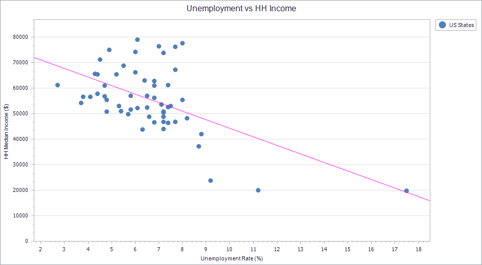
If you make a Scatter Plot from your data in Maptitude, a common visual aid you may want to add is a Regression Line, which analyzes any trend in your data to show if there is some correlation. This article goes over how you can add this regression line to your Charts. To follow the steps in this article you will need a scatter plot chart created in Maptitude. For help with creating this chart, see Creating and Working with Charts in the Maptitude Help. 
- Right-click somewhere on the chart and choose Edit
- On the left, go to Chart>Series and click the “+” to the left of whichever series of data you are wanting to make a regression line for. (e.g. in my example I click the “+” to the left of US States)
- Hover over Indicators and click the “+” in the circle to the right
- Choose Regression Line
- On the right, under the Properties tab, you can customize things such as the color of the line
- Click OK