Mapping Software and GIS Glossary
5 February 2025
A thematic map is a map created to display information about a topic or theme. Themes can be shown with a choropleth (color), heat map, sizes, charts, dot-densities, three-dimensional prisms, cluster (bubble), or cartogram. A bivariate thematic map combines two types of themes (e.g., color and size or color and prism) so that you can display information about two variables.
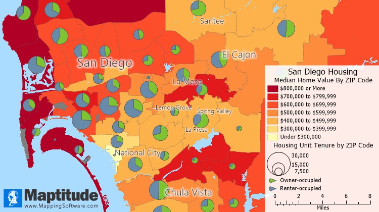
This thematic map uses a color theme (heat map) to illustrate the median home value in ZIP Codes around San Diego. ZIP Codes shown with a darker color have higher home values. This map also uses a chart theme to illustrate housing tenure. The size of the pie chart indicates the total number of housing units in the ZIP Code, and the pie pieces show the share of owner-occupied vs. renter occupied.
In some kinds of thematic maps, the appearance of each feature is based on its characteristics. In other types of thematic maps, charts or symbols on each feature illustrate comparative information. When data are portrayed in a thematic map, the information becomes easier to see, understand, and interpret.
Choropleth Theme
Symbol Theme
Dot-Density Theme
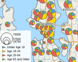
Chart Theme
Proportional Symbol/Size Theme
3D Theme
Thematic maps illustrate the characteristics of map features, so that the characteristics are easy to see and understand. A map theme is a styling of map features according to the values of one or more data fields. Choosing the correct theme can be tricky. The table below helps you choose the correct tool for the data you are using.
| If your data contain... | For example... | Then you should... |
|---|---|---|
| Counts or amounts | Population, Sales | Use any kind of theme |
| Percentages, ratios, or averages | Mean Income, Percent Hispanic | Avoid dot-density themes |
| Negative numbers | Change in Population | Use color or symbol themes |
| Non-numeric information | Zoning, Sales Territory | Use color or symbol themes |
Maptitude Mapping Software gives you all of the tools, maps, and data you need to analyze and understand how geography affects you and your business. Create informative color, chart, scaled-symbol, prism, heat, and dot-density thematic maps that show the characteristics of your area of interest.

|
“Maptitude has a wealth of analytical features that satisfy my ongoing needs in the area of demographic analysis. Regular in the business/demographic sphere include thematic mapping, route planning, territory design, trade area analysis and location/allocation modelling.”
|
 |
“I've made tons of use of the themes (you can color the maps with backgrounds based on the included geodemographics). I've also used the band feature - retailers LOVE it. I recommend it ALL THE TIME!”
|
 |
“All of the tools you need to do spatial analysis are included in the software at the base price. No need to pay for costly add-ons or extensions. This includes state, county, MSA, zip code and census tract level line work and data including all 255 Census fields. The user has the ability to do point maps, thematic maps, drive-time rings and advanced spatial and statistical analysis.”
|
 |
“Thematic maps are truly unique in terms of graphic capabilities and data representation, highly appreciated by customers. With a low cost combined with an excellent training program and support service, Maptitude is an added value for my business!”
|

|
“I've been using Maptitude by Caliper mapping software for over 20 years and love it! The functionality and value are industry leading in the Thematic Mapping space. Check out this software if you are looking for a way to show data in visual ways you didn't know existed. Good stuff! :)”
|
A choropleth map (also called a color theme) is a thematic map in which points, lines or areas are shaded to represent different data values. In a typical example, administrative areas are colored or shaded according to the range in which the aggregated statistic of interest falls.
Choropleth maps are often confused with heat maps. A choropleth map represents distinct data values for geographic features such as states, counties, or postal codes. A heat map shows a continuous representation of density using grid cells. A location that is "hot" and colored red in a heat map could be between and encompass geographic features such as high sales location points.
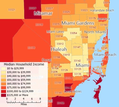
A choropleth map of quantitative data: This map uses color to illustrate the median income by ZIP Code in Miami, Florida. The darker the color, the higher the median income is in that ZIP Code.
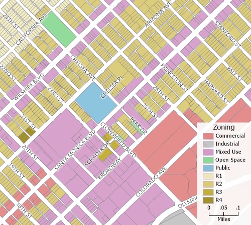
A choropleth map of nominal data: This map uses color to illustrate how each parcel is zoned.
This interactive choropleth map lets you see the per capita GDP of each U.S. county.
Choropleth Maps:
A heat map is used to visualize and analyze point data by transforming the points into a density grid. Each resulting grid cell is assigned a value that is determined by the proximity of nearby points, optionally weighting each point using a weighting value. Heat maps use color palettes that represent the values from low to high. Geographic heat maps are often confused with choropleth maps, but a heat map does not conform to geographic locations such as states, counties, postal codes, or land parcels.
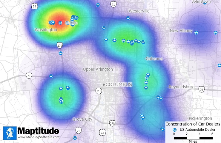
A heat map can illustrate the concentration of stores across a city to help you visualize over and underserved areas.
Heat maps are best used for visualizing data that has a geographical component. They are particularly effective for showing the intensity of a variable across a region. For example, map crime data to find hot spots, map vehicle miles traveled to find areas of congestion and higher air pollution, and analyze the pattern of clients around a store weighted by the cost of their purchases to find areas that are underserved.
This interactive heat map shows where there are larger concentrations of private schools.
Heat Maps:
See also: How do I create a heat map of my locations?
A size theme (also called a scaled-symbol or graduated-symbol theme) is a type of thematic map that uses symbols of different sizes or lines of different widths to show the value of a data field. Features that have a greater value for the chosen field will be shown larger or with a greater width.
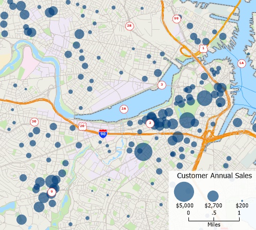
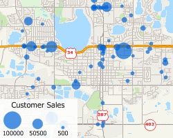
A point layer of customers with a size theme on the value of sales. Customers with higher sales are shown with a larger symbol.
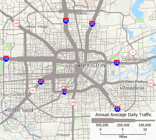
A line layer of highways with a size theme on the value of vehicle flow. Highways with more traffic are shown wider than those with less traffic.
This interactive size theme map lets you see the the locations of hospitals and the number of beds that they have.
Graduated Symbol or Size Maps:
Pie and bar chart themes are a type of thematic map that use pie or bar charts on map features to illustrate the data that go with each feature.
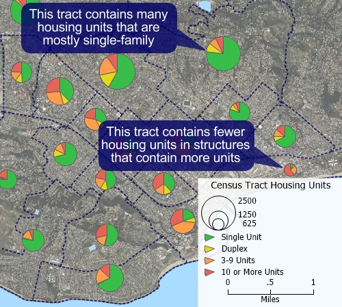
A pie chart theme where the size of the chart indicates the number of housing units in a Census Tract and the pie wedges indicate the size of the structures that contain those units.
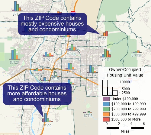
A bar chart theme that shows the number of owner-occupied housing units in each ZIP Code within different value ranges.
This interactive chart theme map shows the commute times for workers in each state.
A dot-density map is a type of thematic map that uses dots or other symbols on the map to show the values of one or more numeric data fields. Each dot on a dot-density map represents some amount of data.
In a dot-density map, areas with many dots indicate high concentrations of values for the chosen field and fewer dots indicate lower concentrations.
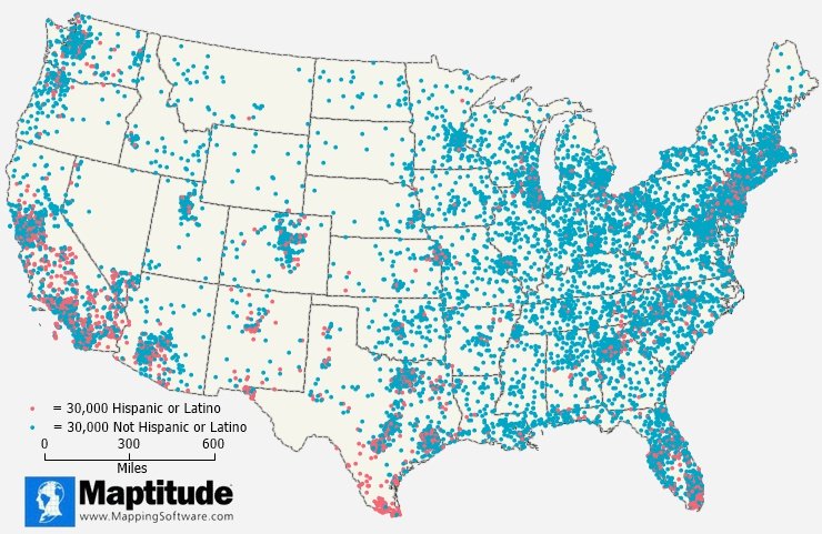
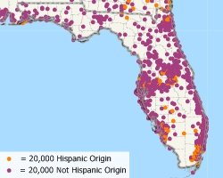
This Maptitude dot-density map shows the distribution of the Hispanic and Non-Hispanic population. Each blue dot represents 30,000 Non-Hispanic people and each red dot represents 30,000 Hispanic people. Population dense areas have many dots and less populated areas have fewer dots. Areas with higher Hispanic populations stand out in central California, southern Texas, and southern Florida.
Dot-Density Maps:
A prism map is a three-dimensional thematic map that uses prisms to show the relative values of a data field where higher prisms indicate areas with higher values.
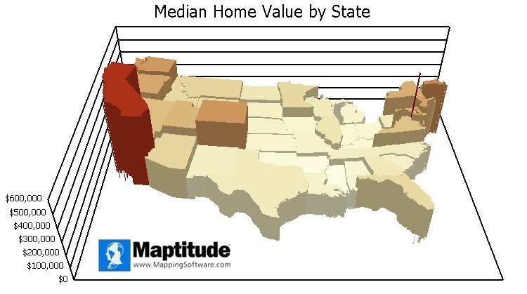
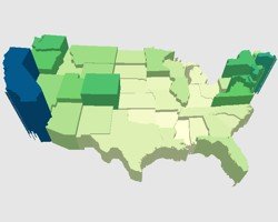
An example of a prism map where states are depicted as three-dimensional prisms whose heights indicate the median home value.
A cluster map (also known as a bubble map) is a type of thematic map that uses clusters of symbols or bubbles to represent and analyze spatial patterns in point data. Each cluster or bubble represents a grouping of items based on proximity and often varies in size to reflect the quantity or magnitude of the data within that group.
To create a cluster map, spatial data points are aggregated based on their proximity to one another. As the user zooms in, the clusters break apart to reveal smaller clusters or individual points. Conversely, zooming out combines points into larger clusters. The visual representation typically involves varying the size of the bubbles to indicate the number of points they contain.
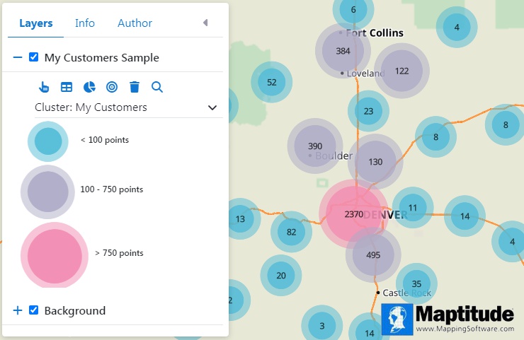
An example of a cluster map where individual points for all of the customers would be too dense to differentiate so they are combined into clusters based on proximity and the clusters are labeled with the number of customers that they represent
Cluster Maps:
This interactive cluster map shows where there are larger concentrations of private schools.
A cartogram is a map that is rehsaped to represent data such as population demographics, business data, or natural phenomena. In the map below, for example, the sizes of the states represent the total number of African Americans.
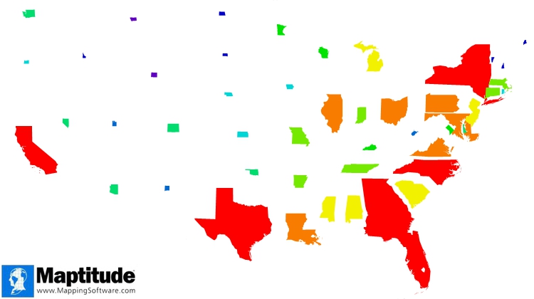
A cartogram of African American population by state. States with a large African American population are shown larger than states with a small population.
A bivariate map is a type of thematic map that displays two variables by using different colors and/or symbols. The variables in a bivariate map can be on the same layer or separate layers.
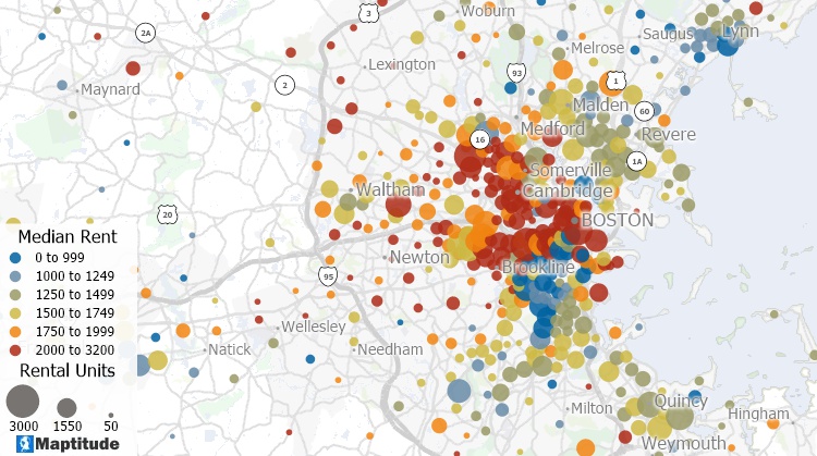
This bivariate map uses color and size on the same layer to show the number of rental units and median rent in different Census tracts. The size of the dots indicates the number of rental units and the color indicates the rent.
Thematic maps are used by a wide range of people for a variety of purposes. Some common users of thematic maps include:
Overall, thematic maps are used by anyone who needs to understand and visualize geographic data in order to make informed decisions or communicate information to others
Reading a thematic map involves understanding the meaning of the symbols, colors, and other visual elements used on the map. Here are some steps to follow when reading a thematic map:
the main difference between a thematic map and a physical map is the type of information they represent. Thematic maps focus on a specific theme or subject such as demographic or business characteristics. Physical maps show the physical features of an area, such as mountains, rivers, lakes, and coastlines.
There are a few steps you can follow to create a thematic map in Excel:
There are many types of thematic maps, which are maps that are designed to illustrate a specific theme or subject.
The top five types of thematic maps are:
Yes, political maps are a type of thematic map. Thematic maps are maps that are designed to illustrate a specific theme or subject, and political maps are a type of thematic map that show the boundaries of different political entities, such as countries, states, provinces, and other administrative divisions.
Political maps can be used to understand the political divisions of a region and how they relate to one another. They can also be used to show the location of important political features, such as capital cities and major cities.
Political maps can be created at different scales, from global maps that show the entire world to more detailed maps that show the political divisions of a specific country or region. Political maps can be useful for a variety of purposes, including studying geography, understanding the political landscape of a region, and supporting decision-making in areas such as business, politics, and diplomacy.
Topographic maps are a type of thematic map that depict the three-dimensional shape and surface features of the earth's surface. They are used to represent the natural and man-made features of an area, such as mountains, valleys, rivers, roads, and buildings.
Topographic maps are produced by government agencies and are used for a variety of purposes, including land-use planning, resource management, and recreational activities such as hiking and fishing. They are often used in conjunction with other types of thematic maps, such as maps showing vegetation or land cover, to provide a more complete picture of an area.
Topographic maps use contour lines to show the elevation of the land surface. The contour lines are spaced at regular intervals, usually in feet or meters, and are used to show the slope of the land. The closer the contour lines are together, the steeper the slope. Topographic maps also include a legend that explains the symbols and colors used on the map.
Learn More Free Trial Free for Students/Teachers
![]()
![]()
![]()
![]()
![]()
![]()
![]()
![]()
This video provides step-by-step instructions for how to create attractive and informative theme maps.


Home | Products | Contact | Secure Store
