Last Updated: March 5, 2025
Cartographic labeling is the technique of positioning text on a map in relation to map features, which collectively reflect real-world characteristics and attributes. Text successfully used in maps generates maps that are clear, instructive, and appealing. For details on how to add labels to maps, see: https://www.caliper.com/learning/media/working-with-labels-on-maptitude-maps/
When you label features, Maptitude automatically decides exactly which locations should be labeled and where the text should be placed. Each time the map is drawn, Maptitude displays the most effective combination of labels. There are several ways to make labels clearer and more comprehensible, such as:
- Using halos, shadows, or frames: You can add a shadow or halo around each label, or you can enclose each label in a frame or shield. Doing so can help the labels stand out more clearly against features drawn behind the labels.
- Labeling more important features with a larger or bolder font to make them stand out
- Stretching area labels: For area layers, you can stretch labels so that they fill the area with which they are associated. If you choose to stretch labels, Maptitude increases the spacing between characters so that the label fits the area it describes.
- Using colors that complement the features they label, such as using blue labels for water features, or labels that are the same color as the point feature that they are associated with, making it easier to see which location the text refers to.
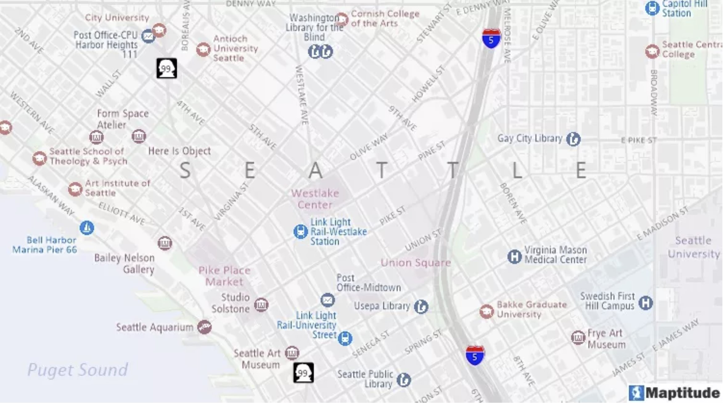
The above map uses a variety of label features: The “SEATTLE” label is stretched, Interstate 5 and Washington Route 99 use highway shields, the streets and landmarks have white halos, and all of the labels use colors relative to the features that they reference.