Last Updated: March 5, 2025
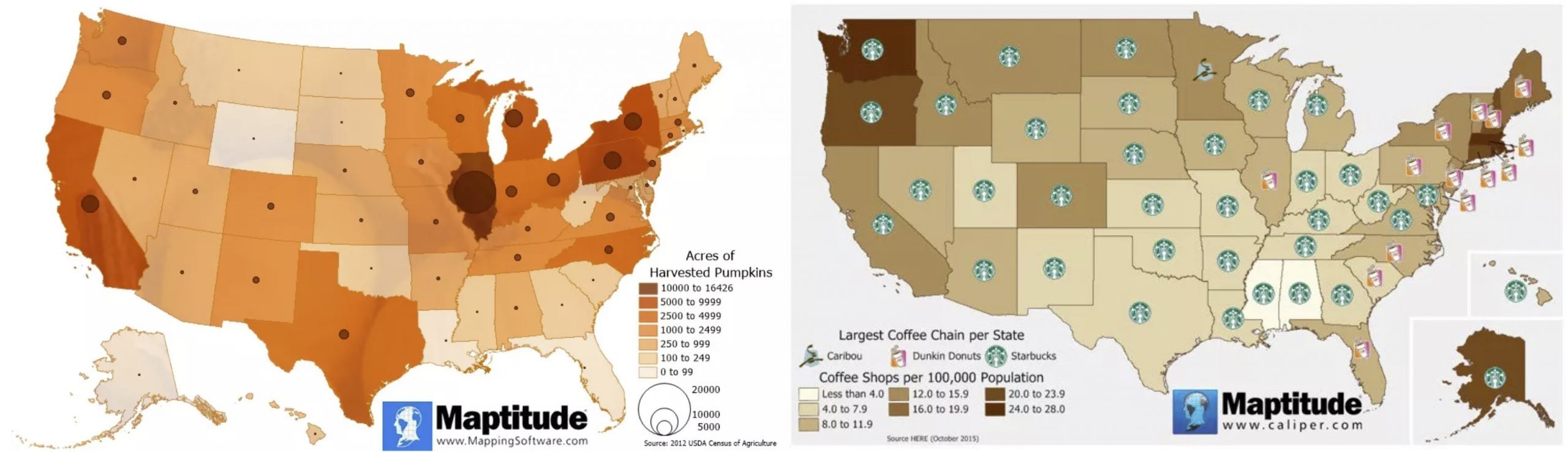
Maptitude has a plethora of color ramps to assist you in displaying your data, including choices that are color-blind friendly. Choosing a color ramp that corresponds to the context of your data helps to clarify your message. For example, a map of pumpkin harvest by state uses shades of orange where darker shades indicate states that produced more pumpkins and a map of coffee shops by state uses shades of brown where darker shades indicate states with more coffee shops. In these examples, we’re choosing colors that are directly related to the message we’re attempting to communicate.
Remember that:
- Most people can easily distinguish only six or seven different colors.
- While choosing a light color for low values and a darker color for higher values makes overall patterns clearer, the individual categories may be hard to tell apart when there are more categories.
- Having a clear and concise legend can be vital.
- Showing layers such as landmarks or towns can add context for people viewing your map. However, you should keep the number of layers in a map to a minimum to avoid confusion and to better show only the data in which you are interested.
For details on how to make a color theme, see: https://www.caliper.com/learning/articles/how-do-i-create-a-color-theme-map/