The November 2020 Maptitude Blog contains a detailed analysis, exploring the best site for a business such as a healthcare location. This article will walk through each step of this analysis to explain how it was done. This kind of analysis can be done for any industry not just dentist offices.
Step 1: Add Layers to Map
The first step in the analysis is to add the layers you want to use to the map.
1. Open any map of the USA
2. Go to Map>Layers… and click Add Layer
3. Browse to where you have the Consumer Expenditure data installed
a. If you do not have the Consumer Expenditure data installed, download them from our online store
4. Choose ccConsumerExpenditure.Cdf and click Open
5. Browse to where you have the Healthcare data installed
a. If you do not have the Healthcare data installed, download them from our online store
6. Choose ccHealthcareOrganization.Cdf and click Open
7. Browse to where you have the Address data installed
a. If you do not have the Address data installed, download the buildings and the address points from our online store
8. Choose ccAddressPoint.Cdf and cc.Building.Cdf and click Open
9. Click Close and check that the layers have been added to the Display Manager
Step 2: Create the Theme
The first piece of analysis done in the Blog is to show where there is above and below average spend on Dental Care. To do this we will create a color theme.
To create a color theme on Consumer Expenditure:
1. Make Consumer Expenditure the working layer
2. Click ![]() in the main toolbar
in the main toolbar
3. For Field choose [Dental Care]
4. For Method choose Nested Averages
5. For # Classes choose 4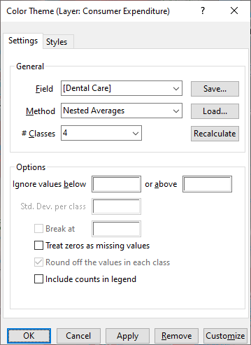
6. Go to the Styles tab
7. Under Color Sets, choose From to be blue and choose To to be a shade of red
8. At the top, highlight Other and click Style
9. Change Fill Style to None and click OK
10. Highlight the first class after Other and click Style
11. Change the Fill Opacity to 50 and click OK
12. Click Copy Pattern and click OK
This will create and style the theme for dental care expenditure:
Step 3: Select Dentists
The following steps outline how to filter the healthcare data:
Each record in the healthcare layers has up to 15 taxonomy codes for services provided. Therefore, to filter the records, you will need to create a filter that checks each of the taxonomy fields for the value of interest to you.
1. Make Healthcare the working layer
2. Choose Selection>Select by Condition to display the Select by Condition dialog box.
3. Use the Condition Builder to create a filter that checks the primary taxonomy field for the codes for dentists. Create the following formula:
[Primary Taxonomy] = “122300000X”
OR [Primary Taxonomy] = “1223D0001X”
OR [Primary Taxonomy] = “1223D0004X”
OR [Primary Taxonomy] = “1223E0200X”
OR [Primary Taxonomy] = “1223G0001X”
OR [Primary Taxonomy] = “1223P0106X”
OR [Primary Taxonomy] = “1223P0221X”
OR [Primary Taxonomy] = “1223P0300X”
OR [Primary Taxonomy] = “1223P0700X”
OR [Primary Taxonomy] = “1223S0112X”
OR [Primary Taxonomy] = “1223X0008X”
OR [Primary Taxonomy] = “1223X0400X”
OR [Primary Taxonomy] = “124Q00000X”
OR [Primary Taxonomy] = “125J00000X”
OR [Primary Taxonomy] = “125K00000X”
OR [Primary Taxonomy] = “126800000X”
OR [Primary Taxonomy] = “126900000X”
OR [Primary Taxonomy] = “292200000X”
You can also copy this formula, paste it into the Select by Condition dialog box.
4. Type Dentists in the Set Name box, check Select from visible features only to limit the analysis to just the area you have zoomed to and click OK.
5. Maptitude highlights the selected features on the map. To hide the features that are not part of the filtered set, choose Selection>Settings, highlight the layer at the top of the scroll list, click Status to change its status to “invisible,” and click Close. Only the filtered features will be displayed on the map.
Step 4: Drive-Time Rings
The following steps describe how to create named drive-time rings:
1. Choose Tools>Routing & Directions>Drive-Time Rings to display the Drive-Time Rings toolbox.
2. Click ![]() in the Drive-Time Rings toolbar.
in the Drive-Time Rings toolbar.
3. Choose Shortest from the Route Type drop-down list.
4. Choose Healthcare from the Layer drop-down list.
5. Choose Dentists from the Using drop-down list.
6. Specify the number and size of the rings to create. We chose one ring of 5 miles based on this research: https://thewealthydentist.com/surveyresults/059-dental-patient-travel-distance/
7. Check the Separate Rings box and choose the NPI field in the point layer to use to name the rings from the Ring Names from drop-down list.
8. Click in the Drive-Time Rings toolbox. Maptitude generates the rings, makes the rings the working layer, and displays them with a color theme using the name field you chose in the previous step.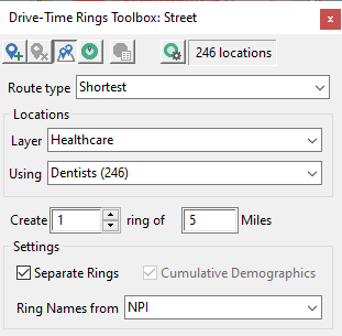 10. Make Drive Time Rings the working layer
11. Choose Map>Thematic Mapping>Color
12. Click Remove
13. Choose Map>Layers>Style…
14. Use these settings: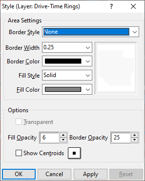 15. This creates a “cloudy” effect, where less “occluded” areas have less competition.
Step 5: Overlay
The following steps describe how to perform an overlay analysis in order to count the number of dentists within each town:
1. Go to Tools>Analysis>Overlay
2. Use these settings: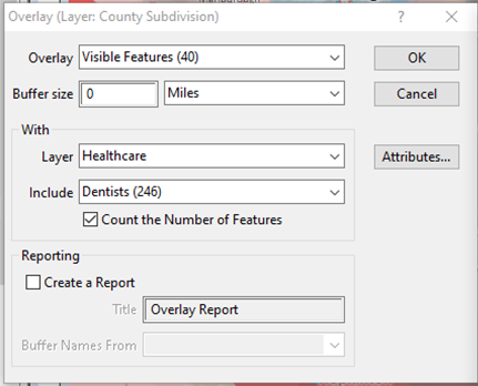 3. Click Attributes… click Defaults (or Clear) click OK, click OK:
Step 6: Formula Field
The following steps describe how to perform a formula in order to determine the ratio of dentists to population:
1. Make County Subdivision the working layer in the map
2. Go to Dataview>Formula Fields…
3. Use these settings and click OK: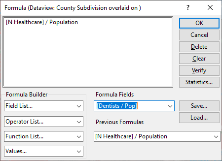
Step 7: Chart Theme
4. Make County Subdivision the Working Layer
5. Click ![]() in the main toolbar
in the main toolbar
6. Use these settings and click OK: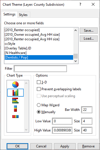
Step 8: Select by Pointing
1. Identify an area in the County Subdivision layer that has a taller bar chart, and a redder color theme shading, and that is in a less “cloudy” (based on drive time rings) location.
2. Use the Select by Pointing ![]() tool to select that area.
tool to select that area.
Step 9: Select by Location
1. Make Address Point the Working Layer
2. Choose Selection>Select by Location
3. Use these settings and click OK:
 If no records are found, then there are no address points for your area. Otherwise, proceed to the next step.
Step 10: Select by Condition
1. Make Address the Working Layer
2. Choose Selection>Select by Condition
3. Use these settings and click OK: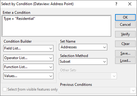 If no records are found, then there are no address points of type residential for your area.
4. Choose Dataview>New Dataview
5. In the Selection drop-down list at the top of the screen, choose “Addresses” as the working selection set
6. Choose File>Export>Table
7. Save the file of exported residential addresses to use in a marketing campaign.