Last Updated: October 10, 2025
You can create a nested average map, a heat map of values above and below the average, using mapping software. Nested average maps enable you to visualize how individual locations, such as ZIP Codes, counties, or customers, compare to the average value of a selected data field like sales, population, or income. In this article, we will go over how to do this using Maptitude.
Table of Contents
- What is a Nested Average Map?
- Why Use a Nested Average Map?
- How to Create a Nested Average Map in Maptitude
What is a Nested Average Map?
A Nested Average map splits map features into two distinct classes:
- Above Average
- Below Average
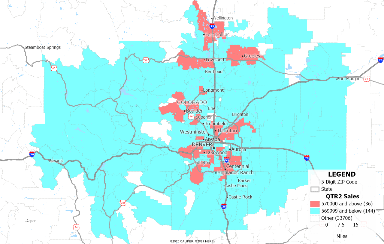
This type of map makes it simple to see at a glance which areas are performing better or worse than average. For example, you can easily identify ZIP Codes with above-average sales in one color and below-average ones in another.
Why Use a Nested Average Map?
This method is especially useful when:
- You want a fast way to benchmark performance or values.
- You’re exploring data distributions and want to avoid setting manual thresholds.
- You need a clear binary classification: above vs. below average.
It’s a simple, clean method that avoids visual clutter and helps you communicate insights effectively.
How to Create a Nested Average Map in Maptitude
Follow these steps to create a nested average map:
- Open up your Maptitude program or request a free trial of Maptitude mapping software.
- Map your data (e.g., ZIP Codes, customers, states) using the New map of my data/table/spreadsheet.
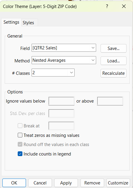
- Click on Map > Thematic Mapping > Color…
- In the Color Theme dialog, set the following options:
- Field: Choose the data field (e.g., Sales, Population).
- Method: Select Nested Averages.
- # Classes: Set this to 2.
- Click OK to apply the theme. Maptitude will then display a heat map with two color zones—those that fall above and below the calculated average value.
- Optionally, you can change the color of your theme. To do so, reopen the Color Theme dialog, and select the “Styles” tab. You can go through the Color Sets to find the best one for your map. We recommend choosing colors that imply high/low values.
- You can also customize your legend by using the pointing tool to right click on the legend and adjust the order of the classes and the legend size.
For more information on how to map your own data from excel, please refer to our learning portal article on mapping data.
For more information on how to create a sales map, please refer to our learning portal article on creating a sales map using Maptitude.
For more mapping and data visualization tools, visit the Maptitude Learning Portal or register for a live webinar.