How to use GIS to look at changes in employment patterns
GIS for local/regional economics:
Using ACS data to complete an
employment shift-share analysis and location quotient at the municipal
level


Authors:
Brett Lucas
and Stewart Berry

Introduction
This article explores how to use
GIS (geographic information software) in local or regional
economics. Many times,
local or regional governments, economic geographers or regional
economists are asked to look at changes in employment patterns over
a specific period within a particular geography (e.g., a city,
township, or county) or between several geographies where a
comparative analysis is required.
In the context of local or
regional economic analysis, GIS (such as
Maptitude mapping software) proves to be a valuable tool for
assisting local government decision-makers, policymakers, and other
stakeholders in visualizing essential data for various applications.
The implementation of GIS in this domain can yield valuable
insights, particularly in conjunction with shift-share analysis and
the location quotient. Some of the key applications include:
- Economic Shift-Share Analysis: GIS can aid in conducting
economic shift-share analysis, allowing local authorities to
identify industries or sectors that are experiencing growth or
decline. By comparing local economic performance with regional and
national trends, decision-makers can better understand the factors
influencing the local economy and develop targeted strategies to
capitalize on strengths and address challenges.
- Location
Quotient Visualization: Through GIS, local governments can create
maps and visual representations of location quotients across
different areas within their jurisdiction. These visualizations
enable policymakers to identify the industries that are relatively
over- or under-represented compared to the broader region. This
insight is instrumental in shaping economic development policies and
focusing resources on sectors with the greatest potential for
growth.
- Assessing Economic Clusters: GIS can facilitate the
identification of economic clusters within the region, showing
concentrations of related industries. Understanding these clusters
can guide decisions on supporting and nurturing these industries,
fostering collaboration, and enhancing the overall competitiveness
of the local economy.
- Infrastructure and Development
Planning: GIS can be used to analyze land use patterns, population
growth, and density to inform infrastructure development and
investment decisions. By visualizing these trends, local governments
can pinpoint areas with high growth potential, identify suitable
locations for new developments, and plan for efficient service
provision.
- Impact Analysis: GIS is a powerful tool for
assessing how proposed economic developments might affect the
surrounding areas. By visualizing data related to traffic,
environmental factors, and socio-economic demographics,
decision-makers can evaluate potential impacts and devise mitigation
strategies.
Incorporating GIS into local government operations for
economic analysis not only enhances data-driven decision-making but
also improves communication and collaboration across different
departments. GIS technology can be leveraged in various aspects,
including
urban planning,
zoning regulations,
economic development initiatives, and monitoring the
effectiveness of policies and programs.
By integrating GIS into
their operations, local governments can unlock the full potential of
geospatial data, leading to more informed, strategic, and
sustainable economic development efforts.
What is an employment shift-share analysis?
A shift-share analysis measures the movement (shift) of the local
economy into faster or slower growth sectors and whether a
community’s larger or smaller portion (share) of the growth is
occurring in each economic sector at the state or national level.
This analysis can help identify industries where a regional economy
has competitive advantages over a larger economy. A shift-share
analysis takes the change over time of an economic variable, such as
employment, within industries of a regional economy, and divides
that change into various components.
How has shift-share analysis been performed historically?
Historically, a shift-share analysis of local or regional
employment analysis has been performed at the
county or MSA (Metropolitan Statistical Area) levels. This is
because these have been the most granular levels of geography that
annual employment data by industry sector have been made available
via Federal data sets such as the Bureau of Economic Analysis. In
large MSAs or counties with significant population (e.g., Los
Angeles County), a county level analysis may be too aggregate and
not adequately describe the industry variation across the
constituent cities within a county or neighborhoods within a city.
Why use Geographic Information Systems for shift-share economic analysis?
GIS provides users with a way of categorizing and assimilating
data geographically, to better understand the underlying factors as
to why certain phenomena are happening in certain locations.
Maptitude mapping software is an ideal software platform for
economists to leverage geospatial data across an organization.
Maptitude is a full featured desktop or online GIS and mapping
software that gives you the tools, maps, demographic, and economic
data needed to analyze and understand how geography affects economic
activities in your region.
In this article we will demonstrate an
application of Maptitude in the economics sector for
economic development
and regional employment.
Using GIS in a shift-share analysis: downloading the data
The employment data being used in this case study is available in
two ways.
- US Census Bureau (www.census.gov):
in the advanced search tool choose "DP03: SELECTED ECONOMIC
CHARACTERISTICS" (a data extract from the American Community Survey
or ACS) under the "Surveys" tab, and then choose a year and
geography. Multiple geographies can be selected (three or four
cities in the same county). The data table can be downloaded as a
.csv file. This step may need to be repeated for multiple years.
Figure 1: US Census Bureau "Advanced Data Search" showing selected
filters.
- Commercial GIS (e.g., Maptitude): extract the
ACS data geographically (no need to know the Census Surveys to pull
down), by selecting on a location on the map or multiple locations,
and then exporting the data into a spreadsheet system of your
choosing such as Excel or Google Sheets. In the next section we will
detail the steps to do this.
Using GIS in a shift-share analysis: extracting the data
For this example, we will be using the communities of Albany,
Corvallis, and Lebanon, located in the Mid-Willamette Valley region
of Oregon, located approximately 70 miles south of Portland. Albany
is the county seat of Linn County. The local economy includes
retail, rare metals processing, agriculture, and forest products.
Corvallis is the county seat of Benton County and is the home to the
main campus of Oregon State University. Besides the university, the
local economy is driven by healthcare and technology. Lebanon is the
second largest city in Linn County with an economy that is focused
on agriculture, logistics/warehousing, and healthcare.
To start the analysis, you can download a
free trial of Maptitude or obtain a
free copy available to educators and students.
- Start Maptitude, and choose "New Map of United States", click OK, choose
"US City", type "Albany, OR", and click Finish. A map zoomed of
Albany Oregon is created.
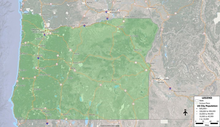
- Next, zoom out to show the
communities of Albany, Corvallis, and Lebanon on the map. With
"Census Place" as the
working layer, use
Selection > Toolbar and click the
Select by Pointing button.
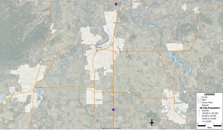
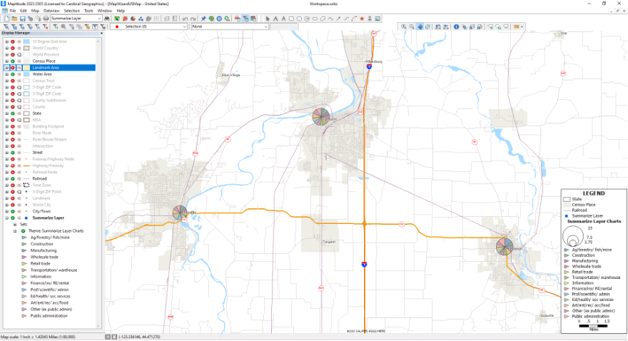
Map 1: Maptitude Workspace of Albany, Corvallis,
and Lebanon in the Mid-Willamette Valley.
- Select the
communities of Albany, Corvallis, and Lebanon by clicking on them in
the map. Your map should resemble Map 2.
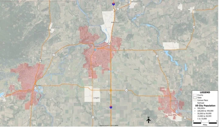
Map 2: Maptitude
Workspace with Albany, Corvallis and Lebanon selected.
- Choose Dataview > New Dataview. We will later export the Census ACS
data associated with each community from the selection in the
Dataview to Excel, to complete the shift-share analysis.
- In the drop-down in the menu at the top of the screen, change "All
Records" to "Selection", to see just the records for the three
communities. Choose File > Export > Table and follow the prompts to
export your records to Excel.
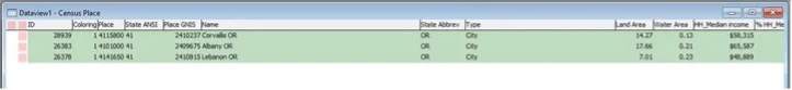
Figure 1: Dataview with the selected
records (Albany, Corvallis, & Lebanon) for export.
- Repeat the previous steps for each year that you have data for. For this
analysis we are comparing 2019 and 2022. Annual 5-year estimate ACS data can be requested from the
Maptitude Team.
- Repeat the previous steps again at the State level, by selecting Oregon. The "State" layer will first need
to be the working layer. Again,
you will want to repeat this twice, once for the current year and once for the previous year used in Step 6.
Map 3: Maptitude Workspace with the State of
Oregon selected.
Using Excel in a shift-share analysis: How competitive is your employment market compared to other regions within the area or State?
- In Excel, you will want to clean the data, and choose
the following fields and create a primary spreadsheet to pull from
for the analysis on different tabs of your spreadsheet.
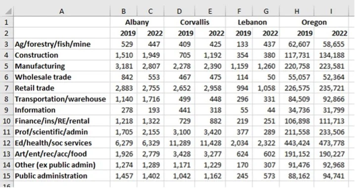
Figure 2: Primary sheet in Excel to pull data from for the shift-share.
- Next, we will start to model the Shift-share for our first
community, Albany. Once you complete the steps for Albany you will
repeat them for Corvallis and Lebanon. Create a new sheet in your
spreadsheet labelled Albany.
- Create the calculations for
Oregon: Next to the thirteen industry calculations, add a column for
the 2019, and one for the 2022 data, having an empty column between
the two. In the empty column, calculate the proportionate share for
2019. In this case, for agriculture, it will be 62,607 / 1,934,643 =
3.2% or "=(B3/$B$16)". Keeping the denominator fixed, copy the cells
for all thirteen categories. Repeat this step for 2022. Your result
should resemble Figure 4.
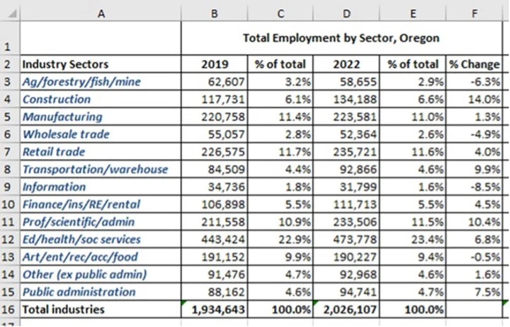
Figure 3: Calculating the proportionate
share for the state of Oregon.
- Next, we will want to
repeat the same process that was outlined in the previous step;
however, this time it will be for the community of Albany. Next to
the thirteen industry calculations, add a column for 2019, and one
for 2022, having an empty column between the two. In the empty
column, calculate the proportionate share for 2019. In this case,
for agriculture, it will be 529 / 24,222= 2.2% or "=(G3/$G$16)".
Keeping the denominator fixed, copy the cells for all thirteen
categories. Repeat this step for 2022. You will also want to add an
additional column to calculate the numeric change between 2019 and
2022, as this will be a comparison reference column in future
calculations. The result should resemble Figure 4.
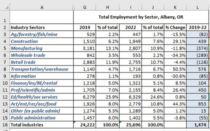
Figure 4: Calculating the proportionate share for the community of Albany.
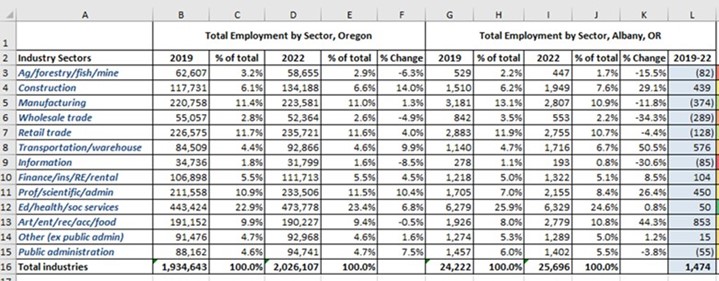
Figure 5: Spreadsheet with both the Oregon and Albany calculations.
- State Share: The first step in completing the shift-share
analysis is to calculate the State or national share. In our example
it is a state share, as the State of Oregon is our reference layer.
The State share effect represents the share of local employment
growth that can be attributed to growth of the national economy.
- Formula
National share = (base year [beginning year] employment in
each industrial sector of the locality) × (the national average rate
of growth for all sectors)
- To do this in Excel, create a
new column, and insert the following formula for the first sector
(Agriculture).
=G3*($D$16-$B$16)/$B$16
- Copy the formula for the
other sectors.
- Once completed, do a highlight of the "State
share" column using a red to green or a low to high coloring ramp.
The result should resemble Figure 6.
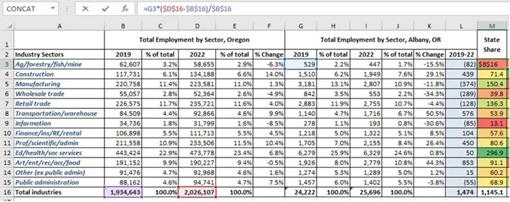
Figure 6: Spreadsheet with the calculations for State Share.
- Industry Mix: The next
step in completing the Shift-share analysis is to calculate the
industrial mix. Industrial mix effect represents the effects that
specific industry trends at the national level have had on the
change in employment in the locality. This component captures the
fact that, at the state/national level, some industries grow faster
or slower than others, and these differences are reflected in the
local industry structure.
- Formula
Industrial mix effect =
(base year employment in local industrial sector X) × (the
national average growth rate for sector X − the national
average growth rate for all sectors)
- To
do this in Excel, create a new column, and insert the following
formula for the first sector (Agriculture).
=G3*(((D3-B3)/B3)-(($D$16-$B$16)/$B$16))
- Copy the
formula for the other sectors. Once completed, do a highlight of the
"Industrial Mix" column using a red to green or a low to high
coloring. The result should resemble Figure 7 (State Share column is
hidden).
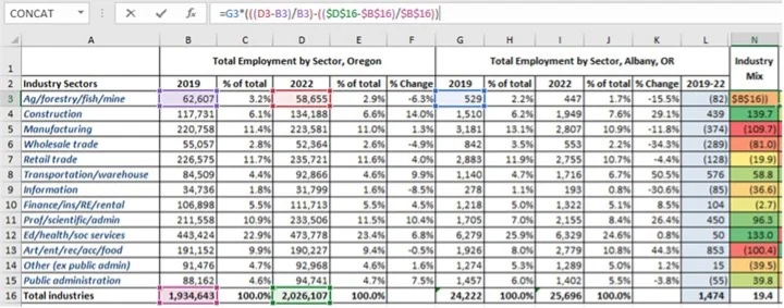
Figure 7: Spreadsheet with the calculations for Industrial Mix.
- Regional Shift: The next step in
completing the Shift-share analysis is to calculate the regional mix
or competitive effect. Regional mix shows how industrial groups in
the locality performed relative to those groups at state or national
averages. It is based on the assumption that for the same industry
groups, sometimes the locality may not follow the state/national
trends with the same magnitude.
- Formula
Regional shift = (base year employment in local industrial
sector X) × (the local growth rate for sector X − the national
average growth rate for sector X)
- To do this in Excel,
create a new column, and insert the following formula for the first
sector (Agriculture).
=G3*(((I3-G3)/G3)-((D3-B3)/B3))
- Copy the formula
for the other sectors. Once completed, do a highlight of the
"Regional Shift" column using a red to green or a low to high
coloring. The result should resemble Figure 8 (State Share and
Industrial Mix columns are hidden).
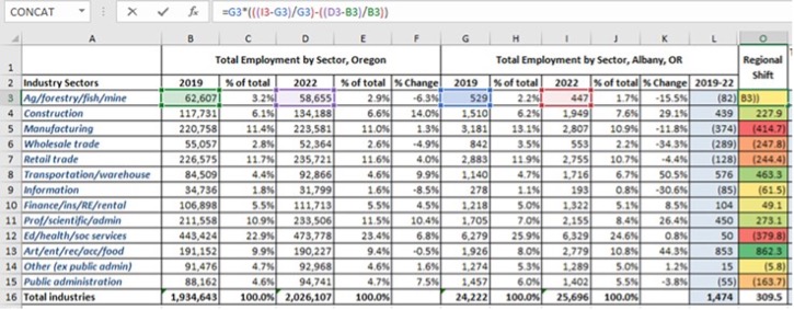
Figure 8: Spreadsheet with the
calculations for Regional Shift.
- Calculate the "Total
change in employment 2019-22" by summing the "State Share",
"Industry Mix", and "Regional Mix". This is also a quick check of
your math in the spreadsheet, and your "Total change in employment
2019-22" values should match your "employment change" column (column
L) for Albany. The result should resemble Figure 9.
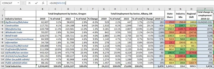
Figure 9:
Spreadsheet with the calculations for Total change in employment
2019-22.
- Competitive Effect: The next step is to
calculate the regional competitive effect indicates how much of the
job change within a given region the result of some unique
competitive advantage of the region is.
- Formula
Actual Change: Expected Change = Competitive Effect
- To do this in Excel, create a new column and insert the following
formula for the first sector (Agriculture).
=SUM(L3-O3)
- Once completed, do a highlight of the
"Competitive Effect" column using a red to green or a low to high
coloring. The result should resemble Figure 10.
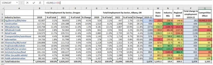
Figure 10:
Spreadsheet with the calculations for the competitive effect.
- Location Quotient: Calculate a Location Quotient or LQ:
According to the Bureau of Economic Analysis, a LQ is an analytical
statistical measurement that measures a region’s industrial
specialization relative to a larger geographic unit (usually the
nation or state). An LQ is computed as an industry’s share of a
regional total for some economic statistic (earnings, GDP,
employment, etc.) divided by the industry’s share of the national
total for the same statistic. For example, an LQ of 1.0 in mining
means that the region and the nation are equally specialized in
mining; while an LQ of 1.8 means that the region has a higher
concentration in mining than the nation.
- Formula
LQ = (e/ei) / (E/Ei) where ei = Local employment in industry
I, e = Total local employment, Ei = Reference area employment in
industry I, and E= Total reference area employment.
- To do
this in Excel, create a new column titled "LQ 2019" and insert the
following formula for the first sector (Agriculture).
=SUM(G3/B3)/($G$16/$B$16)
- Copy the formula. Once
completed, do a highlight of the "LQ 2019" column using a red to
green or a low to high coloring. The result should resemble Figure
11 (columns M, N, O & P are hidden). Repeat this step for 2022.
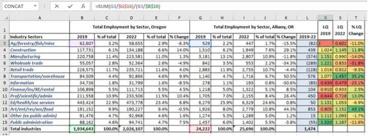
Figure 11: Spreadsheet with the calculations for the location
quotient.
- Calculate the percent change of the difference
between the 2019 and 2022 LQ's.
- Formula
(LQ 2022: LQ 2019) / LQ
2019
- Copy the formula.
Once completed, do a highlight of the "% LQ Change" column using a
red to green or a low to high coloring. The result should resemble
Figure 12.
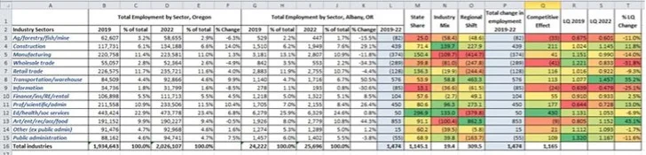
Figure 12: Spreadsheet with the calculations.
- Next, if you choose to do so, create some charts and graphs on this
Excel sheet, looking at the Industry Mix, State Share, Regional Mix,
Competitive Effect, and LQ. Figure 13 is an example. What the region
mix table tells the user is that Albany Oregon shows a level of
regional strength in the "transportation/warehousing" sector and the
retail sector (primarily food, restaurants, and lodging), based on
its proximity to I-5.
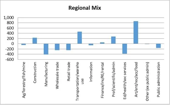
Figure 13: Regional Mix for Albany
- Repeat these steps again for Corvallis and Lebanon. Since you now
have the formulas for Albany, copy the Albany sheet in Excel to
another sheet named Corvallis. From the primary sheet, pull the data
for Corvallis and swap out the cells. The State data columns remain
the same. The Industry Mix, State Share, Regional Mix, Competitive
Effect, and LQ columns should automatically update. Once you have
completed this for Corvallis, repeat the steps again for Lebanon.
Using GIS in a shift-share analysis: bringing you data back into Maptitude
Now that we have done our employment shift-share or LQ analysis
in Excel, we can import the results into Maptitude. In this example,
we want to map our LQ results for 2022, for the communities of
Albany, Corvallis, and Lebanon.
- In Excel, create another
sheet named "Summary" for the LQ results, with communities in the
first column (and a column for state and one for city, so Maptitude
can geocode the data), with other columns for the economic sectors.
When you pull the data from the columns in each of the city sheets,
use "transpose (x/y)" to paste the data into the summary sheet. The
result should resemble Figure 14.
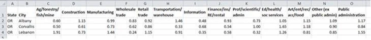
Figure 14: Summarized LQ data by community
- In Maptitude on startup choose "New map of my
data/table/spreadsheet" and choose the Excel sheet created in the
previous step.
- In the "Create-a-Map Wizard" use the
City/State options to geocode locations by City/State.
- When prompted to "Choose a Type of Theme", choose "Chart Theme". For the
theme fields highlight the industry sectors you wish to display and
click Next> and follow the prompts using the defaults.
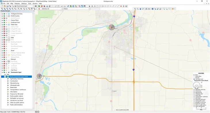
Map 4: Initial map of locations in Maptitude
- The map created
(Map 4) looks good but can be enhanced. First, let’s change the
scale from 1:58,000 to 1:90,000 using Map > Zoom > Scale. This is
also a good time to use the Display Manager on the left of the
screen to turn off unnecessary layers like "10 Degree Grid Area",
"World Country", and "Landmark Area". You can also right click on
the legend in the map and choose properties to adjust the font sizes
(making them bigger, for example). The result should resemble Map 5.
Map 5: Initial map of locations in Maptitude, at a scale of 1:90,000
- Make your imported data layer the
working layer.
- Click on the style icon (normally a blue
dot) for your layer in the Display Manager on the left. To remove
the point layer style, we are going to choose the first empty cell
under the Icons tab at the bottom of the Style window.
- Double click on the Theme item for your layer in the Display manager on the left. In the Chart Theme window:
- Change the Chart Type from a pie chart to a bar chart.
- Check the box to Prevent overlapping lablels.
- Choose the Manually radio button.
- Type "10" for the Bar Width.
- Type "60" for a High Value Size value, because this will better show the data range. The Chart Theme window should resemble Figure 15. Click
OK.
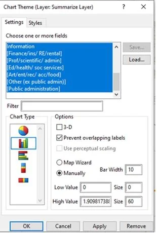
Figure 15: Chart Theme window.
- Right click on the
legend in the map and choose properties to change the Contents by
renaming the Subtitle for the charts theme to "LQ: Industry Sector".
- Modify the
labels for the three communities and use
selection sets to highlight the three cities. The result should
resemble Map 6.
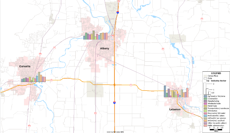
Map 6: Map with a modified bar chart
Conclusion
Both the shift-share and Location Quotient tools are great ways
of highlighting the regional importance of your community compared
to others across your state or the nation. In this example,
education and health services are a standout for Corvallis, being
the home to Oregon State University and the Good Samaritan Hospital.
Alternatively, agriculturally related industries do well in Lebanon.
Albany does well in the transportation and warehousing sector based
on its geographic proximity to I-5.
Maptitude is an extremely powerful software package for
municipal governments doing economic development. For example, it
allows an analyst to target certain areas of a community for greater
economic development opportunities.
Next Steps
Learn more about Maptitude to see how you and your team can benefit from mapping software!
Schedule a Free Personalized Demo
Free Trial Buy Now