Last Updated: March 5, 2025
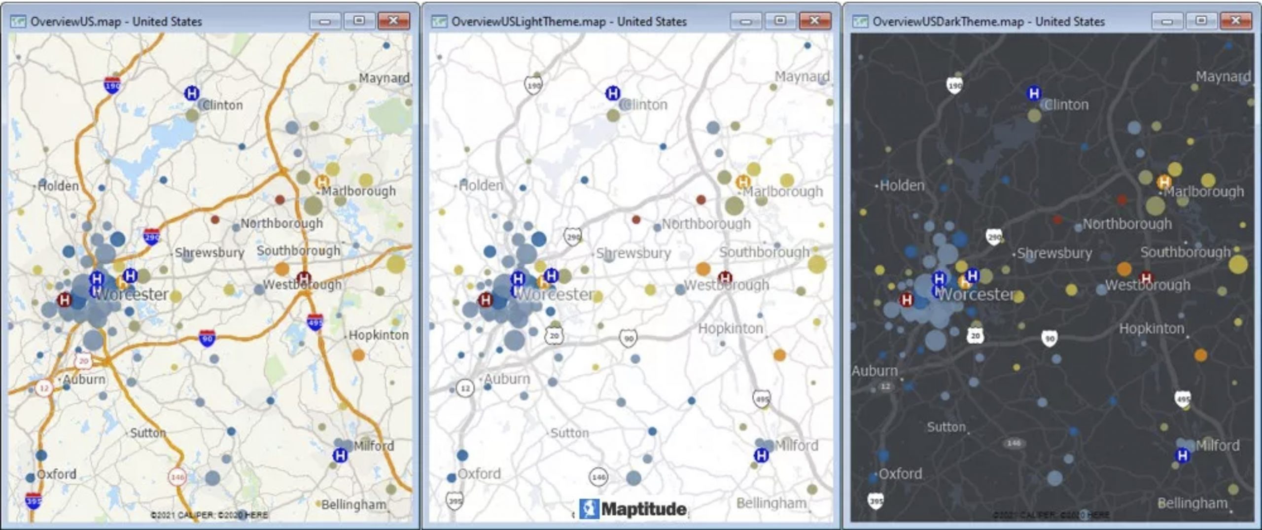
The Maptitude Create-a-Map Wizard creates maps with a standard map background that should be suitable for most situations. However, you may want to consider adding imagery to the background of your map to provide additional reference to viewers. If you are using the United States Country Package, you also have the option of using the light and dark theme overview maps that are available in the Demographic Map Librarian.
In general, when using images in the background, consider the following:
- Details in satellite imagery tend to get lost at smaller scales, so limit their use to larger scale maps of a city or neighborhood
- Satellite Images tend to have many contrasting colors that can make your map features and labels hard to see. Experiment with different levels of contrast or opacity so that the image does not interfere with the message that you are trying to convey
- By default, images are displayed early in the drawing order so that they do not obscure other layers. If you have layers with solid fills (such as the landmark areas) in your map, you should either hide them, change their opacity, or change the drawing order so that they draw before the imagery. By adjusting the opacity of the image, you can have these layers still somewhat visible.
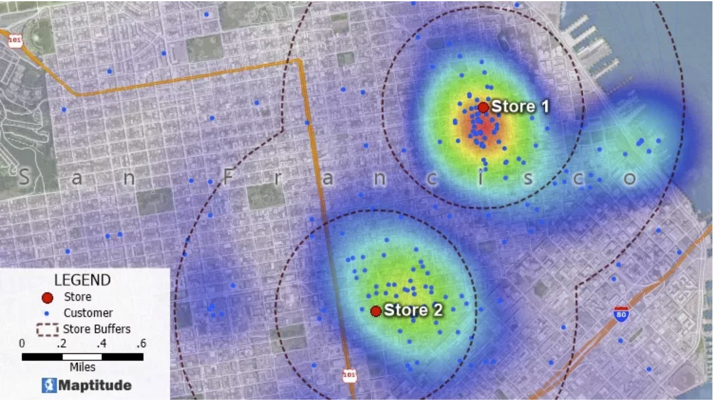
In the above map, the image is displayed with 45% opacity so that the colors of the landmark areas show through and the customers, labels, buffers, and heat map are still legible.