Last Updated: March 5, 2025
Two blog articles each provide a detailed market analysis that compares the types of areas that competing organizations have their locations in:
- Grocery chains: https://www.caliper.com/maptitude/blog/grocery-market-analysis/default.htm
- Healthcare networks: https://www.caliper.com/maptitude/blog/healthcare-market-analysis/default.htm
This article will step you through the analysis for Kroger and Albertsons, both national US Grocery chains, but these steps can be performed with any two groups of locations in any industry.
Step 1: Add Layers to Map
The first step in the analysis is to add the layers you want to compare to the map. If you are looking to compare a list of addresses from Excel, you can geocode them into separate layers. To add two chains of business locations to the map:
- Open any map of the US
- Go to Map>Layers… and click Add Layer
- Navigate to where you have the Business Location data saved
- If you do not have the Business Location data installed, download them from our online store
- Highlight the chains you would like to compare and click Open
- Click Close and check that the layers have been added to the Display Manager
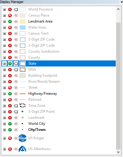
Note that if you are far zoomed out, these layers may not appear in the map itself until you zoom in.
Step 2: Create the Density Grids
The first piece of analysis done in the Newsletter is simply to show where these two chains have a high density of locations. To do this we will create two Density Grids, and apply a different theme to each.
To create the Density Grid for the Kroger locations:
- Click
 in the main toolbar
 - Under Layer, choose US Kroger
- Under Set, choose All Features
- Next to Radius, type 100
- Note: This value entered for radius will depend on the data you are using. Larger values will mean that each individual location will “spread out” more in its contribution to the Density
- You can repeat steps 1-6 using different values for Radius to find one that works well
- Next to Name, type Kroger Density
- Click OK
- Make Kroger Density the working layer
- Click
 in the main toolbar
 - Go to the Styles tab
- Under Color Sets, choose From to be white and choose To to be a shade of red
- At the top, highlight Other and click Style
- Change Fill Style to None and click OK
- Highlight the first class after Other and click Style
- Change the Fill Opacity to 50 and click OK
- Click Copy Pattern and click OK
This will create and style the Density Grid for the Kroger locations:
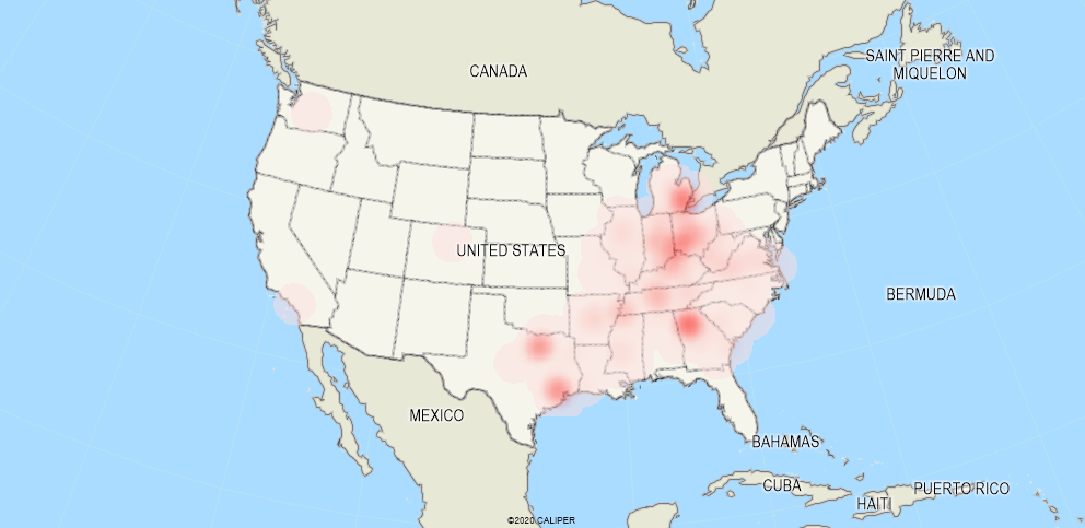
Repeat the above steps for Albertsons, but change the name of the Density layer and use a shade of blue instead of red
For a video tutorial on creating a density layer, see: https://www.caliper.com/learning/media/creating-a-maptitude-hot-spot-density-grid-map/
For a written tutorial on creating a density layer, see: https://www.caliper.com/learning/articles/how-do-i-create-a-density-or-heat-map-of-my-locations/
For a written tutorial on changing the color of a density layer, see: https://www.caliper.com/learning/media/creating-a-maptitude-hot-spot-density-grid-map/
Step 3: Tagging the Data
Next, we are going to use two of the free data products that come with Maptitude mapping software to analyze the types of area that these two chains tend to have their locations in. We will be using the Consumer Expenditure data to see how much is spent on Groceries per Household in the areas surrounding each location, and we will be using the Geodemographic Segmentation to see which segments each chain tends to target.
- Go to Map>Layers… and click Add Layer
- Navigate to where you have the Consumer Expenditure data saved
- If you don’t have this data installed, you can download it from our online store
- Highlight ccConsumerExpenditure.cdf and click Open
- Click Add Layer
- Navigate to where you have the Geodemographic Segmentation data saved
- If you don’t have this data installed, you can download it from our online store
- Highlight ccGeodemographicSegmentation.cdf and click Open
- Click Close
- Make US Kroger the working layer
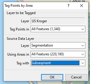
- Go to Tools>Analysis>Tag Points by Area…
- Choose these settings and click OK:
- Go to Tools>Analysis>Overlay
- Use these settings and click OK:
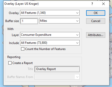
- Note: The value you choose for Buffer Size should reflect the size of the radius that you want to consider around each location
- We now want to save the resulting analysis. Go to File>Export>Table and save the analysis in an appropriate location with the name Kroger Analysis. You can now close the Dataview
- Repeat Steps 8-13 with the US Albertsons layer
This will save an Excel file for the analyzed layers that tells you:
- The Subsegment from the Caliper Geodemographic Segmentation that each location is in
- The Annual Average Expenditure per Household on a variety of different categories for the 1-mile radius surrounding each location
Step 4: Summarizing the Segmentation Data
To analyze the Segmentation data, we need to count up the number of locations in each Subsegment:
- Go to File>Open, change the File Type to Excel Worksheet and find the Excel file you saved as Kroger Analysis. Click Open
- Make sure Import is checked and click OK. Click No when prompted to create a new geographic file.
- Go to Dataview>Tools>Group By…
- Under Field, choose [Segmentation:Subsegment]
- Click Attributes, click Clear, click OK and then click OK
This will make a table showing you the count of each location In their respective Subsegment. For more information on what each subsegment means, see the Demographic Handbook
You can export the table out to Excel using File>Export>Table or you can simply Copy and Paste into Excel as well. Repeat for the Albertsons locations.
In the newsletter, we simply used these counts to find the Subsgements where a high percentage of each chain’s locations were found and examined if there was much overlap.
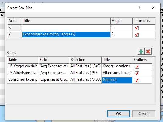
Step 5: Making a Box Plot
Box Plots are a data visualization option that we added in Maptitude 2022. They allow you to visualize how one field changes over a set of data, giving a clear representation of the median value as well as how spread out the values tend to be.
In this example we will be creating a box plot based on the Average Spending at Grocery Stores around each location. You can choose to use any of the Expenditure fields, depending on your needs.
To make the Box Plot:
- Right-click on Consumer Expenditure in the Display Manager and choose New Dataview
- Go to Dataview>Statistics>Box Plot
- For X, leave the Title blank and change the Angle to 0
- For Y, type Expenses at Grocery Stores ($) as the Title
- Click
 three times
 - For the first row choose:
- Table: Kroger Analysis Table
- Field: [Avg Expenses at Grocery Stores]
- Selection: All Features
- Title: Kroger Locations
- For the second row, choose:
- Table: Albertsons Analysis Table
- Field: [Avg Expenses at Grocery Stores]
- Selection: All Features
- Title: Albertsons Locations
- For the third row, choose:
- Table: Consumer Expenditure
- Field: [Expenses at Grocery Stores]
- Selection: All Features
- Title: National
- Click OK
This will create a chart that can then be resized and printed. You can export to an image by right-clicking on the box plot and choosing Export, or you can print directly to PDF using the print icon.