

Author:
Stewart Berry
Images: Dan Martin
How you define your markets and territories can seem daunting. You are faced with questions such as: Where are my competitors? How do I avoid cannibalizing markets? How do I effectively deploy my sales teams? But, when approached through mapping software, this task will become a valuable and even an exciting part of your job.
There are many ways that you can define your regions, and for many different purposes, ranging from seeing where your customers live, defining franchise territories, and assigning sales reps, to exploring competition. Surprisingly, few map tools provide these capabilities in a comprehensive and easy-to-use way.
Read on to learn how to map your territories and market areas using tools that best fit you and your organization!
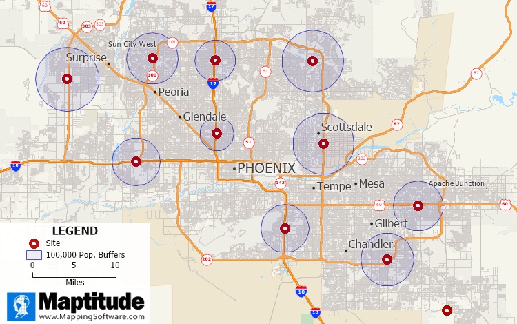
The most traditional way to look at your service areas is to draw a circle around your locations to see who lives within 1, 3, and 5 miles of each site. These tools ignore obstacles and the transportation network and are a straight-line or “as-the-crow-flies” method. To make this analysis much more realistic, areas or rings are created based on the travel time, distance, or cost to drive between locations.
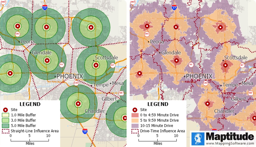
These boundaries allow you to see who is closest to each of your sites or to your competitors, and the demographics of these zones, too. Such results are easily understood by others and lend a consistency to your analysis where every location has the same size rings around them. You can also weight these zones and rings based on differences in your stores or in the demographics at each site, allowing an appreciation of larger stores or higher spending customers, for example.
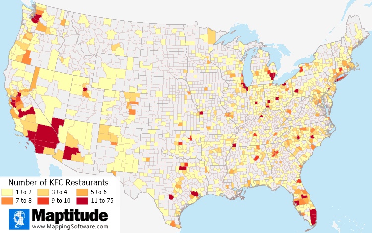
Seeing where your sales are highest or where you have the most customers is an important step in any territory mapping exercise. Maps allow you to clearly visualize data so that it can be easily compared between different geographies. You can answer questions such as: How many of each product are we selling in each postal/ZIP Code, and where are our sales hottest? Chart and heat themes are a great way to explore the competitive landscape and to discuss the geographical distribution of your data with others.
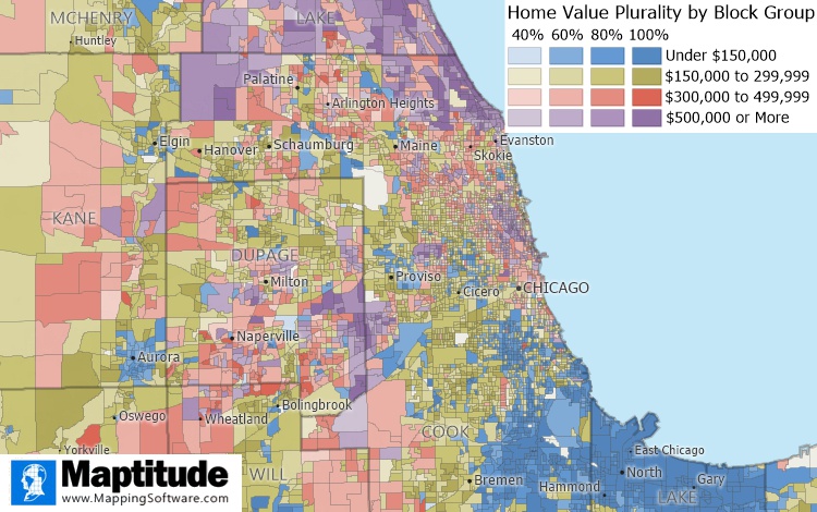
These multiple column heat maps take the traditional color theme a step further, revealing patterns that would not otherwise be obvious. The "heat" of your multiple columns of data blends together so that there is a spectrum of overlapping information that can only be appreciated in a map. You can, for example, see how home values vary across a region and how homogenous the values are in different areas.
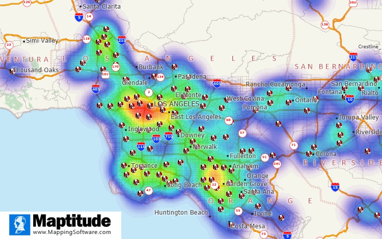
Hot spot maps show the density of your locations and weighting can be used to make areas even hotter based on sales numbers or number of customers, for example. These heat zones allow you to see where you have higher concentrations, allowing appreciation of gaps in service or highly performing areas.
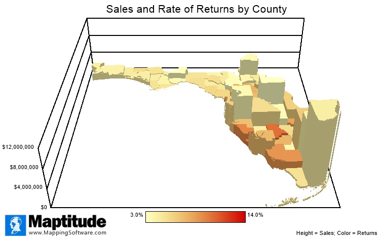
Flat 2D maps can sometime hide unusual trends or very high values in your data. 3D mapping allows you to appreciate your data literally in another dimension. You could look at ZIP Codes or Census tracts in 3D based on the number of deliveries, where each area is also shaded to show another column of data such as the number of returns. You could then visually determine patterns of high returns but low deliveries, for example. 3D cylinders allow you to perform such comparisons for multiple columns of data.
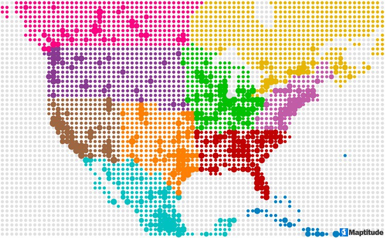
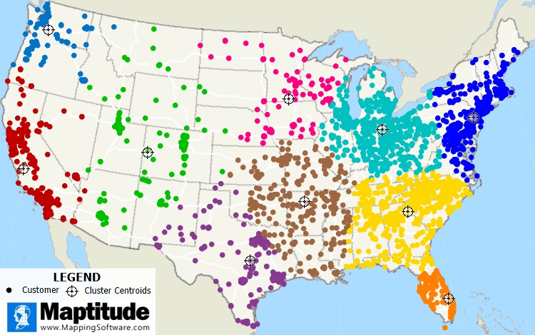
Clustering takes your locations such as customers, delivery destinations, or sales prospects, for example, and groups them together. These groupings usually reflect your desire to best serve those sites. This could be in terms of identifying the best central location for a store for each cluster, or the best pairing of locations based on the supply and demand between depots and deliveries.
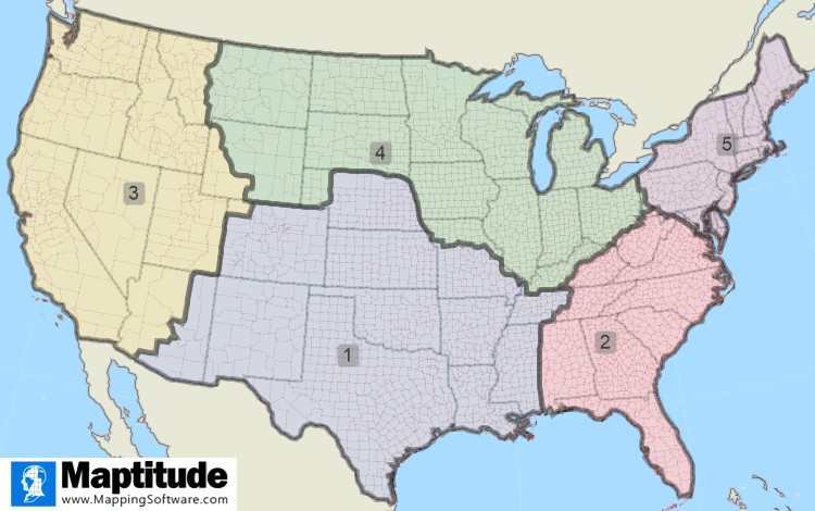
Creating your territory, service, market, and sales regions is a critical way that a mapping application can assist your business strategy. Typically, these areas are:
Once mapped, these boundaries change over time and need to be adjusted manually, or automatically using a database of sales numbers or changing demographics, for example. In addition, territories often “nest” where you have local markets that fit within larger regional assignments that are the responsibility of different managers and teams. Sometimes, territories can even overlap to provide adequate coverage, for example. Maptitude can handle all the above scenarios, and you should ensure that the product you choose is flexible enough to meet your specific needs.
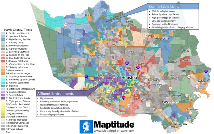
Maps allow you to tell a story with your data that spreadsheets do not support. Geodemographics make this exploration easier by grouping the thousands of demographic characteristics together into understandable and relatable "types" of people. When you find that you are selling to a particular market segment or group, you can then target these customers in untapped cities and towns. Maybe you should be direct mailing about your premium product to "Affluent Environments" that have high income and many college graduates. Or maybe you want to site your new kid friendly franchise in "Comfortable Living" neighborhoods that feature middle to high income people with a high percentage of families.
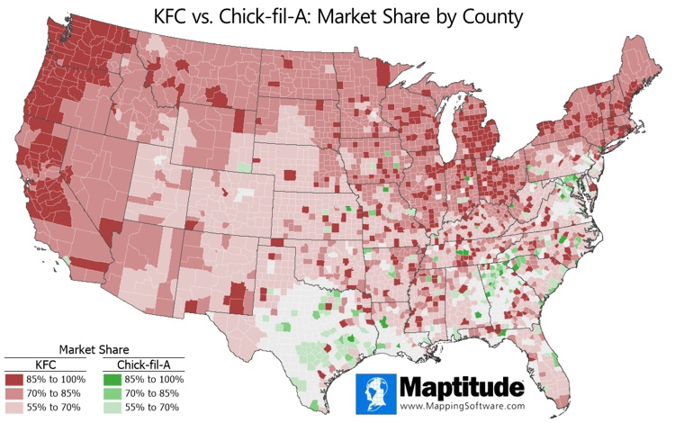
When you have a need to visualize market share and brand strength, you can do so geographically. This is possible by modeling how likely people are to travel to your service or location, with the assumption that closer locations are more attractive. You can then see the market in terms of percentage market share gradient rings, or at the postal, county, or even state and national levels. Market share modeling is a powerful tool that offers crucial business insights and is implemented in Maptitude as a Wizard that gets you to insightful answers with only a few clicks.
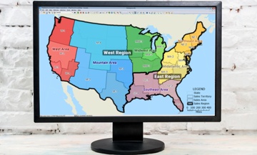
Sales territory mapping software will assist with territory design. Whether you are mapping territories or sales data for sales managers, a territory tool will allow you to clearly tell your story. Sales territories are required by an organization so that decisions can be quickly made based on territory ownership and the local-regional-national sales hierarchy. Often, opacity is used so that you can see each level in the sales territory plan on the map. Territory management also requires the ability to create a new territory, or to merge or remove territories. Territory maps serve both as an analytical tool and as a way to present and share results.
Maptitude ensures that your territory and market area mapping projects and reports will be a success. By integrating with key geographic, business, and consumer datasets, Maptitude provides a one-stop wizard-driven interface. Maps are an intuitive way to convey and analyze large amounts of data. Maptitude can support all the above analytics and comes with all the data used in the examples shown, as well as information for almost any industry and sector you would need to map.
Learn more about Maptitude to see how you and your team can access the data critical to making successful business decisions!
Schedule a Free Personalized Demo

Home | Products | Contact | Secure Store
